


.png)
Let’s talk

Thank you! Your submission has been received!
Oops! Something went wrong while submitting the form.
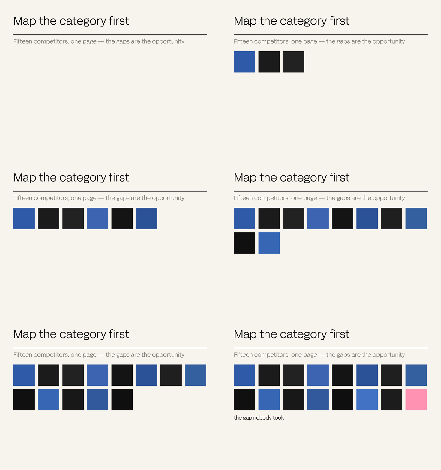
Colour should be chosen against the competitive set rather than from a mood board. The category-conventional colour is recognised instantly and attributed to nobody, which makes it the most expensive choice available. Owning a territory means picking something the category has left open and then holding it long enough to accumulate recognition.
Colour is usually decided in the room with the fewest facts in it. Someone likes it, someone else finds it warm, and a decision that will appear on every surface for a decade gets made on preference.
The right question is not which colour suits the brand. It is which colours the category has already taken, and which are therefore unavailable regardless of how well they suit you.
Blue in enterprise software is not wrong. It is unavailable – recognised by everyone, attributed to nobody, and permanently funded by everyone in the category at once. The 2026 direction reflects this: brands moving away from generic eco-green toward earth tones and deliberate territories precisely because the obvious signal stopped signalling.
The category-conventional colour is the most expensive one available. It costs full price and builds recognition for everybody.
– The Antimony position
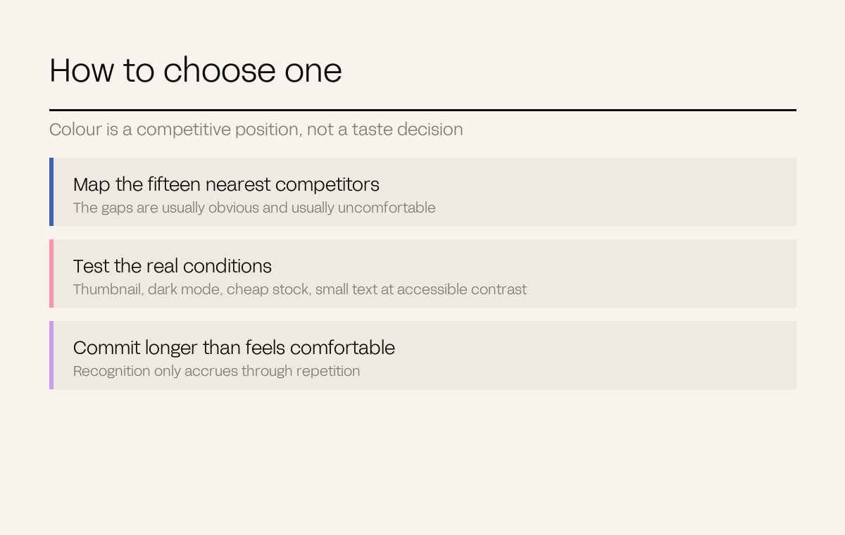
Put your fifteen nearest competitors' primary colours on one page. The gaps are the opportunity, and they are usually obvious and usually uncomfortable – which is why they are still open.
It has to work at thumbnail size, on a delivery-app listing, in a dark interface, printed on cheap stock, and behind small text at accessible contrast. Colours that only work in a presentation are not territories.
Recognition accumulates through repetition. A colour changed every three years never accrues anything, which is why the temptation to refresh is usually a decision to start over.
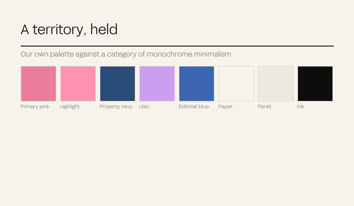
We are a creative studio, in a category that presents itself almost uniformly in monochrome minimalism – black, white, one restrained accent. We run pink against navy.
That is not a taste decision. It is the map exercise above applied to ourselves: the studio category had left warm, saturated colour almost entirely unclaimed, because it reads as unserious to people who have never tested the assumption.
The general rule: the colour your category avoids on instinct is usually available for exactly that reason, and the instinct is usually inherited rather than evidenced. Test it before accepting it.
Our rebrand produced website sessions up 82%, average time on site from 1:48 to 3:12, and inbound enquiry quality up 42%. The case study has the full picture.
Our property case studies share a navy that identifies the programme across four separate listings – Barfoot & Thompson, Taiharuru, Lion Rock and Mataka – so a buyer encountering any one of them meets a coherent programme rather than four unrelated campaigns.
Ka Ka Wa uses colour to distinguish ten SKUs at shelf while keeping them recognisably one family, which is the harder version of the problem: differentiate within the range without fragmenting the brand.
Definitions. Colour territory: a colour or palette a brand holds distinctively within its competitive set.