

.png)
Let’s talk

Thank you! Your submission has been received!
Oops! Something went wrong while submitting the form.
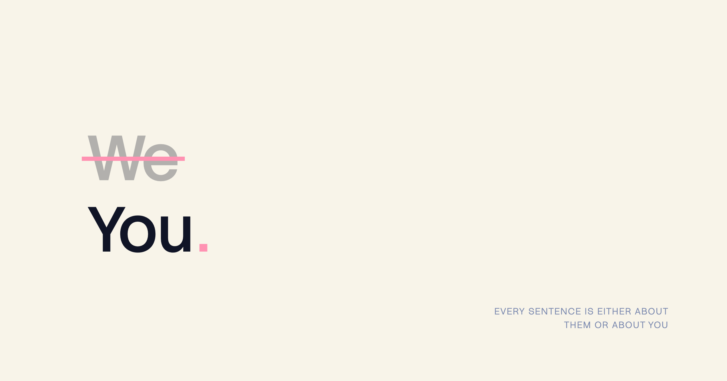
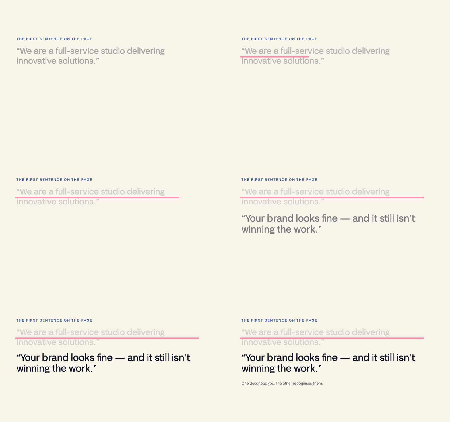
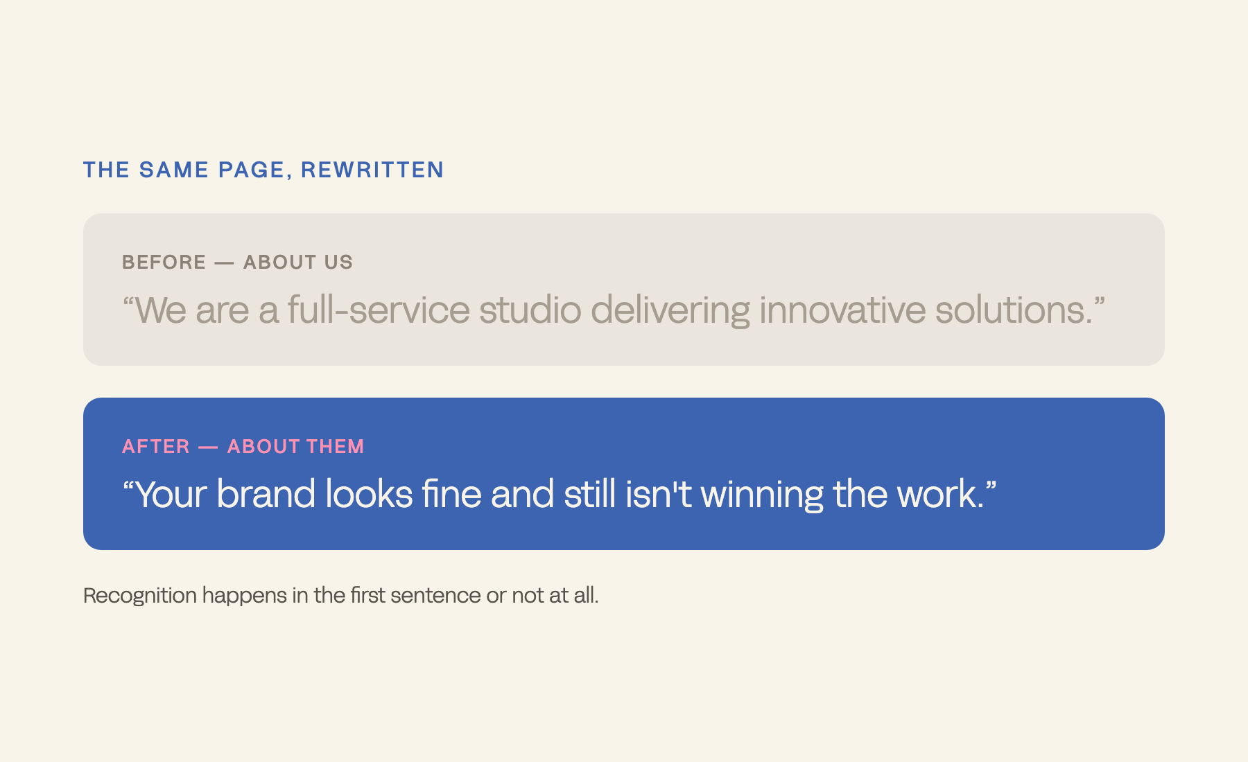
The most common homepage opening – “we are a [category] that helps [audience]” – is a description, not positioning, and it makes the visitor do the work of translating you into their situation. The first line's job is recognition: name the customer's situation so the right person feels seen and the wrong person self-selects out.
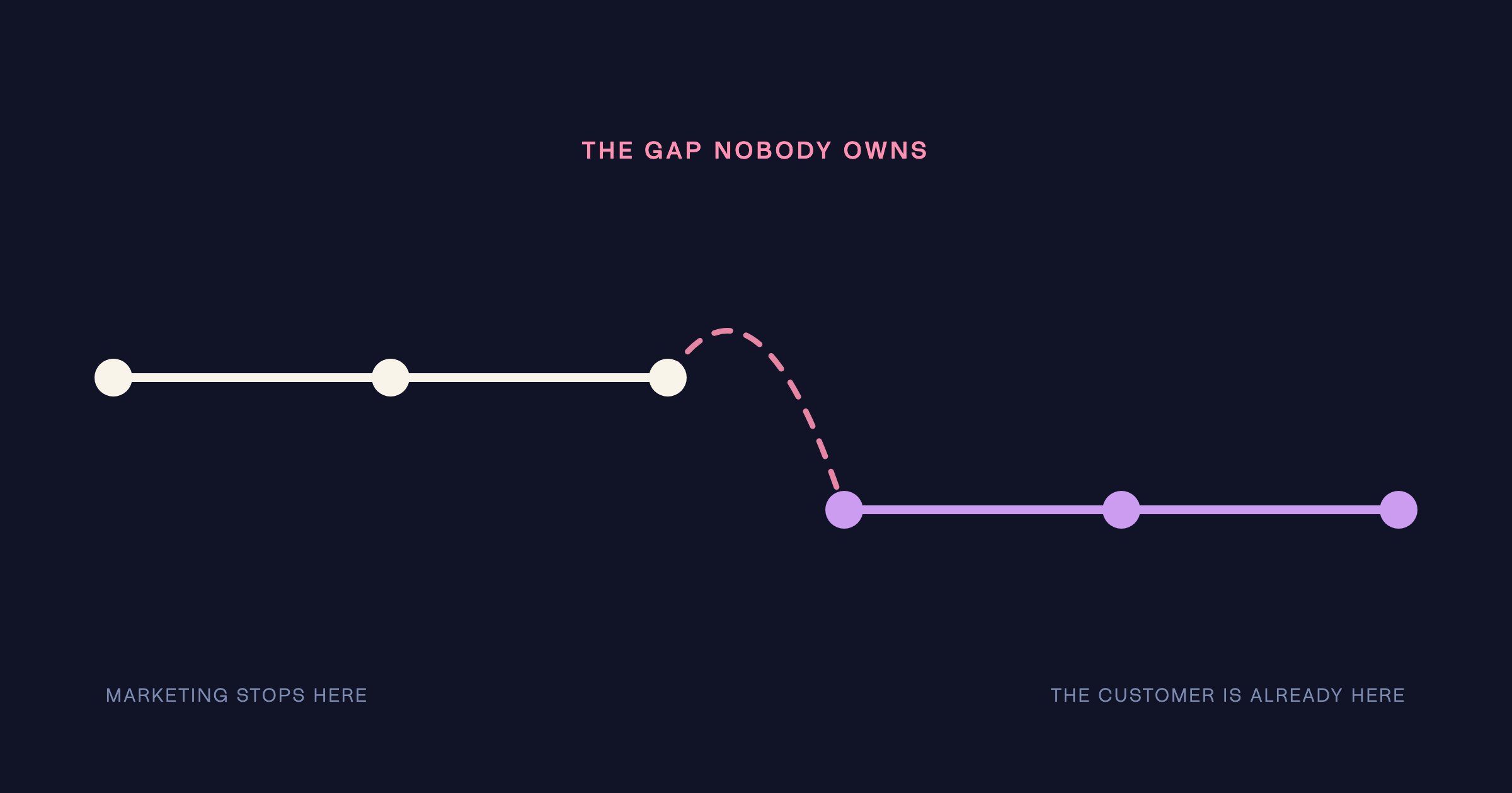
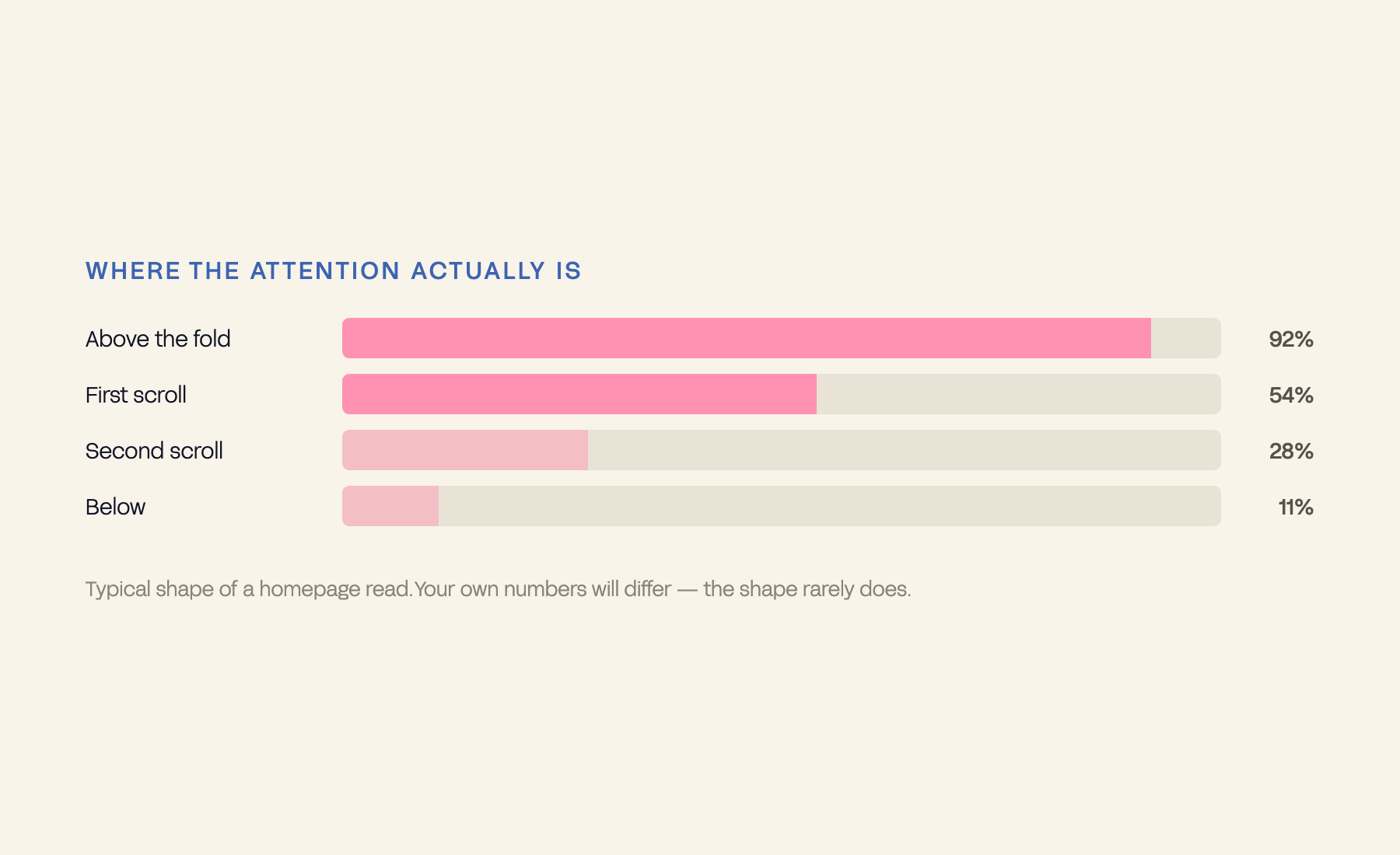
Most websites lose the visitor in the first sentence. Before the scroll. Before the design has a chance to work. And the mistake behind it is so common that most brands cannot see it on their own homepage.
The most common opening line on the internet is some version of: “We are a [category] studio that helps [audience] achieve [outcome].” Accurate, professional – and invisible. The visitor is not looking for a description of you. They are looking for recognition: to know, in the first second, that you understand their problem. A sentence about you asks them to do the work of translating your description into their situation. Most will not bother. They leave before the scroll, and the design they never saw gets blamed for a problem the copy created.
A headline that works for everyone works for no one. Specificity is the conversion tool.
– The Antimony position
Read your headline aloud and ask: could a direct competitor put this exact sentence on their homepage without changing a word? If yes, it is not positioning – it is a description occupying the space where positioning should be. Strong opening copy names the situation the customer is in, implies the outcome they want, and creates one immediate feeling: “this is for me” – all before a single feature is mentioned, because features are answers to questions the visitor has not yet decided to ask.
Its job is to make the right person feel seen and let the wrong person self-select out – those two things happen together. A headline that tries to work for everyone cannot name anyone specifically enough to create recognition. Write it like a filter, not a welcome mat. Request the Brand Revenue Leak Audit to see where your homepage loses people before they ever scroll.
Taiharuru Cove is the sharpest test of this we have run, because there was exactly one thing to sell and no second chance at the headline. A secluded Whangarei Heads estate, a global buyer pool, and a landing page that had to do the qualifying itself.
The copy was written for the buyer’s situation – what this place would be to live in – rather than for the property’s specification. The conversion rate is the argument.
Brand-first copy on that page would have described a property. Customer-first copy described a life, and let the wrong readers leave. Read the case study.
Our own site made the same change: rewriting for the reader rather than the studio took average time on site from 1:48 to 3:12 and lifted inbound enquiry quality 42%. The Antimony case study has the detail.
Definitions. Above the fold: what is visible before scrolling. Positioning: the specific person and specific change your brand claims.