

.png)
Let’s talk

Thank you! Your submission has been received!
Oops! Something went wrong while submitting the form.
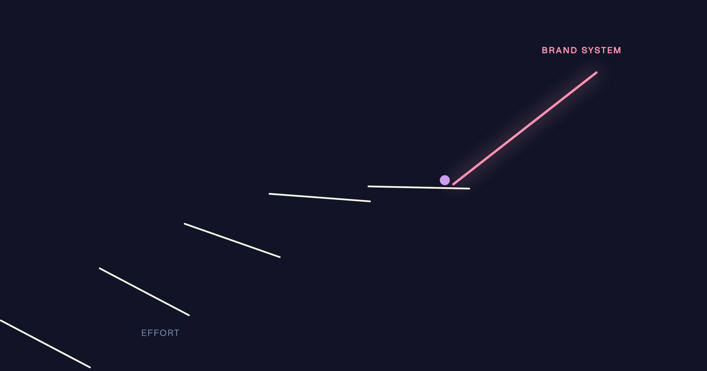
Identity amplifies what is already there: clear positioning gets amplified clarity, muddled positioning gets amplified confusion at a higher price. Before any rebrand, five foundations must be solid – positioning, value proposition, audience perception, commercial clarity, and journey integrity.
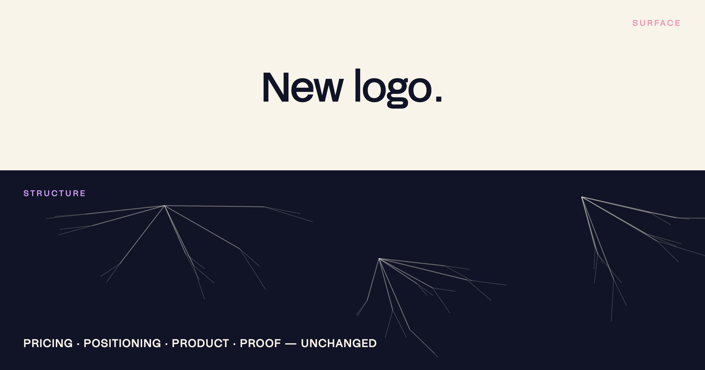
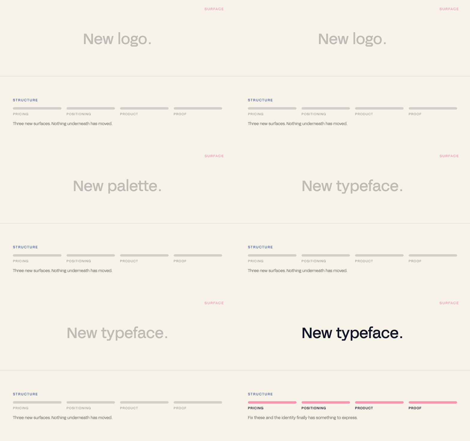
A new logo feels like action. When growth stalls, when the brand feels tired, when a competitor launches something sharp – the rebrand is the move that seems obvious. But a new identity on a broken foundation is expensive wallpaper. The problem was almost never the visual. It was the strategy underneath it.
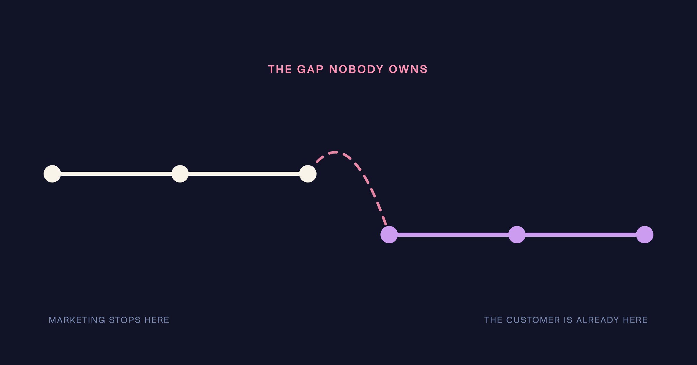
When something isn't working, the instinct is to change what is most visible. Identity is tangible, communicable, exciting to produce. It signals change without requiring the harder work of diagnosing what is actually wrong – that the positioning is unclear, that the value proposition doesn't land, that the journey is broken at a level a new colour palette cannot touch. So the rebrand gets briefed, the studio produces something beautiful, the launch generates excitement – and by Q2 the same metrics that drove the brief are flat again.
Identity amplifies what's already there. If what's there is unclear, a new identity will amplify the confusion at a higher price point.
– The Antimony position
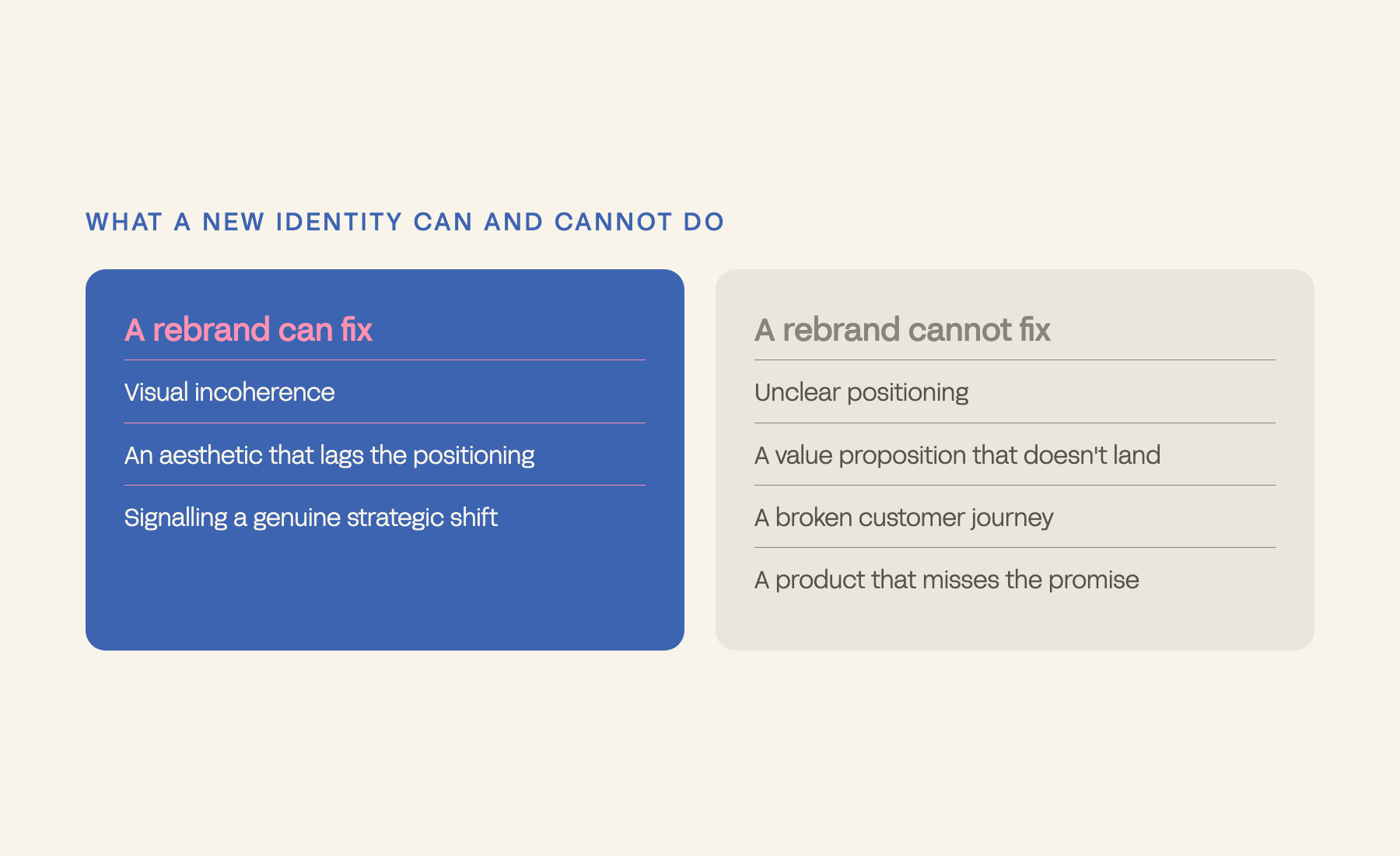
It can fix: visual incoherence across touchpoints, an aesthetic that lags the current positioning, perception drift, a visual language working against the audience, or signalling a genuine strategic shift. It cannot fix: unclear positioning, a value proposition that doesn't resonate, a broken journey, a product that doesn't match the promise, or a gap between what the brand claims and what customers believe.
If any of the five are unclear, the rebrand will underperform – not because the design was poor, but because there was nothing precise enough for the design to express.
A rebrand starts with a new logo. A brand evolution starts with a question: who are we for now, and what do we need to say to them? One produces a brand that looks different; the other produces a brand that performs differently, because every touchpoint now expresses the same precise positioning. The readiness test is three questions with consistent answers: who is this for, specifically; what is the one thing it must communicate; and what does success look like in 12 months, commercially.
RT Edgar is the counter-example to this article – a rebrand that did work, and it is worth being precise about why. It was not the identity on its own. It was that the identity shipped with the system the network needed to actually use it: a collateral framework agents could run themselves, in the field, on every listing.
The adoption number is the one that explains the rest.
Had the work stopped at a logo and a palette, that 87% would have been the number that collapsed – and the enquiry lift with it. Read the case study.
We ran the same test on ourselves. Antimony’s own rebrand shipped as a system rather than a skin, and produced 82% more website sessions, average time on site up from 1:48 to 3:12, inbound enquiry quality up 42% and pitch conversion up 30%. The Antimony case study documents what we changed and what it cost.
Strategy first. Identity second. Always. Not because it is convenient – it would be simpler to take every rebrand brief at face value – but because we have seen what happens when the visual precedes the strategic: brands that look good at launch and underperform by Q2. Identity is the output of strategy, not the substitute for it. Request the Brand Foundation Audit before the design brief is written.
Definitions. Positioning: the strategic choice of who you serve and why you win. Perception gap: the distance between intended and actual audience belief.