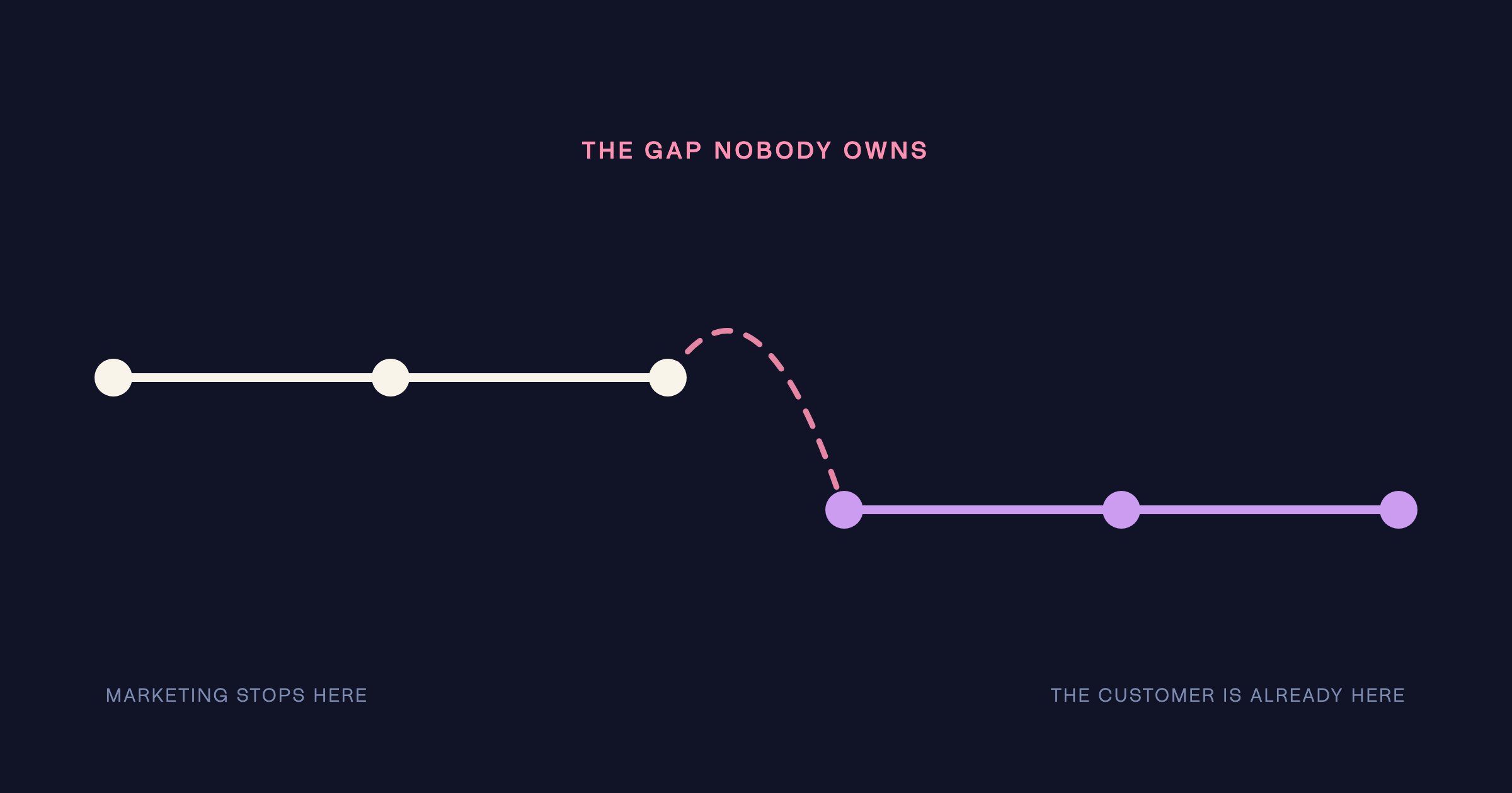


.png)
Let’s talk

Thank you! Your submission has been received!
Oops! Something went wrong while submitting the form.
The contact page is the highest-intent moment in the journey and the one most brands leave to chance. Four failures dominate: too many form fields, no response-time expectation, no sense of what happens next, and a design drop-off. Fix: four fields maximum, a stated response commitment, and a page that feels like a beginning.
The contact page is where commitment actually happens. It is the last thing a visitor sees before they become a client. And most brands treat it as an afterthought – a form dropped onto a plain page at the end of the build. The cost is measured in clients who decided to reach out and then quietly didn't.
By the time a visitor reaches your contact page, the hard work is done. They have read the work, found the thinking compelling, decided to reach out. This is the highest-intent moment in the entire journey – and then the page introduces friction, or doubt, or a dead end, and the conversion that was all but won is quietly lost. Everything upstream worked. The last step undid it.
The contact page should feel like the beginning of something. Not a bureaucratic endpoint.
– The Antimony position
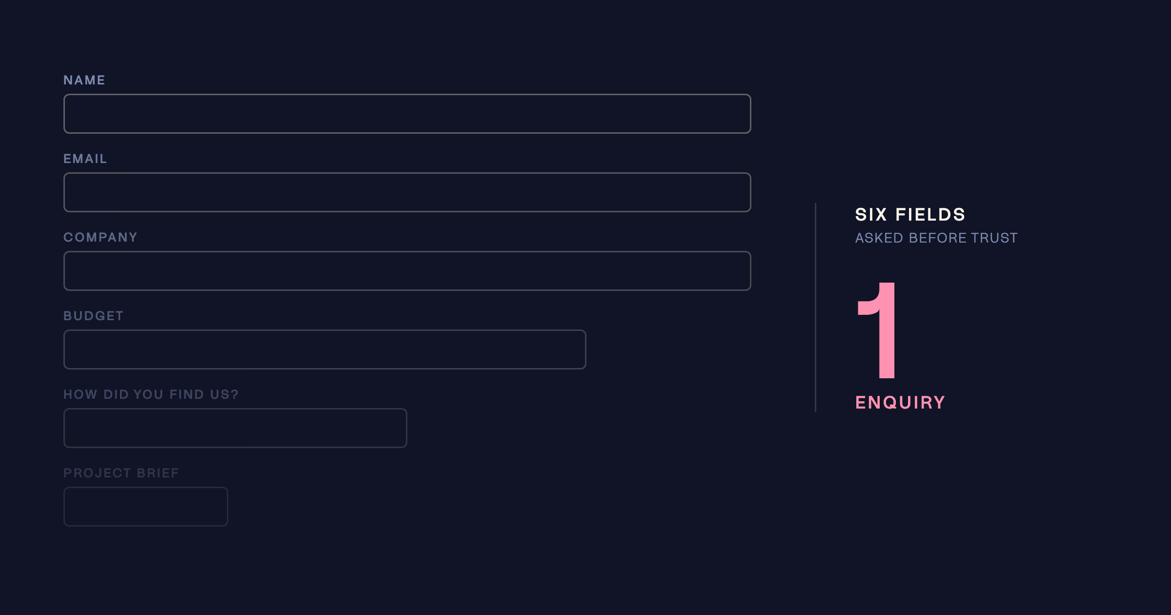
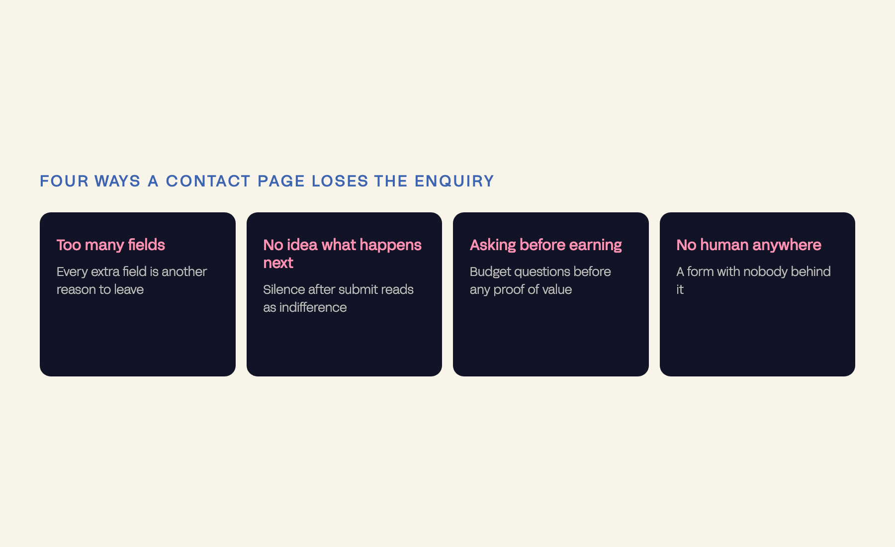
A form with too many fields – every additional field is another reason to stop. No response-time expectation – an hour or a month, who knows. No indication of what happens next – submitting feels like a message into a void. And a design that suddenly looks nothing like the rest of the site – signalling that care ran out at exactly the moment it mattered most.
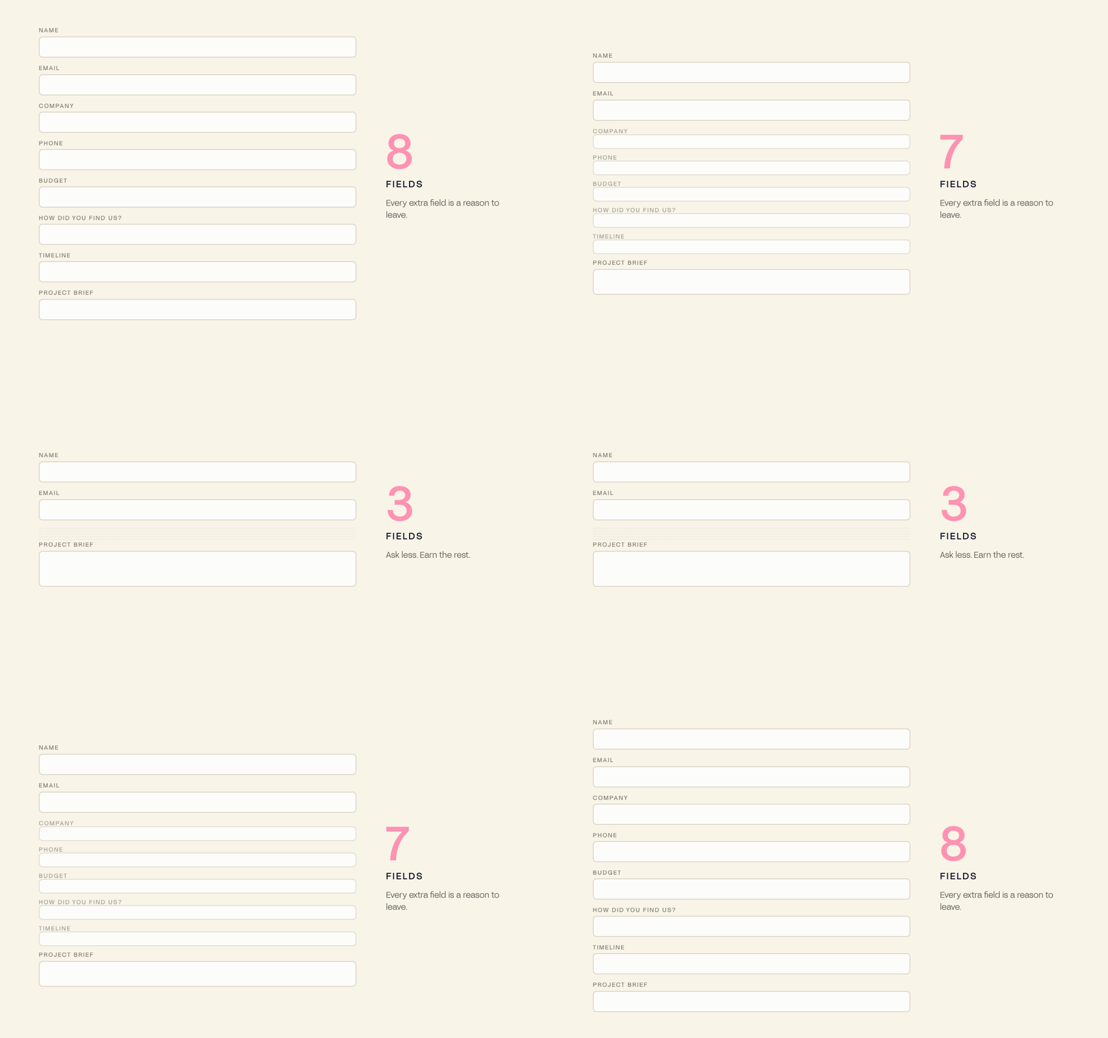
Reassurance on every axis the visitor is quietly worried about: you're reaching the right people; they will respond; here is when; here is what happens next; and the form is short because we respect your time. The person on the other side is nervous. Answer the nervousness directly, and submitting becomes the obvious next step rather than a risk. Ours is right here – and the Brand Revenue Leak Audit will review yours.
For an agent, the contact moment is the entire business. A vendor deciding who to trust with the sale of their home is at the highest-intent point they will ever reach, and most agent websites answer that moment with a bare form and a phone number.
We rebuilt Lindsay Ryan’s brand so the enquiry point carried the same authority as the rest of the work – who you are dealing with, what happens next, and why this agent rather than the three others in the same suburb.
The traffic did not multiply by 4.5. The proportion of it that converted did. Read the case study.
Aaron McKenzie is the same story in hospitality: thirty years of craft with no way to be found, pitched or booked, and 3,800 sessions plus six new venue commissions within 90 days of giving that reputation a front door.
Definitions. Form friction: every element that adds effort or doubt between intent and submission. Post-submission anxiety: the doubt that follows sending a message into silence.