

.png)
Let’s talk

Thank you! Your submission has been received!
Oops! Something went wrong while submitting the form.
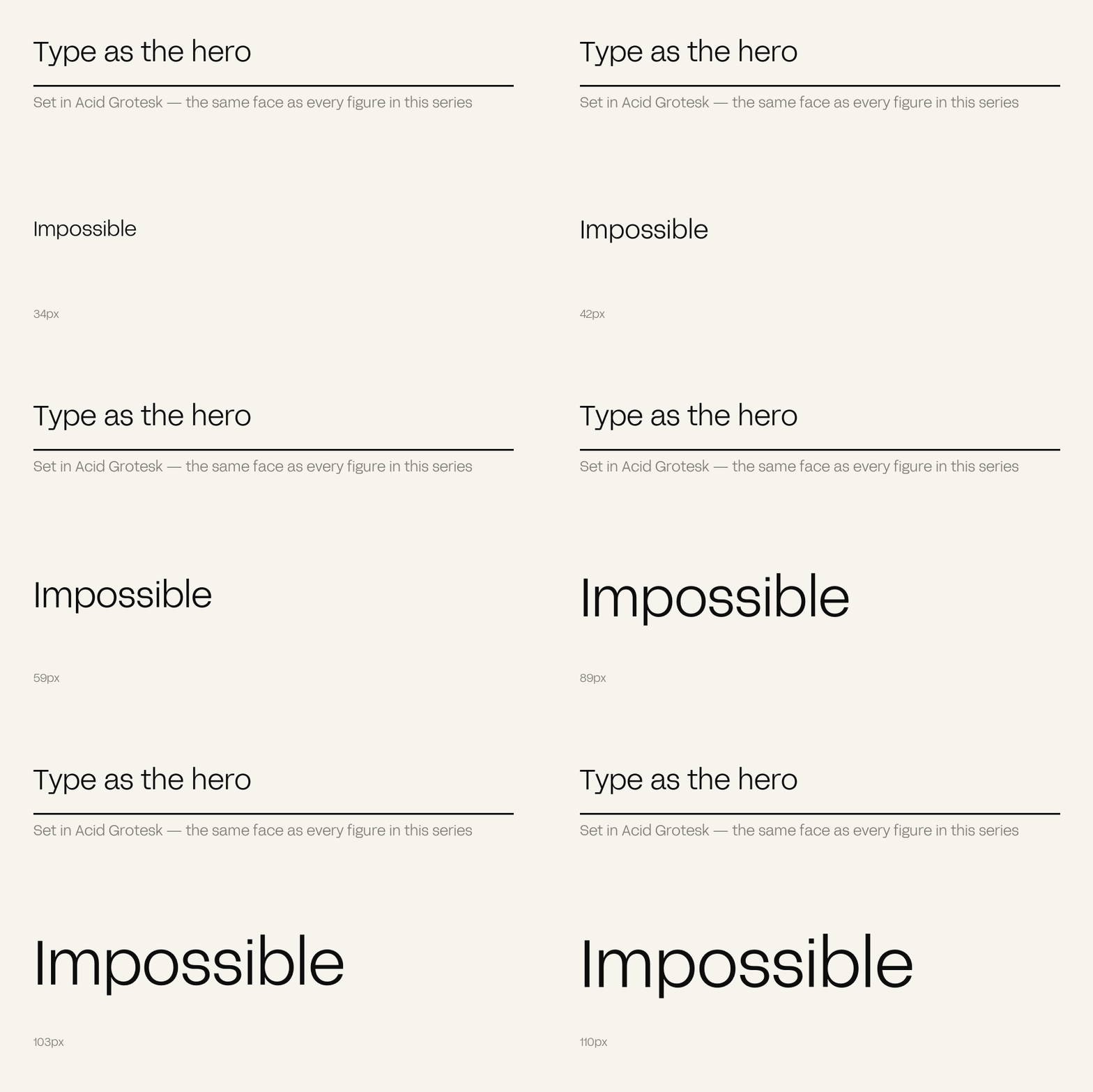
In 2026 typography is frequently the hero image rather than the caption on one: bold, kinetic, custom type doing the work a photograph used to. Brands investing in distinctive type systems separate from competitors still running default web fonts and template kits, because a typeface is one of the few identity elements that appears on literally everything.
The most efficient distinctive asset available to most brands is the one they treat as a settings choice.
Stock photography has collapsed as a differentiator – everyone can generate an image of anything, so an image proves nothing about who made it. Illustration is expensive to sustain across every touchpoint. Type appears on all of them, unavoidably, and a distinctive letterform is recognisable at a glance.
The 2026 direction is explicit about it: custom typefaces, expressive letterforms, and kinetic typographic layouts, with type behaving almost like motion graphics rather than sitting quietly beneath an image.
A default typeface is not a neutral choice. It is a decision to look like everyone who made the same neutral choice.
– The Antimony position
The cheapest real move. Not a commissioned typeface – simply a deliberate one, chosen for character and checked against competitors rather than picked from the first screen of a font menu.
Scale, weight, spacing, and the rules governing which pairing carries which job. This is what makes a headline recognisable as yours in a feed at thumbnail size.
Assets increasingly live in motion contexts. Letterforms that hold up when animated – and a system that specifies how they move – are worth more than static ones.
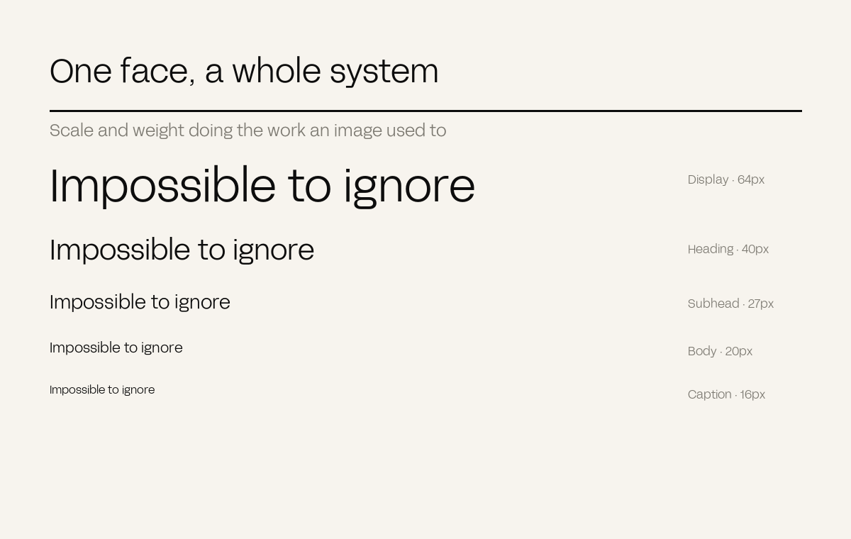
This journal is set in Acid Grotesk, and every diagram in this series is rendered in it too – including the ones generated programmatically. That consistency is deliberate: a chart set in a system default would be identifiably not-us at a glance, which quietly undoes the recognition every other page is building.
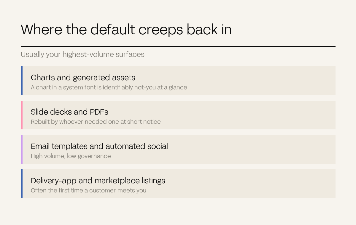
The general rule: your typeface has to reach the places nobody thinks about. Charts, slide decks, PDFs, email templates, generated assets, delivery-app listings. These are usually where the default creeps back in, and they are frequently the highest-volume surfaces you have.
When we rebranded on that basis, average time on site rose from 1:48 to 3:12 and inbound enquiry quality rose 42%. The case study covers what changed.
Casper Magazine is a publication, so the editorial framework and typographic system are the brand – built to scale output without diluting voice, with website sessions up 92% after the reposition.
Ka Ka Wa works at shelf, where packaging typography is doing the selling with nobody standing beside it across ten SKUs and fifteen stockists.
Definitions. Type system: the scale, weights, pairings and rules governing typography across a brand.