


.png)
Let’s talk

Thank you! Your submission has been received!
Oops! Something went wrong while submitting the form.
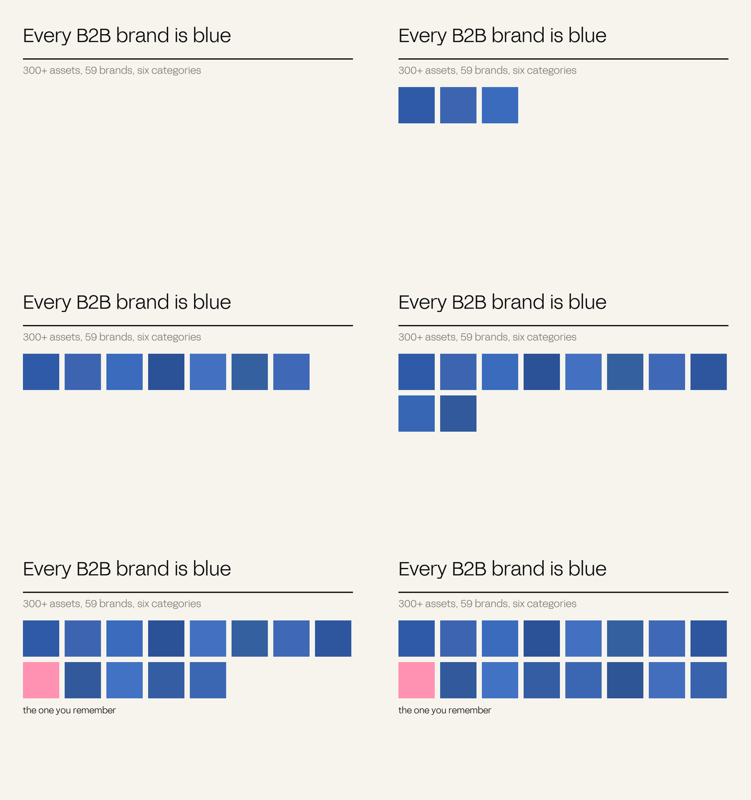
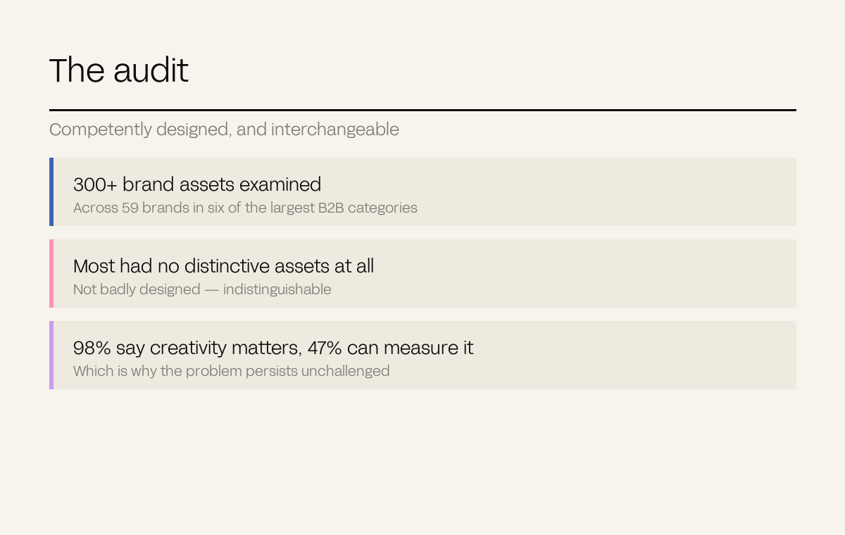
A study of more than 300 brand assets across 59 brands in six major B2B categories found that most companies have no distinctive brand assets whatsoever – the same blue, the same claims, the same visual language. This is a commercial problem, not an aesthetic one: a brand nobody can recognise without reading the logo has to buy every impression it gets.
Put six competitors' websites side by side with the logos removed and ask someone in the category to name them. Most cannot. That is not a design opinion, it is now a measured finding.
An analysis of more than 300 brand assets across 59 brands in six of the largest B2B categories found that most of those companies possessed no distinctive brand assets at all. The summary from that work is blunt: B2B brands are drowning in a sea of sameness, with every brand being blue and saying the same things in the same way.
Not badly designed. Competently designed, and interchangeable.
A brand nobody recognises without reading the logo has to buy every single impression it gets.
– The Antimony position
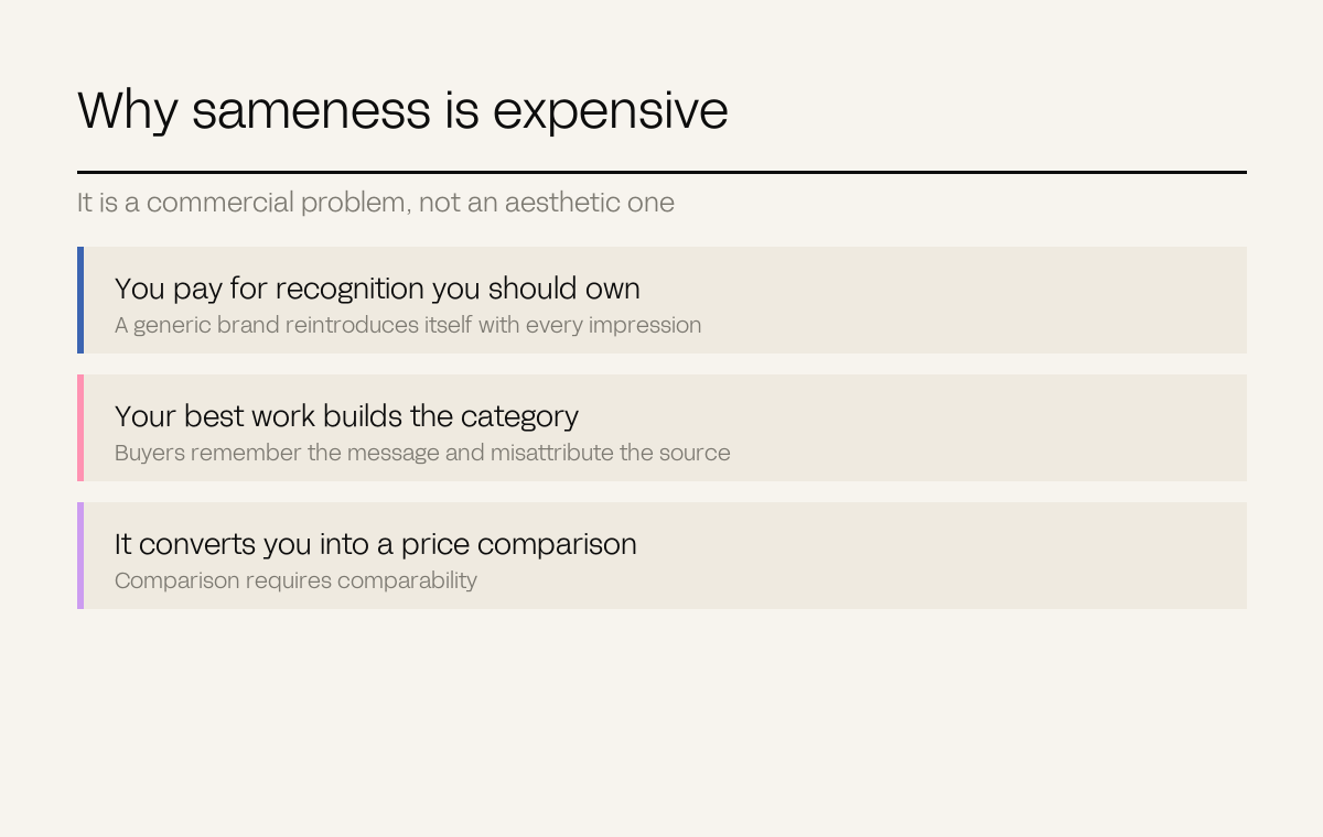
A distinctive brand is recognised in a fraction of a second, before any copy is processed. A generic one has to reintroduce itself every time, which means every impression works harder and costs more.
When a campaign looks like the category rather than like you, the impression it creates is diffuse. Buyers remember the message and misattribute the source – often to the market leader, because that is the name that comes to mind for a category-shaped memory.
Comparison requires comparability. Brands that look like versions of one another invite the buyer to differentiate on the only remaining axis, which is cost.
Category convention feels like safety. Blue reads as trustworthy and stable, so everyone selecting for trust selects the same hue, and the aggregate result is that none of them signals anything.
Research does it too. Ask buyers what they want from a brand in your category and they will describe the category, because that is the only reference they have. Designed straight from that input, you arrive at the average.
Ken AI sells B2B cold outreach software – a field where, as the client put it, most AI brands look and sound the same. Blue, abstract, technical, indistinguishable.
We built it from first principles across three phases: strategy and naming, then a full design system with a custom character and icon library of 24 bespoke assets, then website, content and a global go-to-market plan. Character and clarity over category cliché.
The character library is the distinctive asset – the thing recognisable at a glance without the logo. Read the case study.
We are a creative studio in a category where studios present themselves in near-identical monochrome minimalism. Our own identity runs on pink against navy, which is not a taste decision – it is the same argument applied to ourselves.
The general rule: the test of a distinctive asset is whether it still identifies you with the name removed. Run it on your own material before you commission anything: cover the logo on your last five pieces and ask whether anything left on the page could only be you.
When we rebranded on that principle, inbound enquiry quality rose 42% and pitch conversion rose 30%. The case study has the detail.
Definitions. Distinctive brand asset: a non-verbal element that triggers recognition of a brand without its name.