Let’s talk

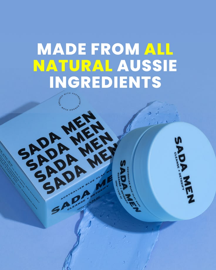
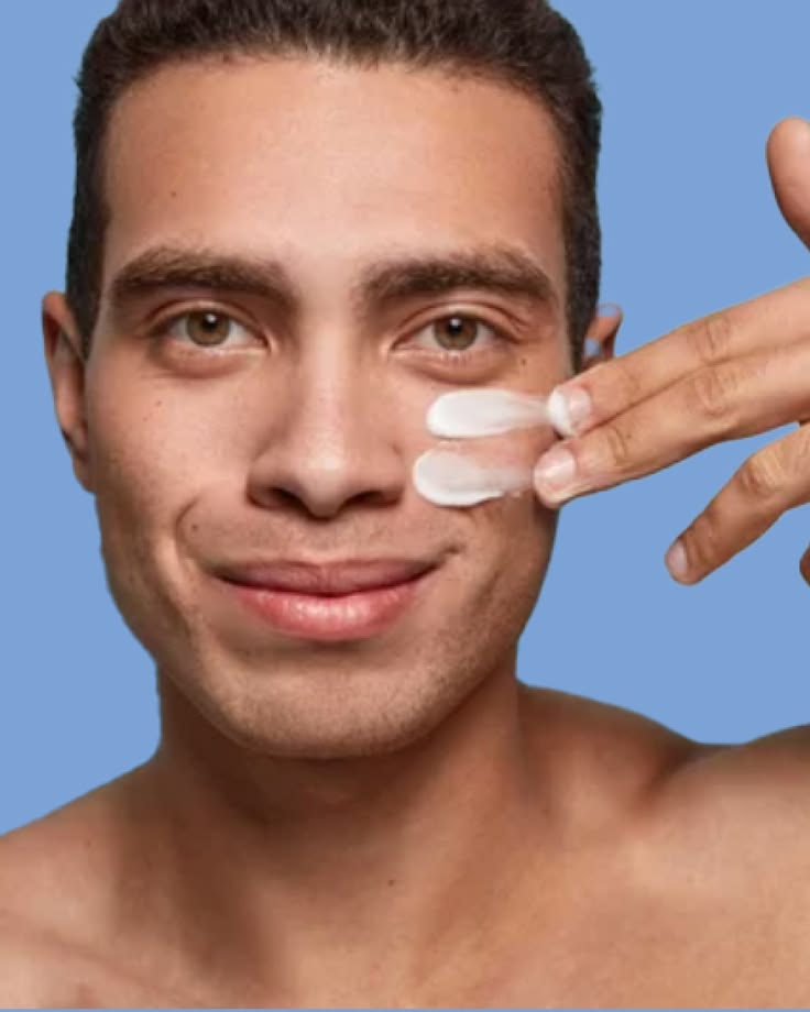
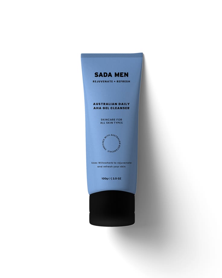
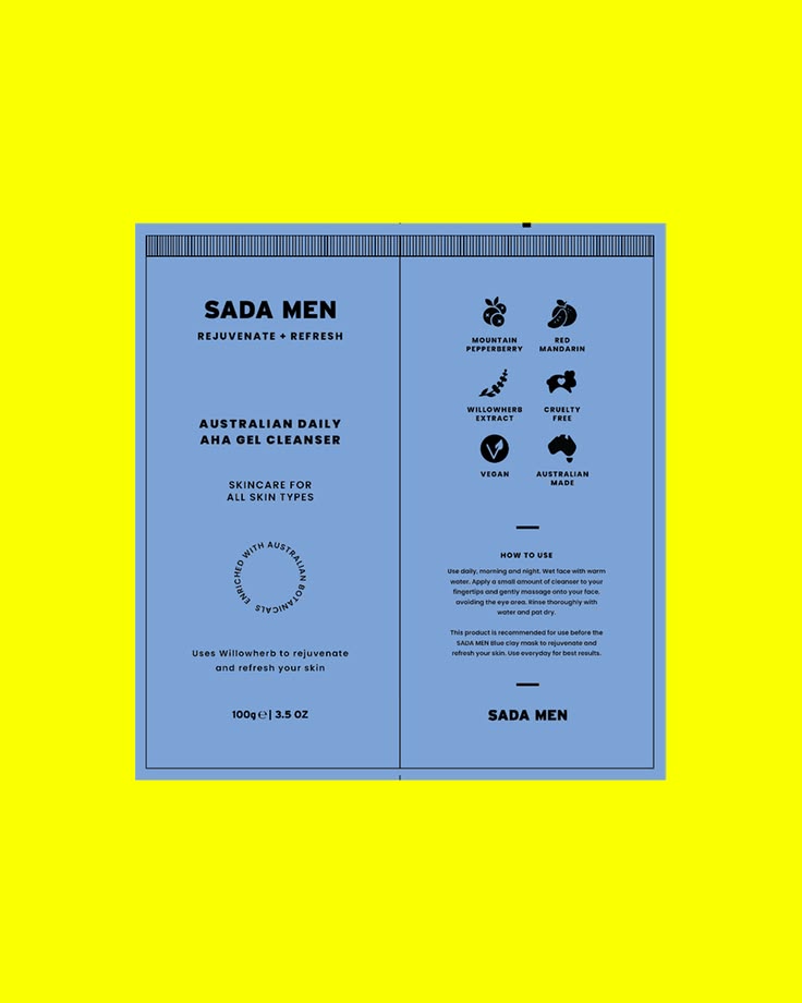
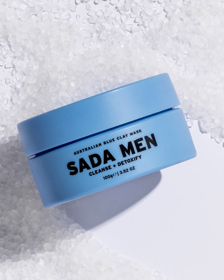
Warm, huggable and built to make you look good and feel good. For Sada Men we created a brand identity that feels as good as the product itself. A men's skincare brand made from all natural Australian ingredients, crafted specifically for men. The br
Brand identity, packaging design and strategy for beauty, skincare and personal care brands. Case studies and inspiration from Antimony Studio. Melbourne-based, working globally.
Warm, huggable and built to make you look good and feel good. For Sada Men we created a brand identity that feels as good as the product itself. A men's skincare brand made from all natural Australian ingredients, crafted specifically for men. The br
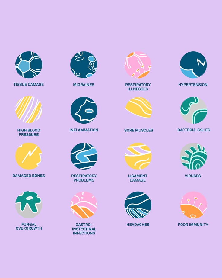
A warm, huggable brand built around a simple promise: look good, feel good. For this wellness supplement client we created an identity that makes the science feel accessible and the benefits feel real. From reducing inflammatory markers to supporting
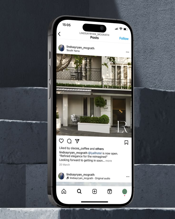
Launching an independent real estate brand requires more than a logo. It demands strategic positioning across every public touchpoint. For Lindsay Ryan we translated a newly established identity into a consistent and recognisable presence across list
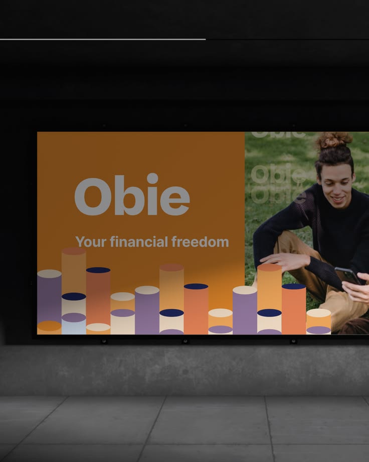
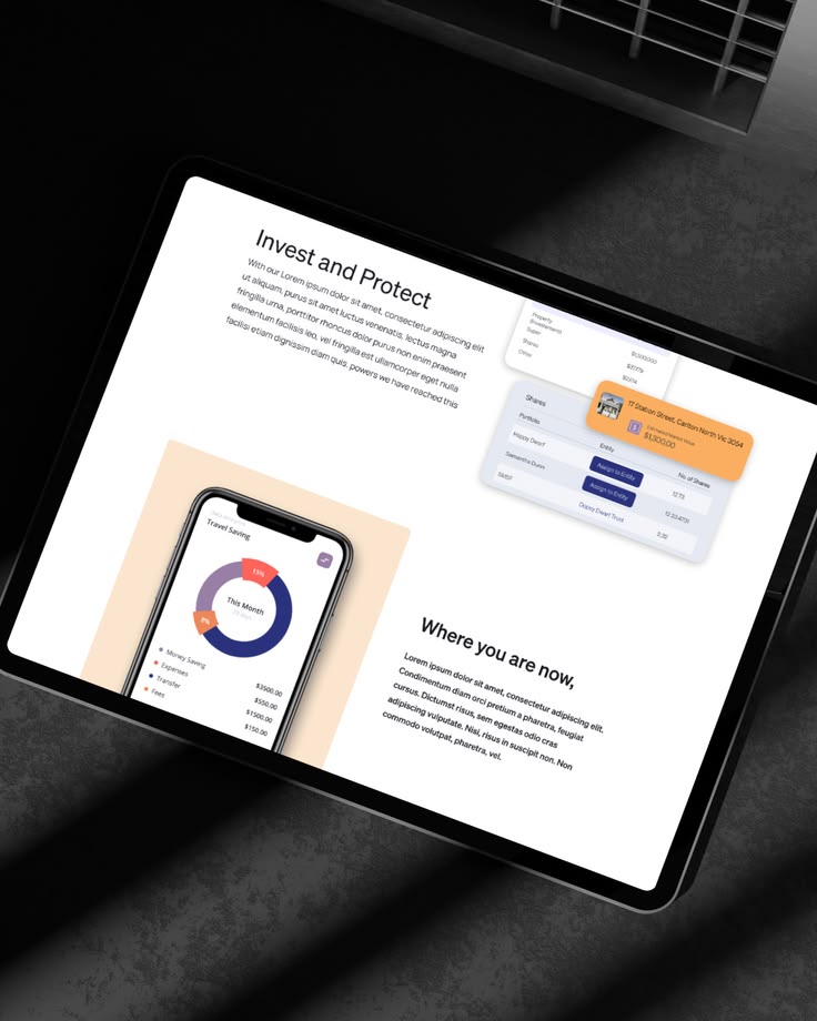
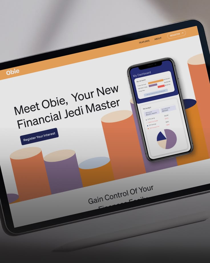
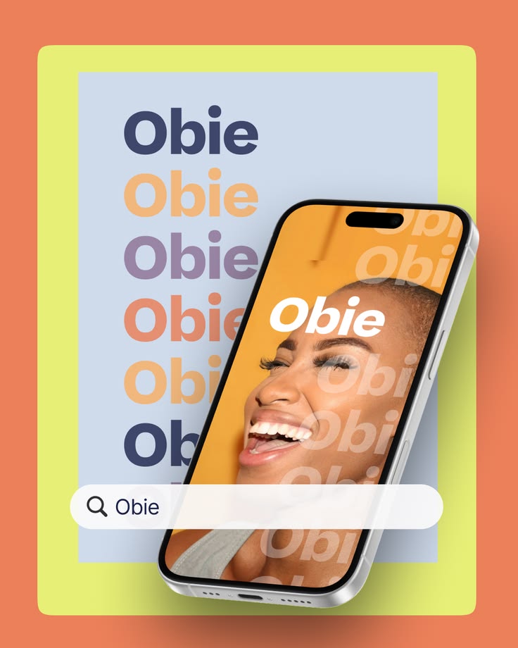
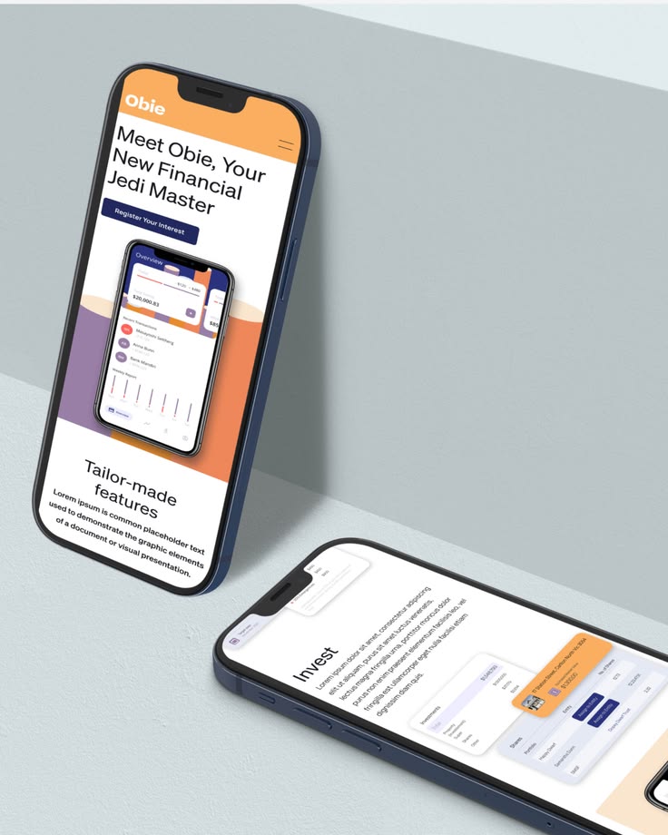
Obie is a bold, energetic brand built for the way people actually think about money. Warm, accessible and distinctly human -- an identity designed to make financial tools feel less intimidating and more like something you actually want to use. From b
Ken AI operates in a highly technical category. The challenge was to humanise complex automation and outbound systems without diluting credibility. We developed a suite of custom characters representing key moments in the outbound journey: prospectin
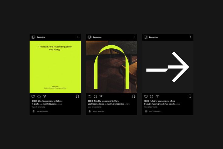
Branding fore Becoming: innovative organic minimalism
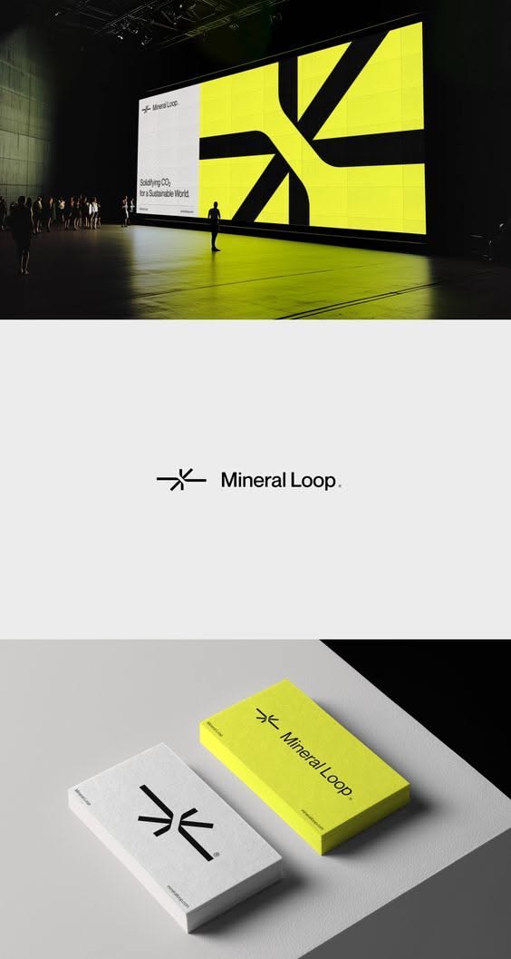
Entdecke ein einzigartiges Logo Design im abstrakten Kunststil mit dem Buchstaben K – perfekt für moderne und kreative Firmenkarten. Setze dein Unternehmen stilvoll in Szene und hinterlasse einen bleibenden Eindruck. #LogoDesign #AbstrakteKunst #Firm
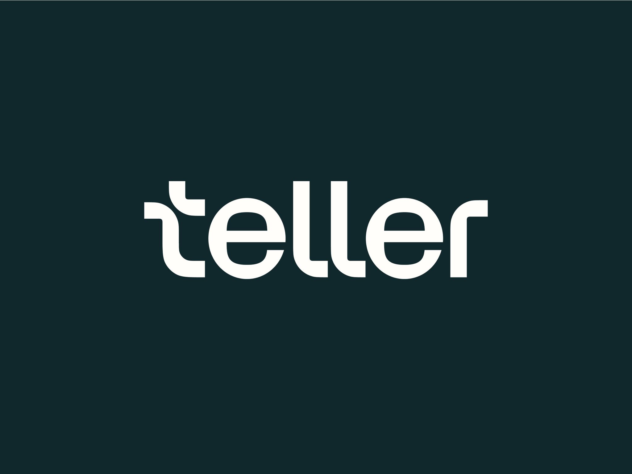
The Teller wordmark in white on a dark teal ground
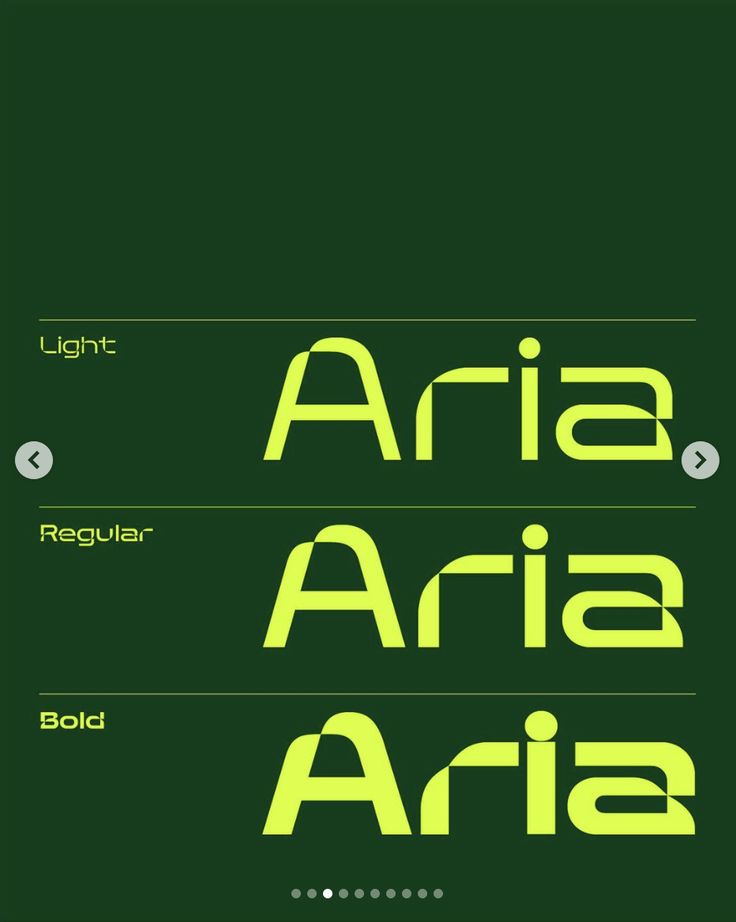
Dark green type specimen showing the Aria typeface in light, regular and bold weights
Modulus is a studio focused on contemporary architecture and interior design. It explores how design can shape spaces with intention, balance, and visual silence. The visual identity is built on geometry, rhythm, and restraint. The modular symbol act
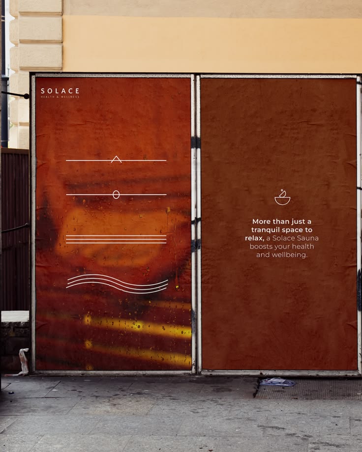
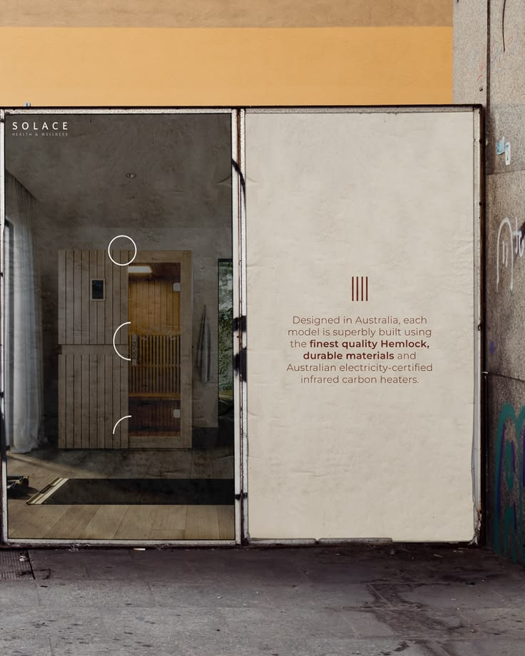
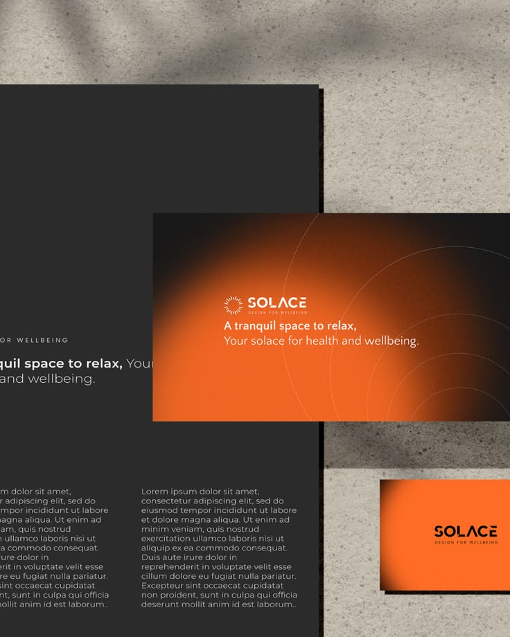
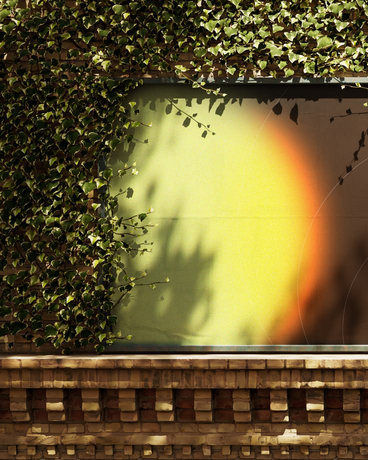
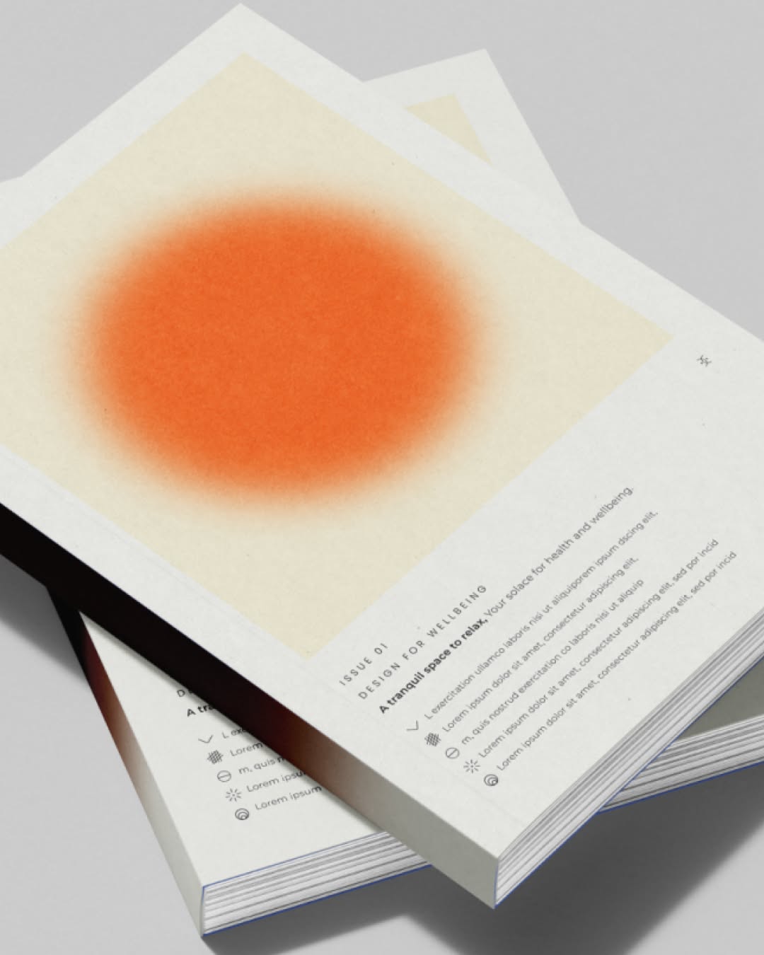
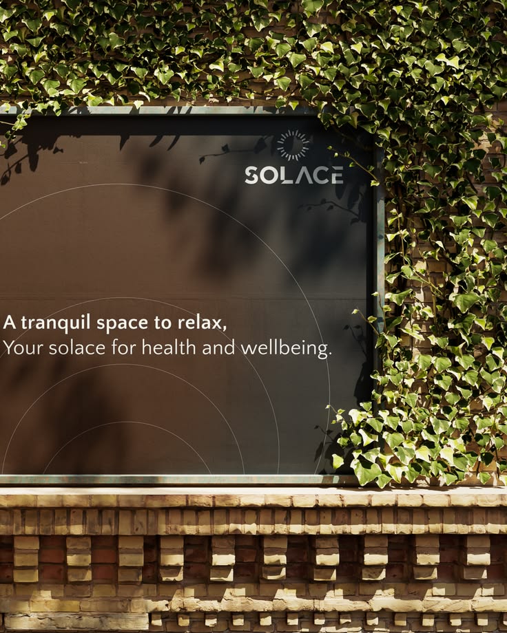
A tranquil space to relax. Your solace for health and wellbeing. Following a brand refresh, we aligned the Solace Saunas digital experience with their refined premium positioning. Product pages and landing sections restructured to communicate craftsm
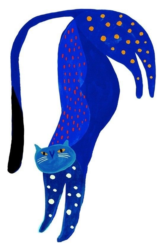
Illustration of a stretching cobalt blue cat covered in orange dots
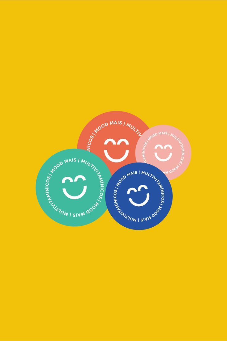
A colorful and playful brand identity design for a health and wellness brand, Mood Mais. It features a bright and cheerful color palette and minimal typography. Want to see the full project? Head to our website and check it out!
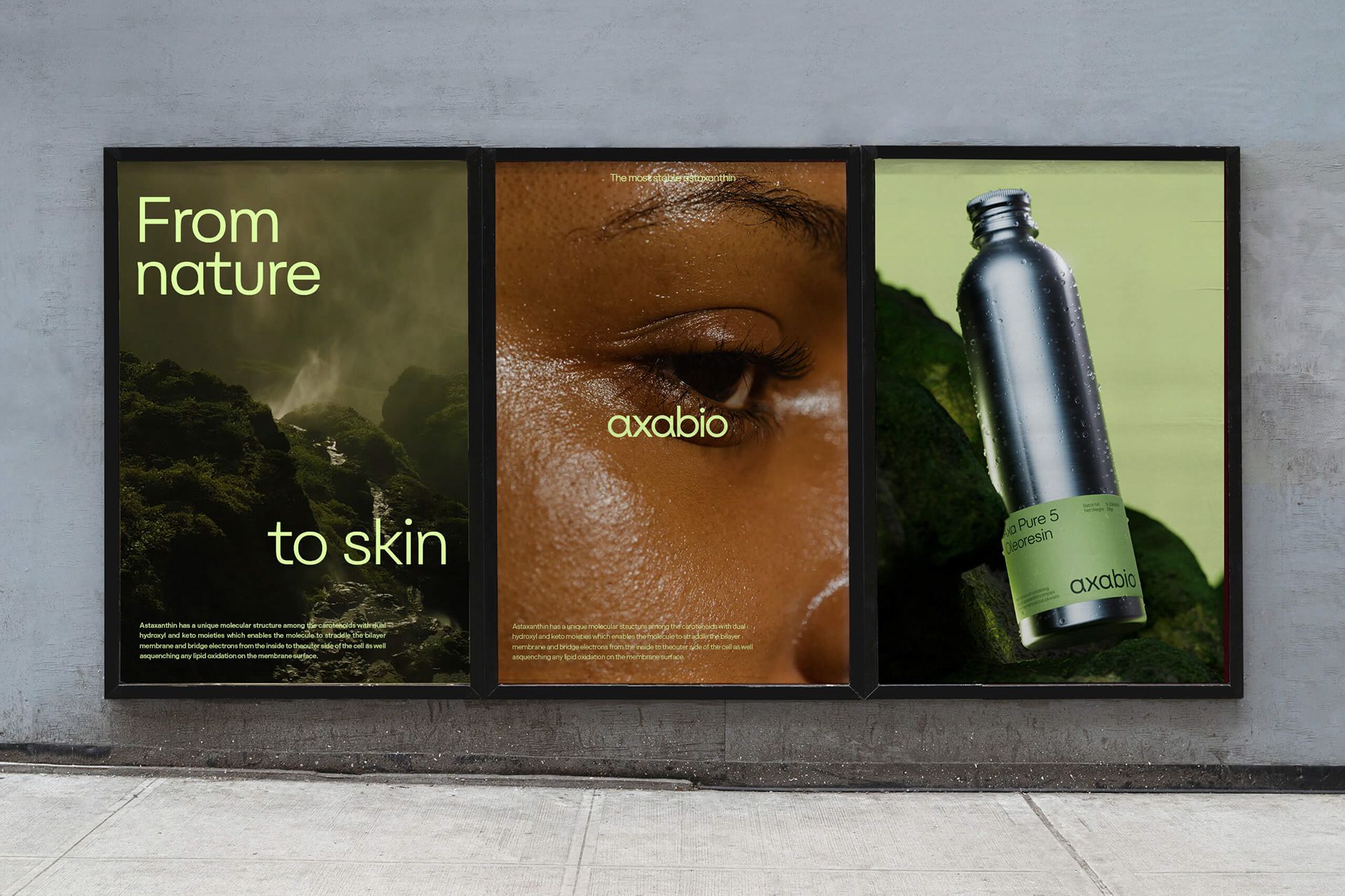
Axabio (16) | Images :: Behance
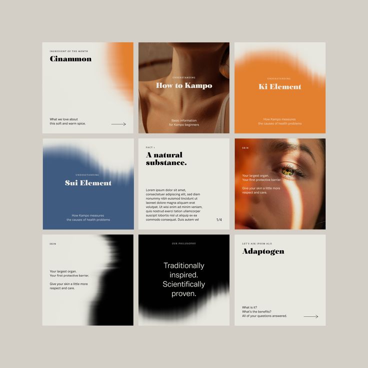
Ipsum Alii Packaging and Social Media Post Design on Behance
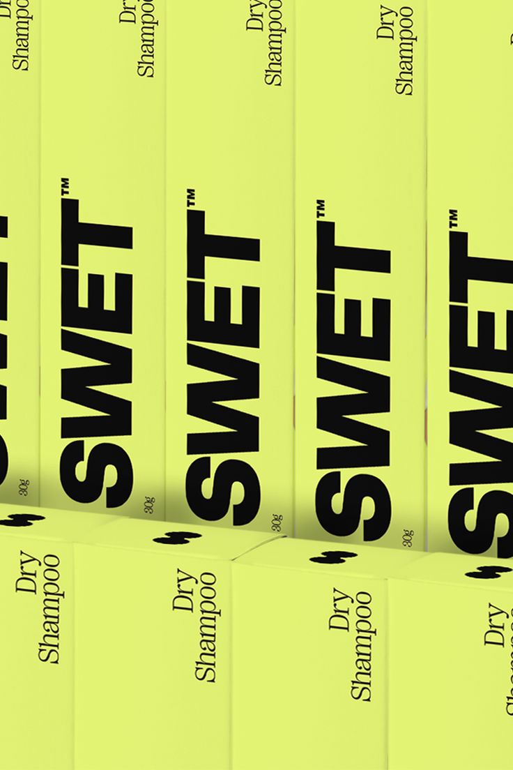
The Swet identity not only amplifies their mission; but, more importantly, aims to shift perceptions with the ultimate goal of empowering women to go all in. Bold, powerful and impactful, whilst simultaneously bridging the gap between beauty and fitn
Modern Logo Design, Name Logo, Beauty Studio Logo, Beauty Brand Logo, Beauty Business Logo, Beauty Salon Logo, Beauty Logo Ideas, Beauty Shop Logo, Creative Logo, Luxury Branding Design
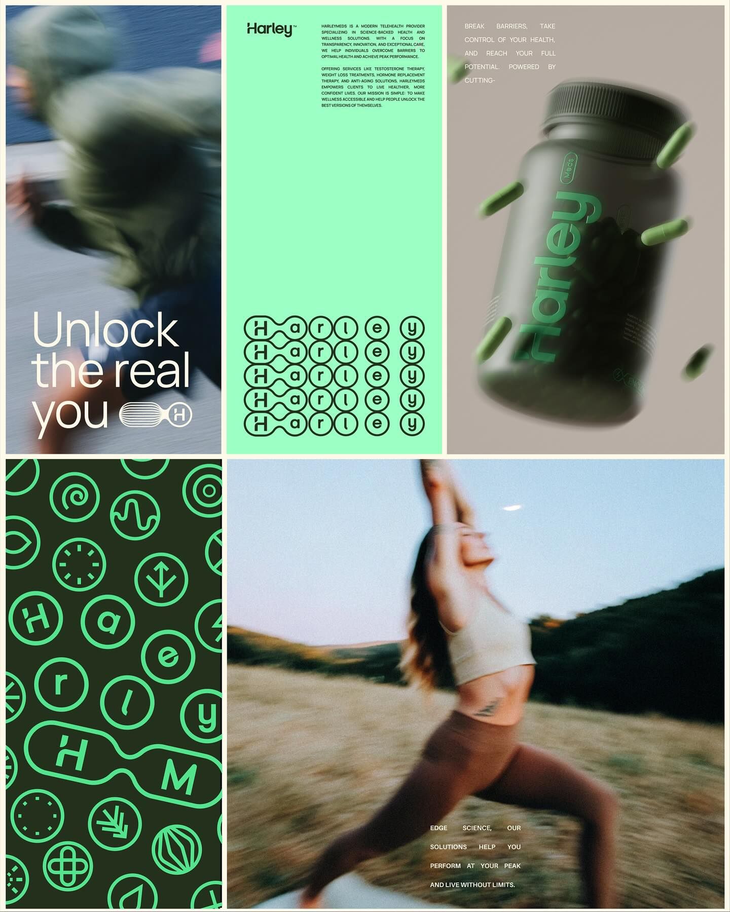
HarleyMeds is a modern telehealth provider specializing in science-backed health and wellness solutions. With a focus on transparency, innovation, and exceptional care, we help individuals overcome barriers to optimal health and achieve peak performa
Creech (@creech_studio) • Instagram photos and videos
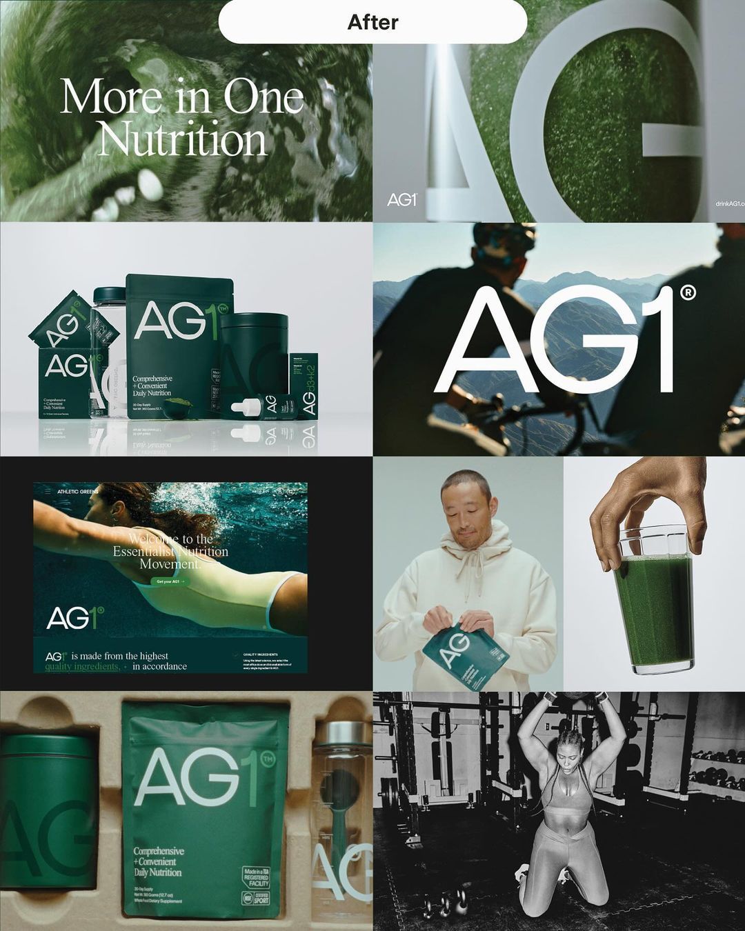
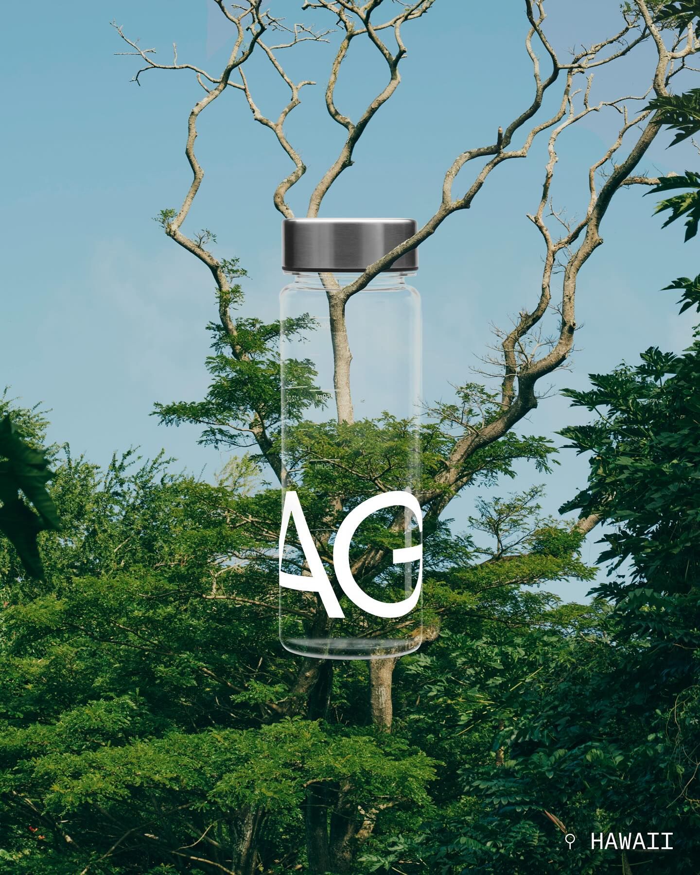
AG1 (@drinkag1) • Instagram photos and videos
Black and white Japanese sauna-boy logo with a seated character illustration and katakana wordmark
Flow Yoga Studio script logotype set over a soft photograph of a figure stretching
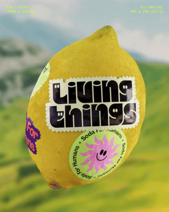
A lemon wrapped in Living Things soda labels and stickers against a green hillside
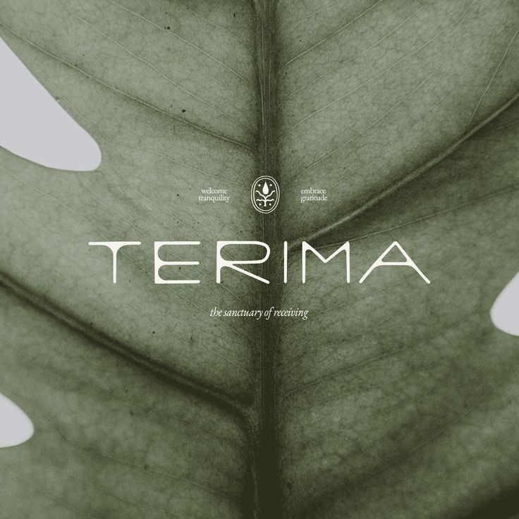
Terima wordmark over a close-up of a green leaf with the sanctuary of nothing tagline
Если вы хотели бы поработать вместе, то по поводу сотрудничества пишите в инст: svyatosshka / Дизайн сайта, дизайн сайта минимализм, дизайн сайта психолога, дизайн сайта лендинг минимализм, дизайн сайта 2024, лендинг веб дизайн, лендинг дизайн, ленди
CLIENT SPOTLIGHT - MORE MILES. Had to shine some more light on one of my fave projects of last year! I love that my client went from not wanting two bold colors to literally choosing two bold colors 😅 Paired a funky wordmark with editorial type for a
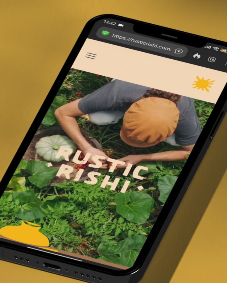
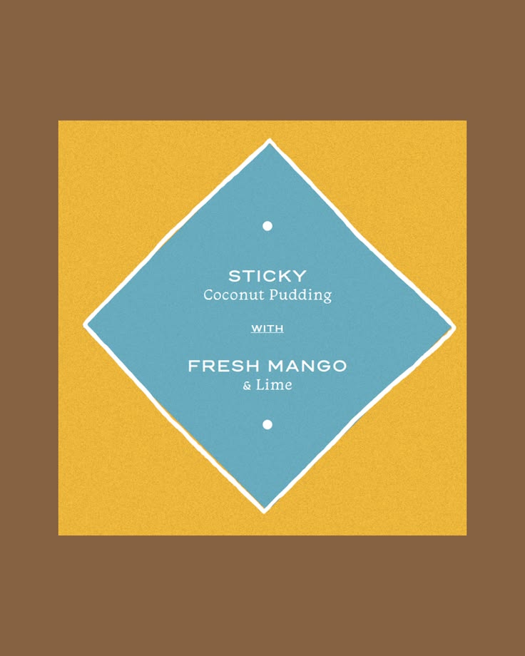
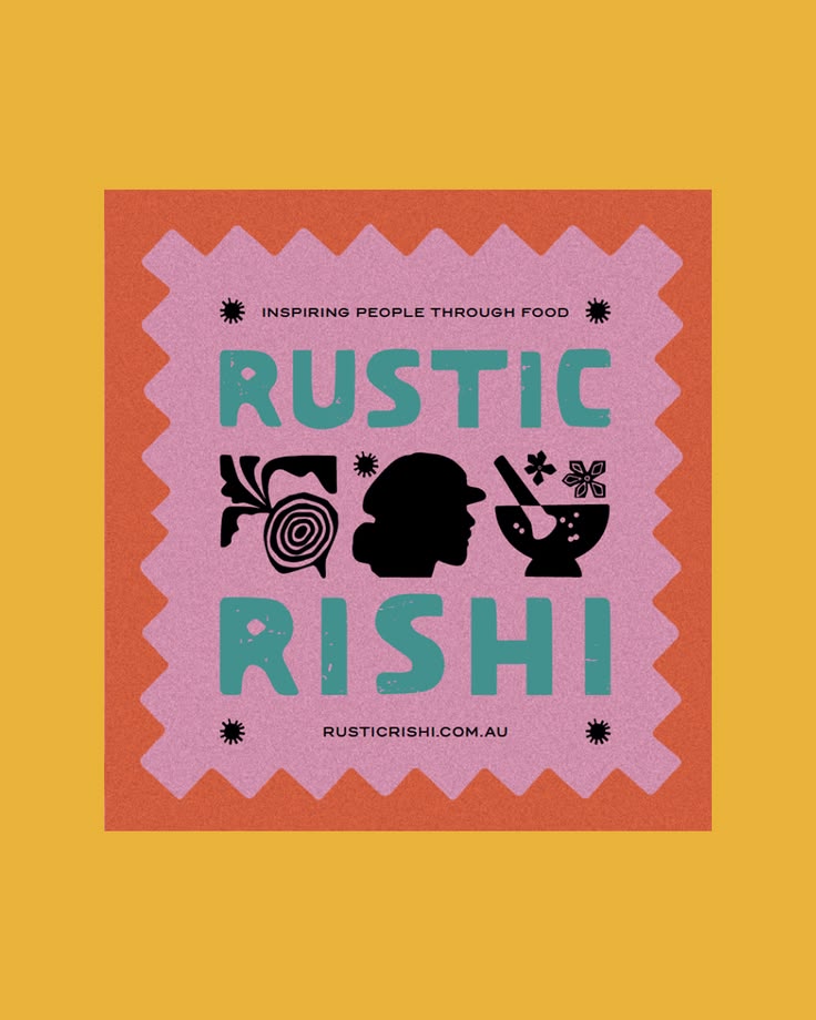
Rustic Rishi is a food brand built on a simple idea: cooking with love, and reconnecting people with the food they eat. The heart was there. The look was distinctive. But without a system holding it together, every new asset started from scratch and
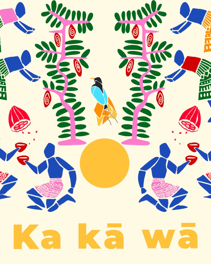
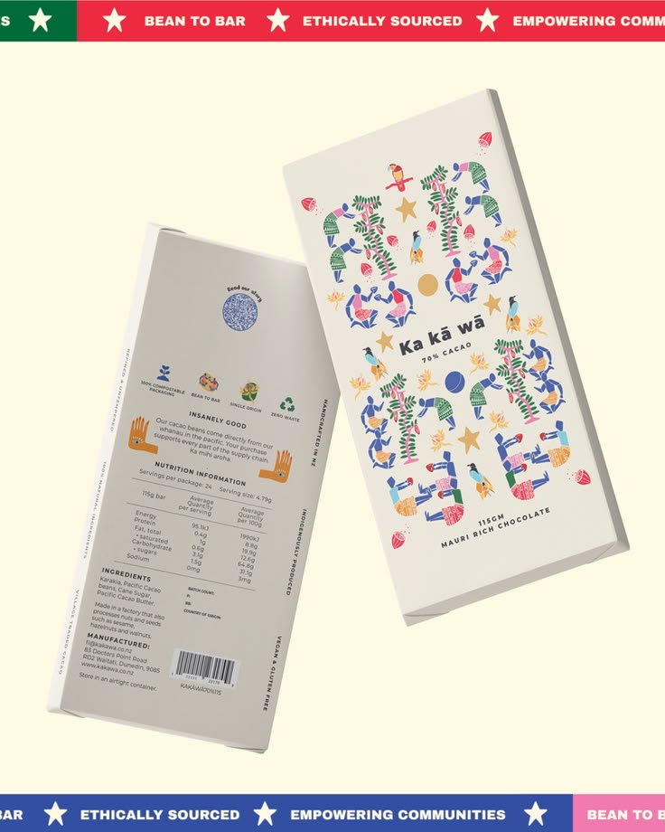
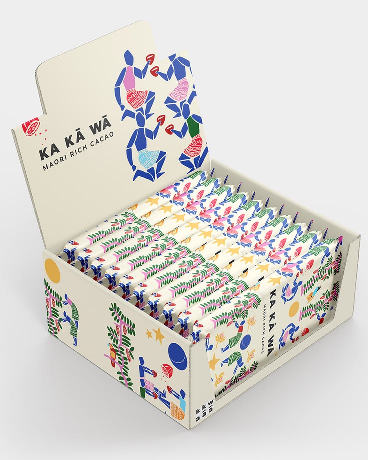
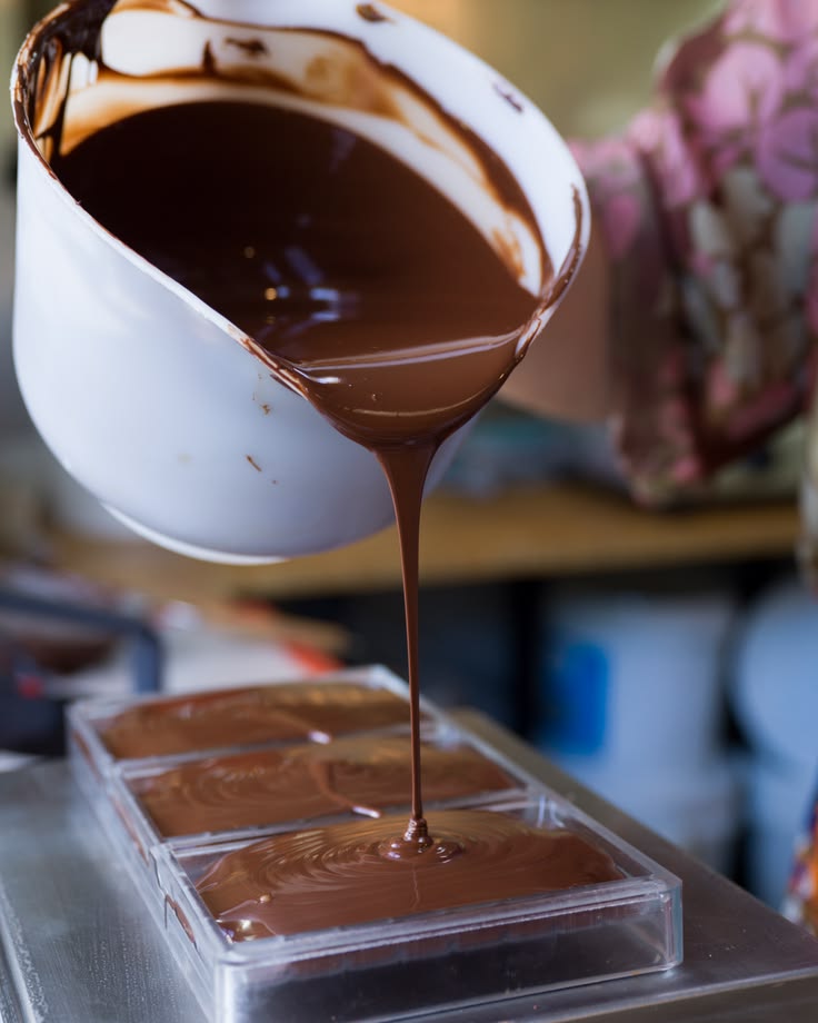
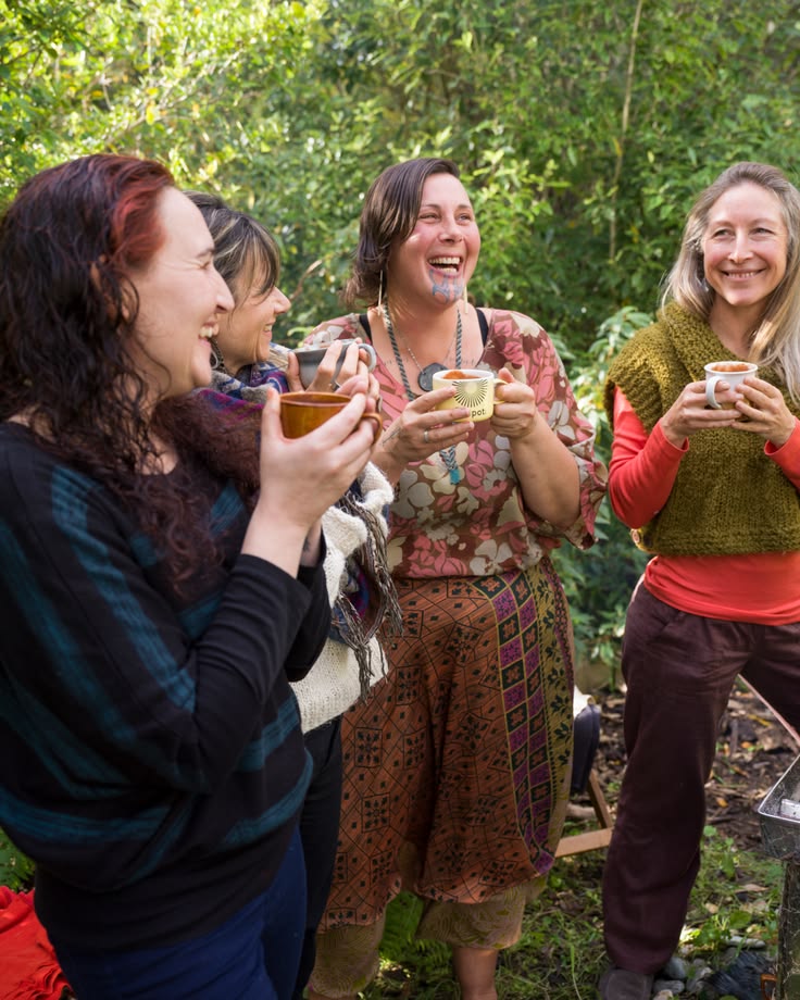
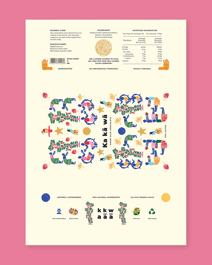
Most branding starts after the product exists. We built Ka Kā Wā the other way round. Brand and business designed together, from a blank page to a bar you can buy. Ka Kā Wā is sustainable cacao with something real underneath it. Ethically sourced bea
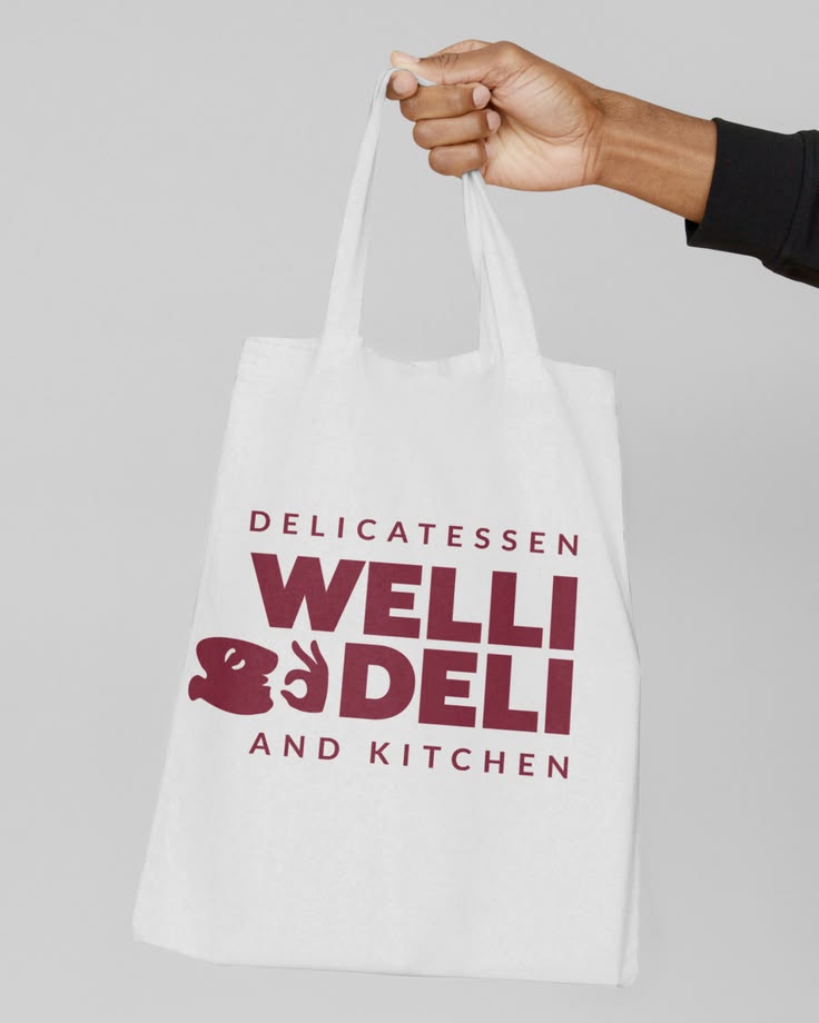
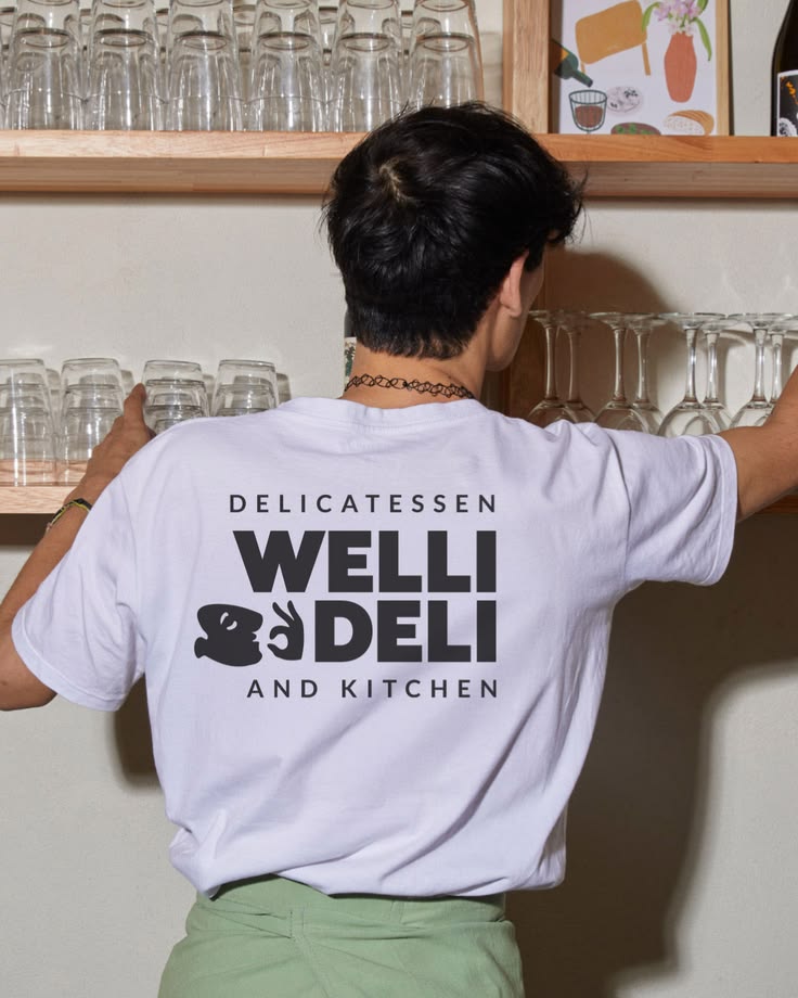
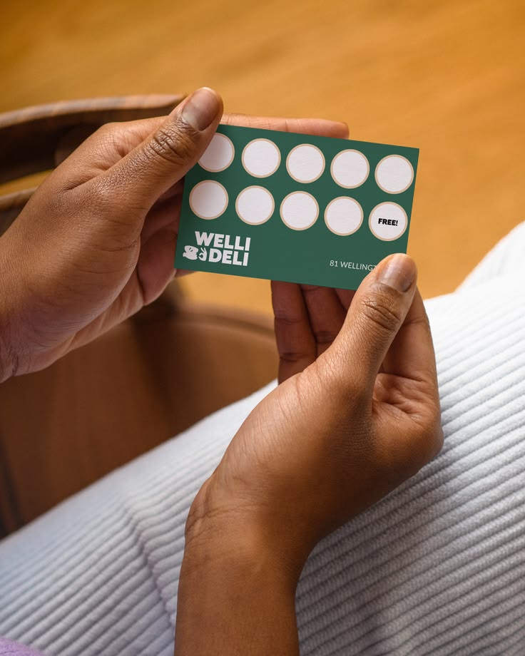
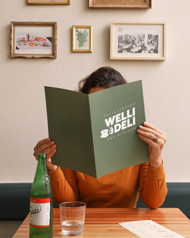
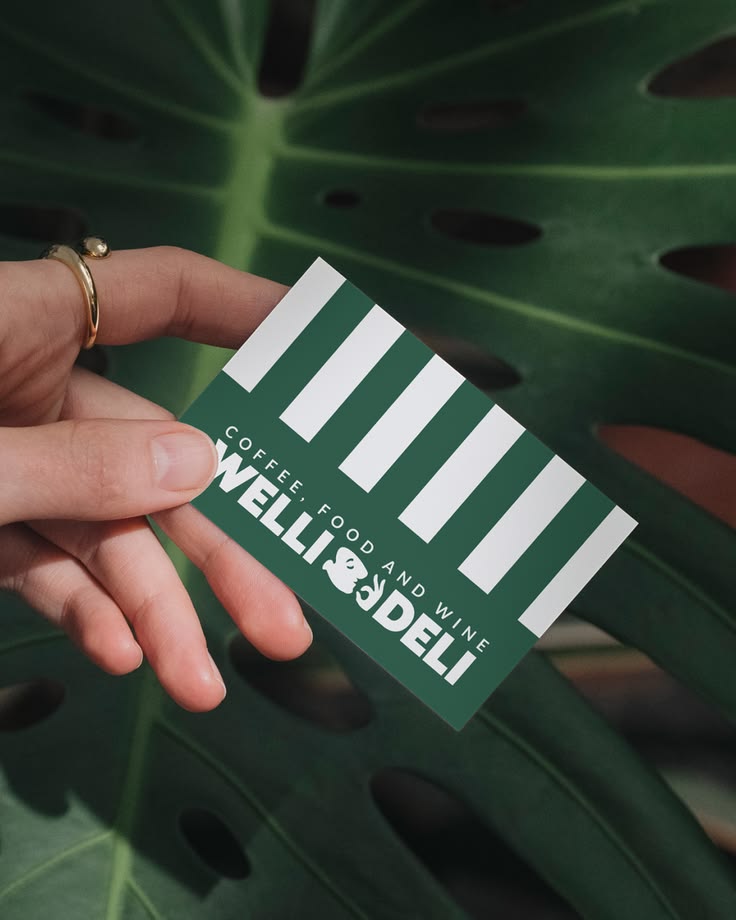
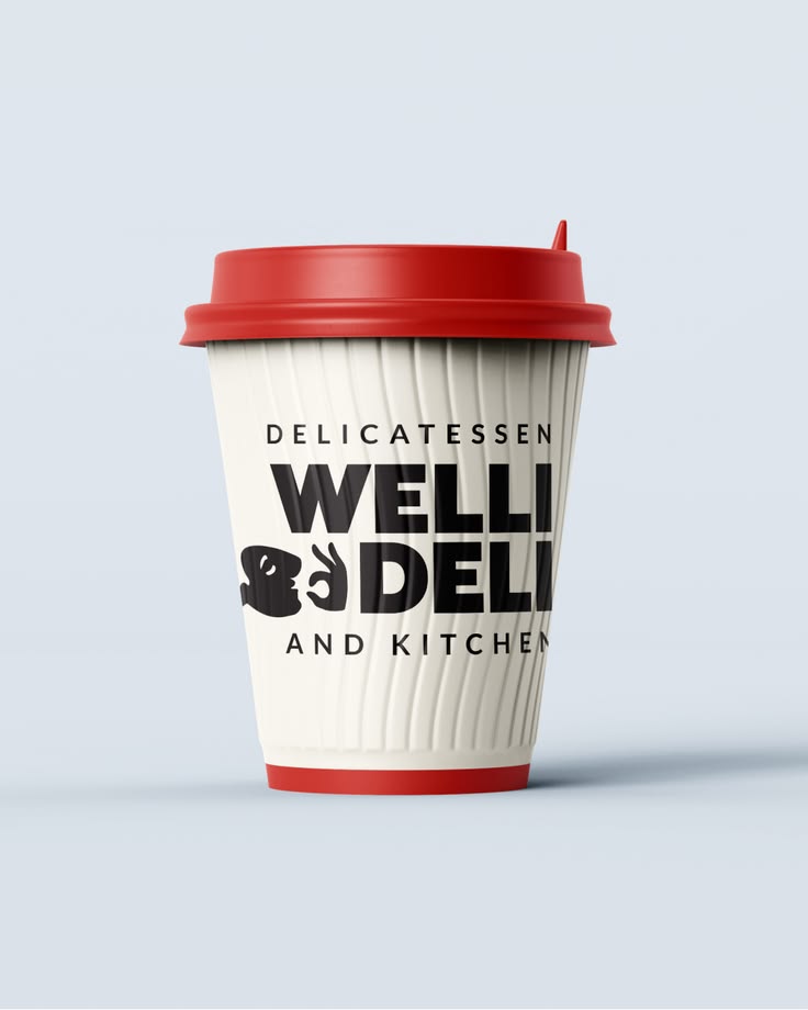
Welli Deli is a delicatessen and kitchen brand built to feel warm, characterful and craveable. A brand with personality that shows up consistently across every touchpoint -- from coffee cups and loyalty cards to apparel, packaging and in-store presen
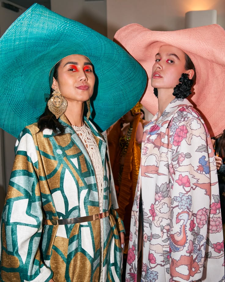
Launching a luxury fashion label requires more than aesthetic direction. It requires disciplined brand architecture. For My Paloma we developed a comprehensive visual and commercial identity system honouring both Peruvian craftsmanship and Australian
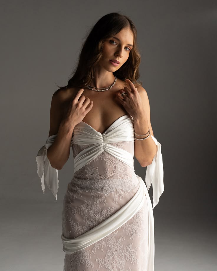
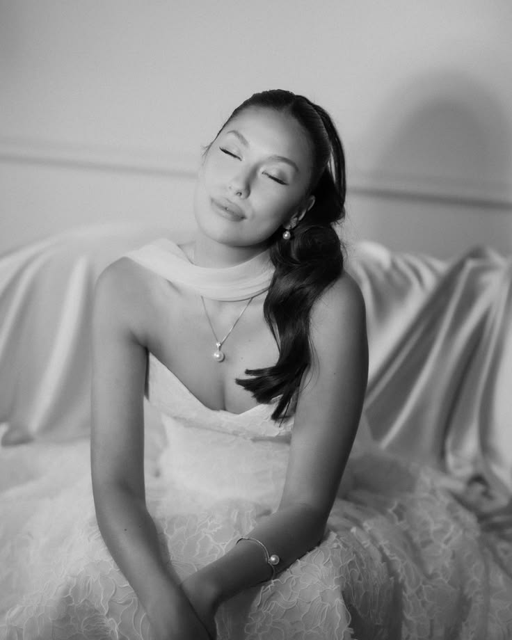
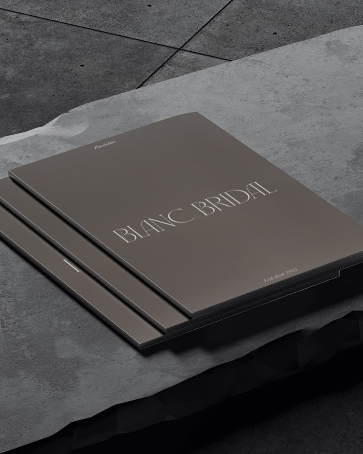
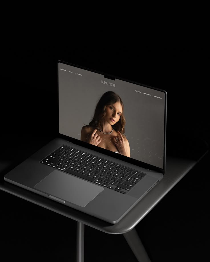
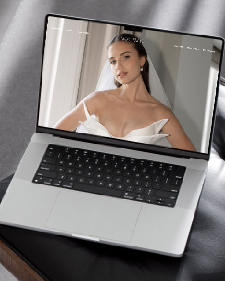
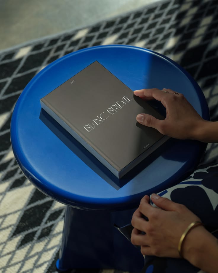
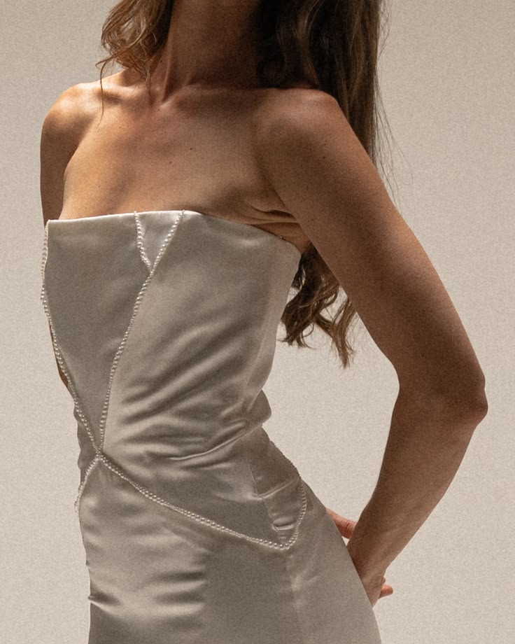
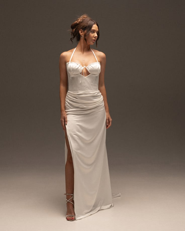
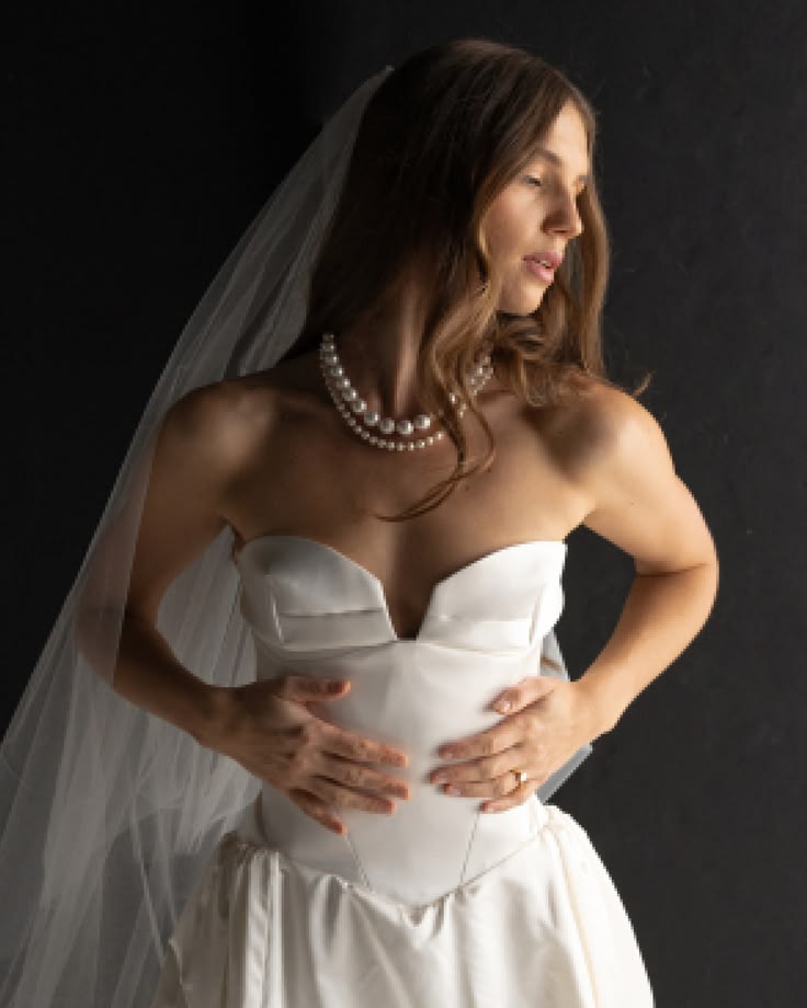
Modernising a bridal boutique brand requires restraint. Refinement should strengthen recognition, not replace it. For Blanc Bridal we focused on typographic refinement, elevated colour calibration, improved visual hierarchy and art direction alignmen
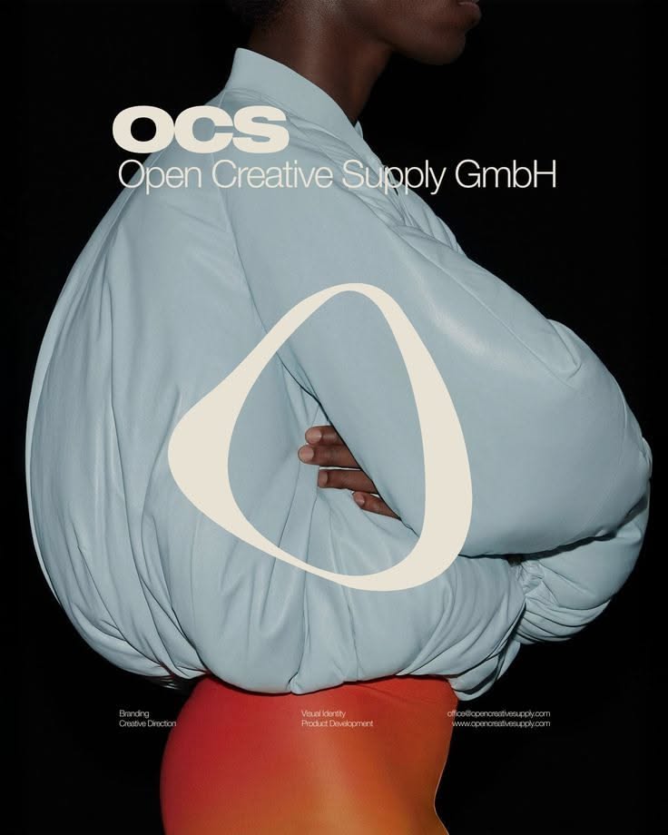
Pale blue oversized puffer garment shot on black for Open Creative Supply, marked with a white oval
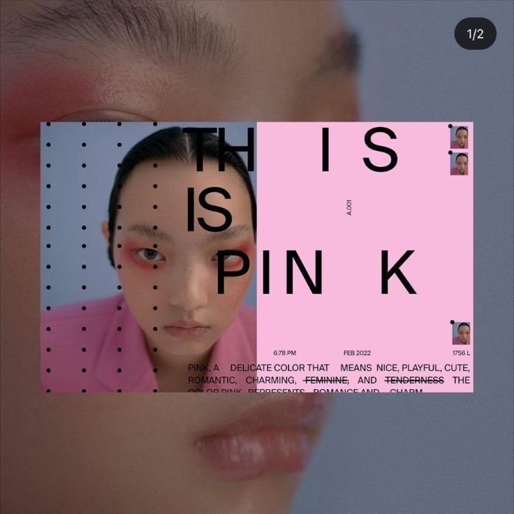
Layered layout reading This Is Pink over a soft-focus portrait in pink and grey
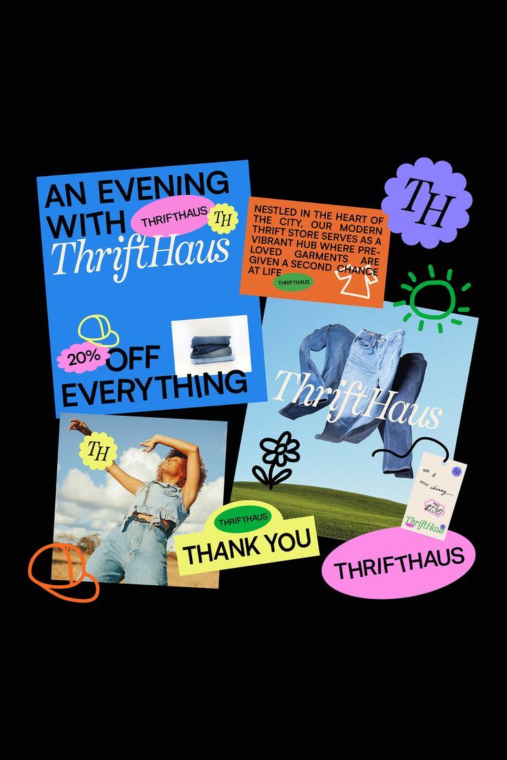
Thrifthaus is a modern apparel company that believes every piece of clothing has a story to tell. Leaning into modern, colorful and funky vibes, this brand identity is eye-catching and bold. #logo #logodesign #brand #colorfulbrand #modernlogo #funkyl
Fashion portrait overlaid with acid-green exhibition typography for a Los Angeles and New York show
An unforgettable brand identity for Velotti, designed by Vièr Studio. This expressive, multicultural system blends bold typography, color-forward packaging, and striking visuals into a cohesive identity that celebrates bold expression and modern styl
Blurred cyclist in green fields with a large reversed SLOW wordmark and breath, ride, connect labels
Bizuz vintage clothing / Landing page
by Kai Damian Matthiesen - typo/graphic posters
High-converting online store layout for a premium shoe brand. Minimal, stylish, filled with typefacedesign, UX thinking and real aesthetics. Use it for moodboardinspiration, uidesign practice, or website redesign ideas. Great for feed planning and Pi
Motion-blurred tennis photograph on teal with a Break Point wordmark
Editorial layout mockups titled Monochrome — pale pink grid pages with a red-toned portrait
Nøra — E-commerce Website Design :: Behance
HYRO ⚡️ branding for a health and wellness brand that’s all about energy, balance, and keeping things simple. Clean, bold, and ready to make an impact 💥 We are now booking for March, drop us a line if you want to collab with us 🙌🏽💫
Pink poster reading Not Doing Much with teal-stockinged legs raised against green velvet
A key priority for Firma Construction Group was the development of structured corporate documentation to support commercial growth and tender submissions. We delivered separate Commercial and Residential Capability Statements, ensuring each division

Archive