Let’s talk

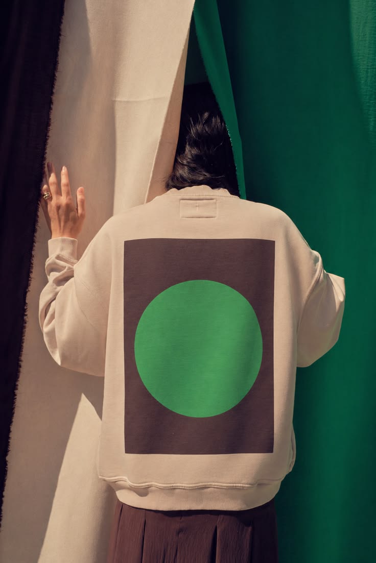
The Auguste printed crewneck is now available in our new limited-edition green and brown colorway. This unisex crewneck is made from 100% cotton terry and features a relaxed, perfectly oversized fit. It is detailed with Kitty Cooper’s signature letter “K,” embroidered on the front bottom left in a d
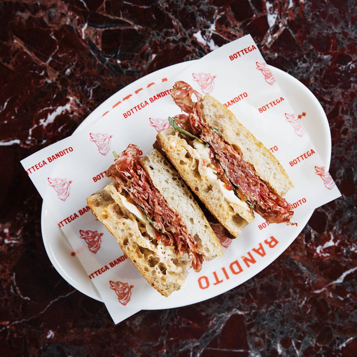
Bottega Bandito 🌹 Cafe & Deli Branding :: Behance
SDCO Partners | Restaurant Signage Design | Custom Food Packaging
Design Feed — Creative inspiration (@design.feed) · Instagram 照片和视频
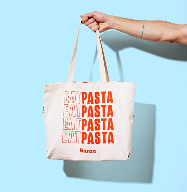
Banza - Gander, Inc.
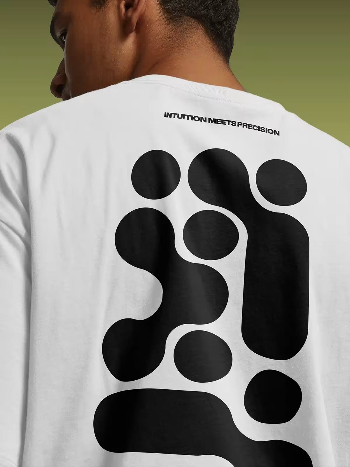
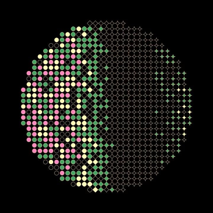
Branding Omnui: Ancient Symbols, Data-Like Dots & a Hidden Mark | Mindsparkle Mag
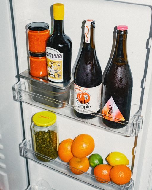
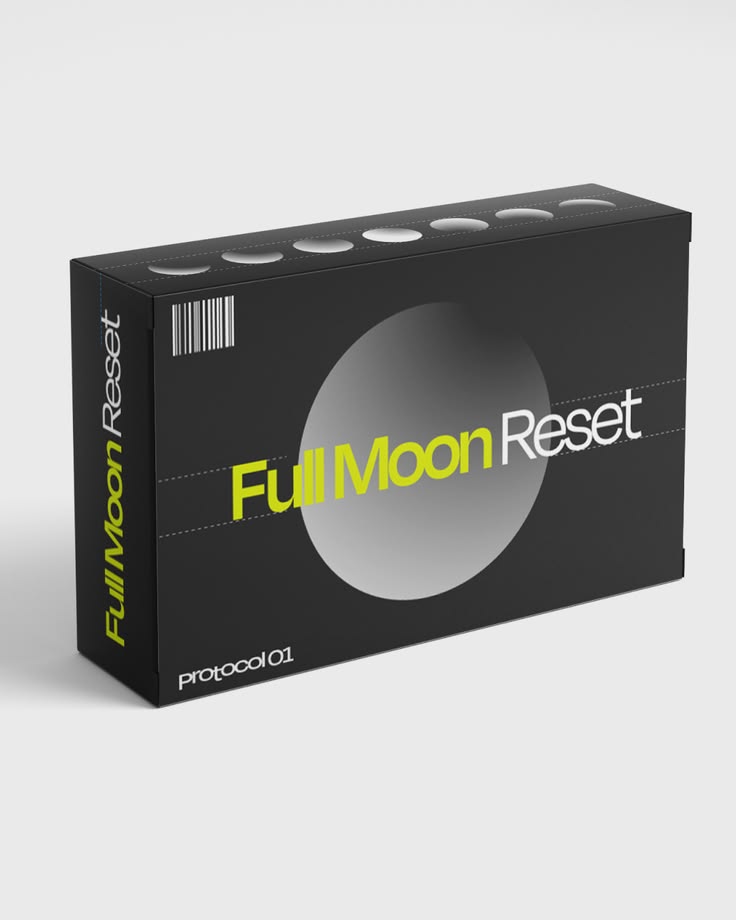
Sober curious? Join us on our dry adventure, and cop our ‘Sober Curious’ box to wet your whistle along the way. Whether you’re in reset mode ...
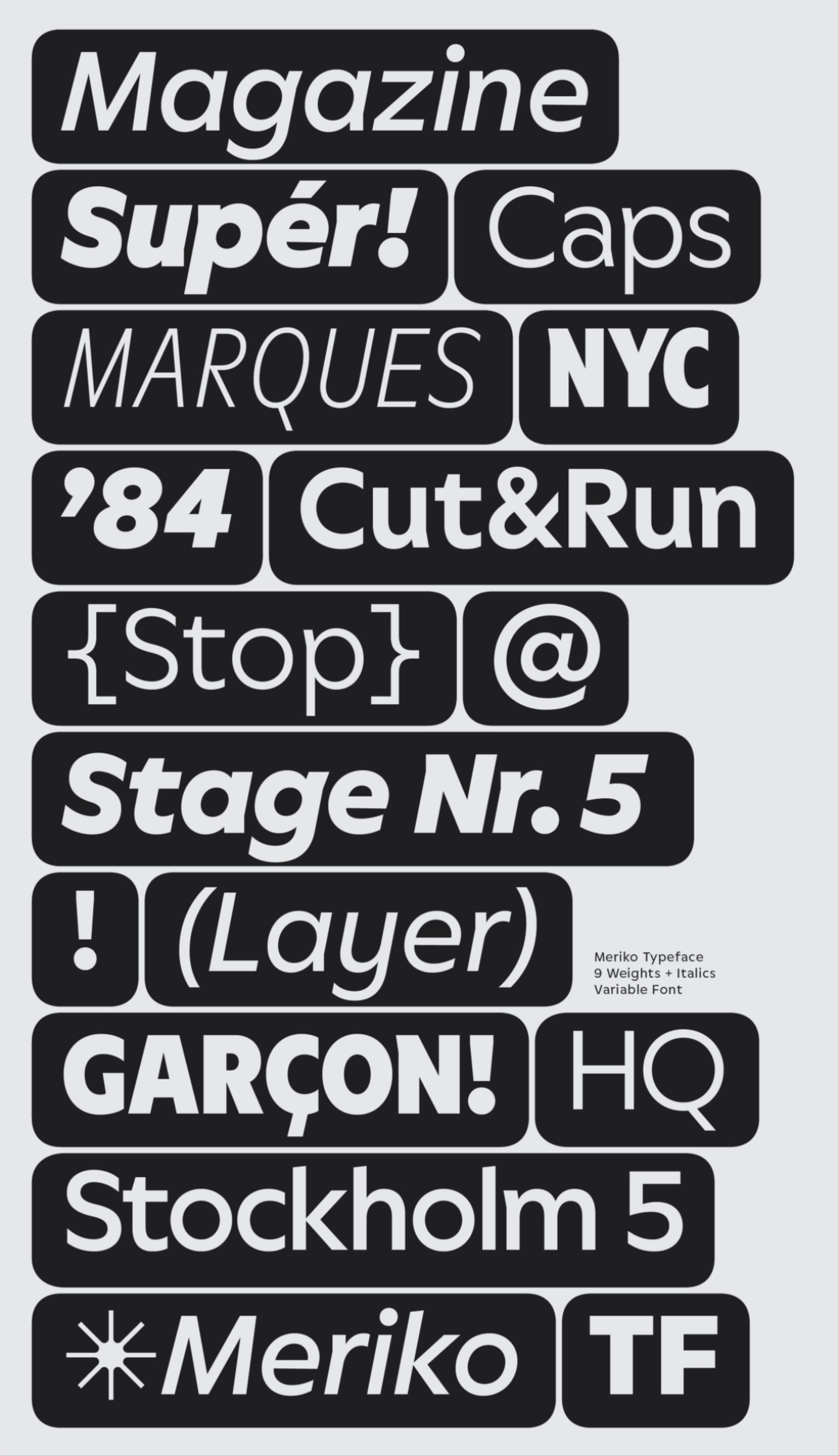
Meriko is a sophisticated geometric sans made for branding and interface design. The typeface positions itself as a unique alternative for modern branding projects spanning technology, culture, and commerce—from digital to print and spatial applications. Whether for a fresh tech start-up or an estab
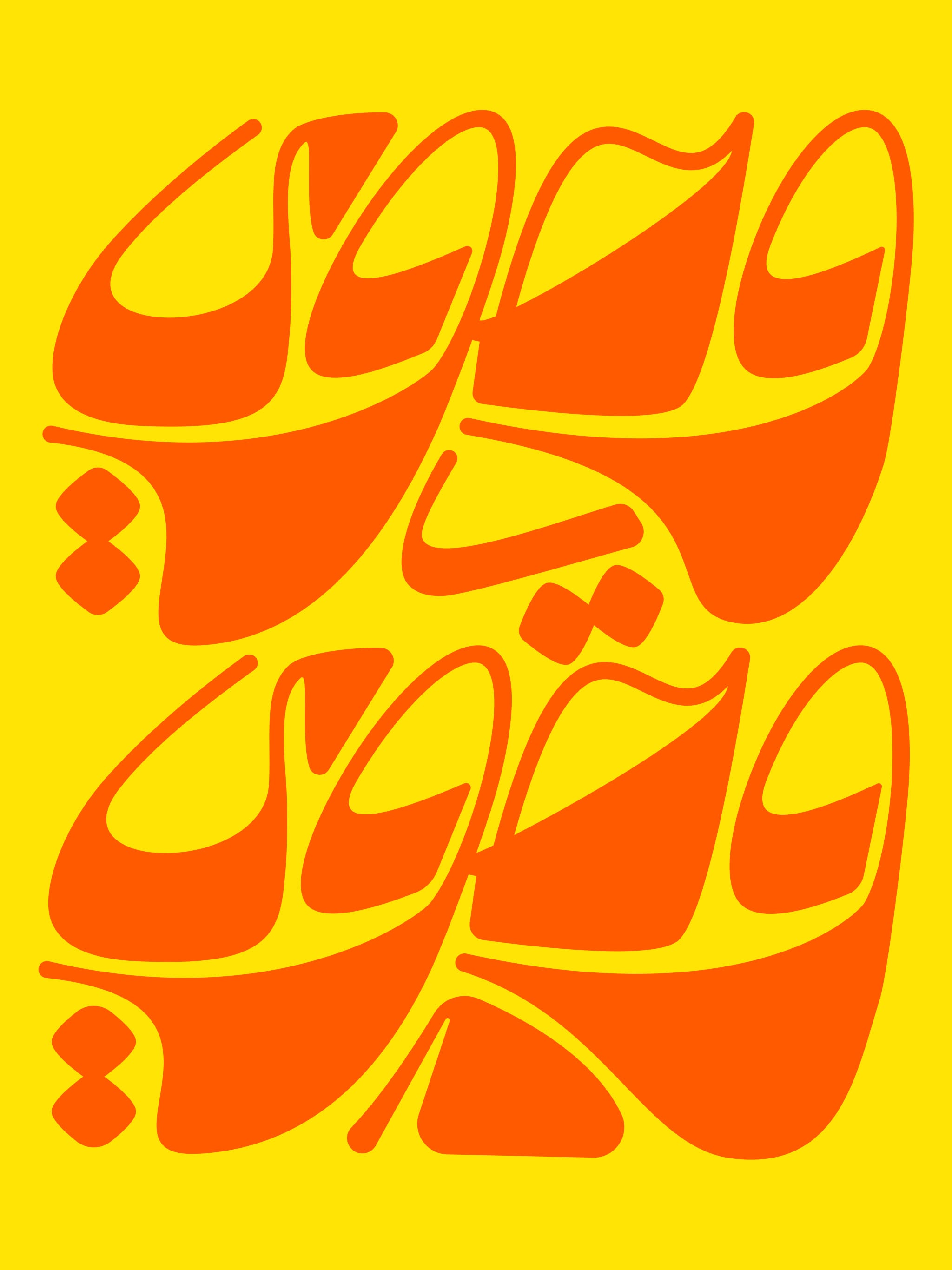
#Arabic #calligraphy #typography #lettering #Bold #sketch #Arabicletters #letter #type #Arabictypetypematters #typism #goodtype #pencil #inspiration #food #nature #blackandehite #craft
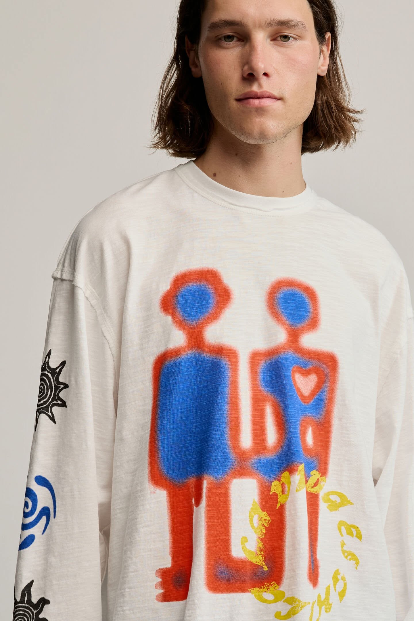
Long-sleeved T-shirt in 100% cotton knit fabric. It features a crew neck and a print of geometric shapes on the front and motifs on the sleeves. The design is white with blue and black details. Fit: RegularKnit fabricGraphic print on front and sleevesCrew neckLong sleevesMaterial: 100% cottonBase co
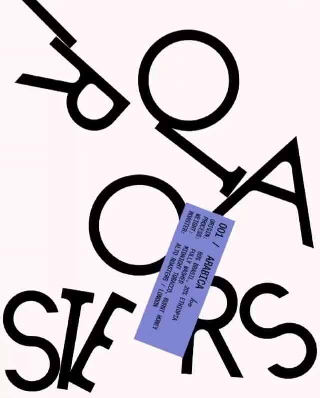
Alto Roasters visual identity by @ofjuly.studio⁠ ⁠ #type01 #visualidentity #visualidentitydesign #graphicdesign #artdirection
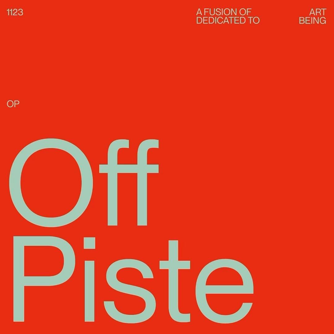
‘Off Piste’ For inquiries, please email info@joediver.co or book a call using the link in my bio. If you’re interested in joining my… | Instagram
Pin by gardevs. on Pins by you | Motion graphics inspiration, Motion graphics design, Motion graphics typography #TikTokTypography #StoryTypography #ReelTypography #HighlightTypography #TrendyTypography
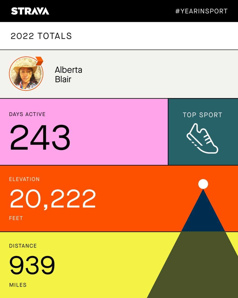
Strava Year in Sport summary card — 243 days active, 20,222 feet of elevation and 939 miles, in blocks of pink, teal, orange and yellow
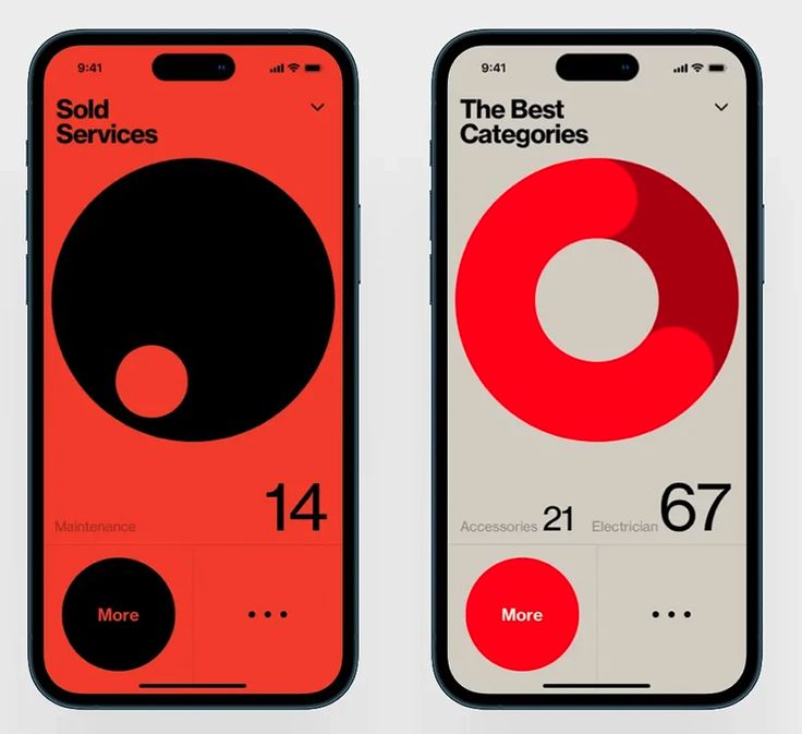
Two iPhone screens in red and bone — Sold Services and The Best Categories, built from oversized circle and donut charts
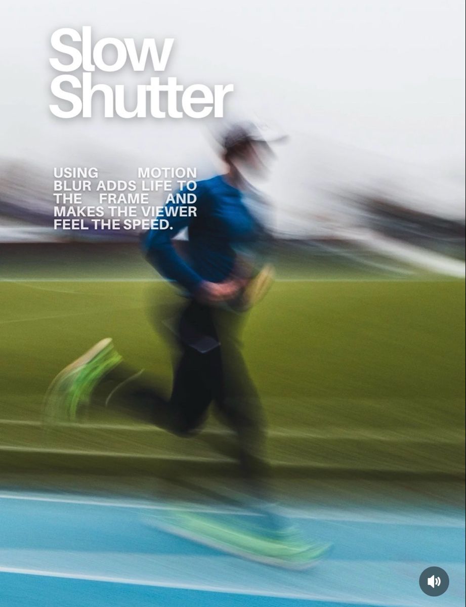
Slow Shutter editorial page — a runner captured with motion blur on a blue track, headline set in bold condensed type
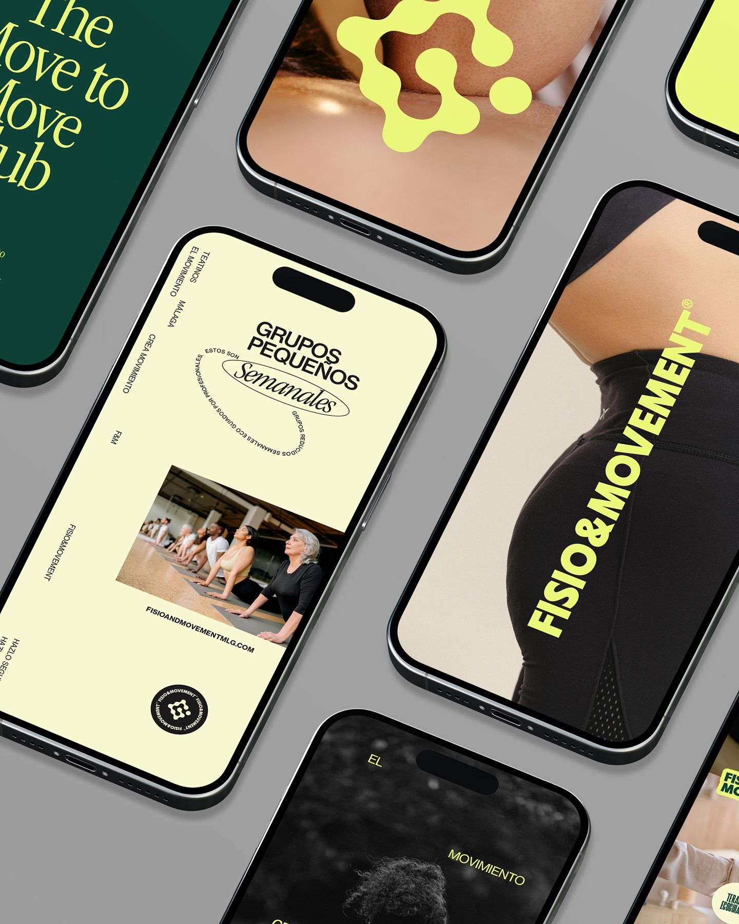
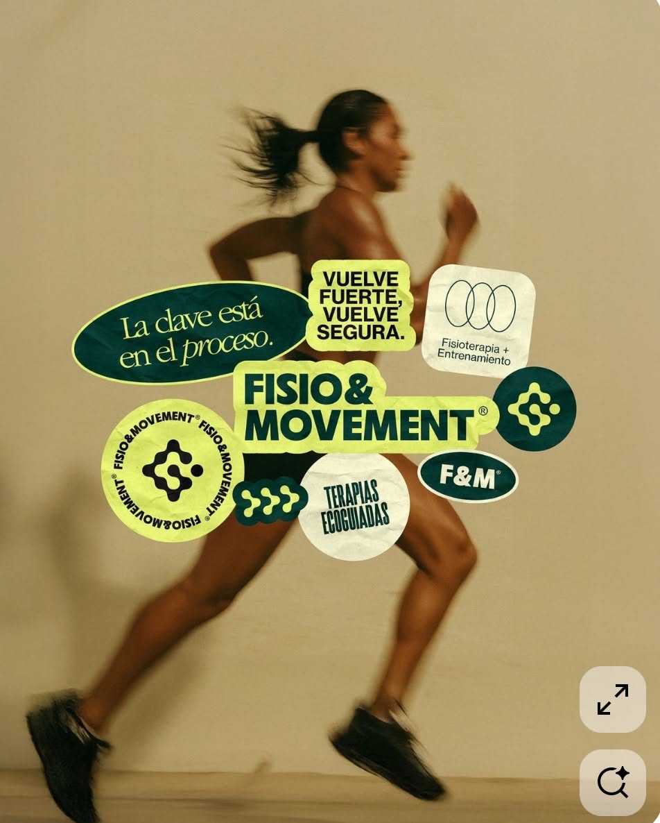
Welcome to the Move to Move Club 🏃🏽‍♀️ Fisio&Movement es un nuevo centro de fisioterapia y entrenamiento que está a punto de abrir sus puertas en Teatinos, Málaga 🏋🏽‍♀️⚡️ Un espacio que entiende el cuerpo como un territorio donde recuperar autonomía, consciencia y fuerza. En un mundo que corre detrá
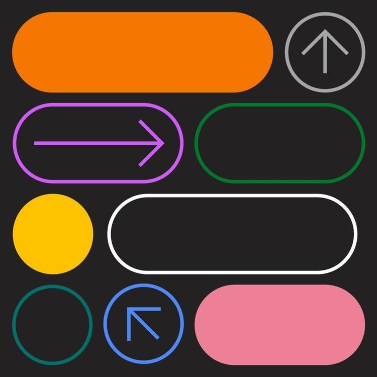
Button and arrow component studies on charcoal — orange, pink and yellow pills alongside outlined circular arrow icons
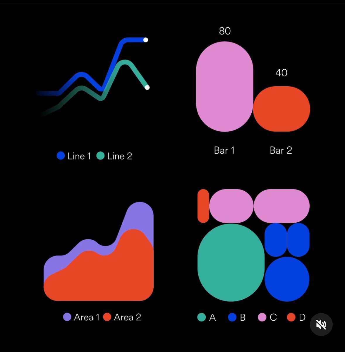
Chart component set on black — line, bar, area and bubble charts in pink, blue, teal and red
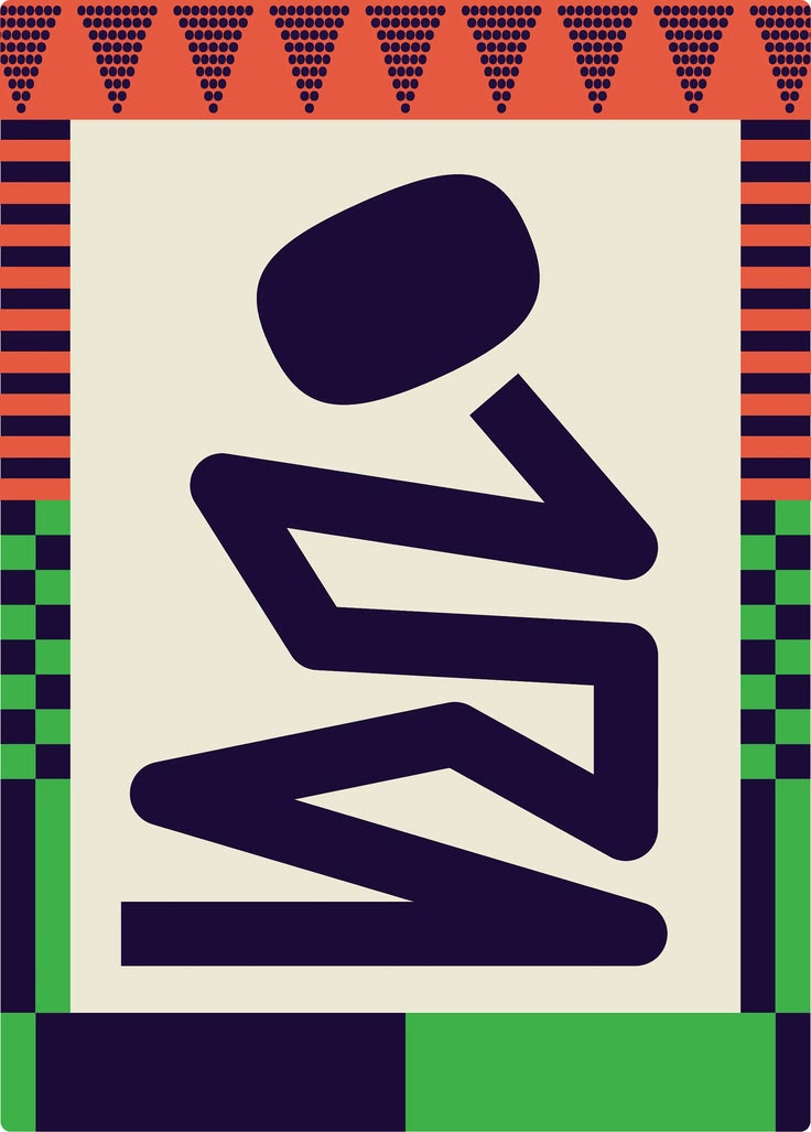
Poster of an abstract seated figure drawn in heavy navy strokes on cream, framed by orange, green and navy patterned borders
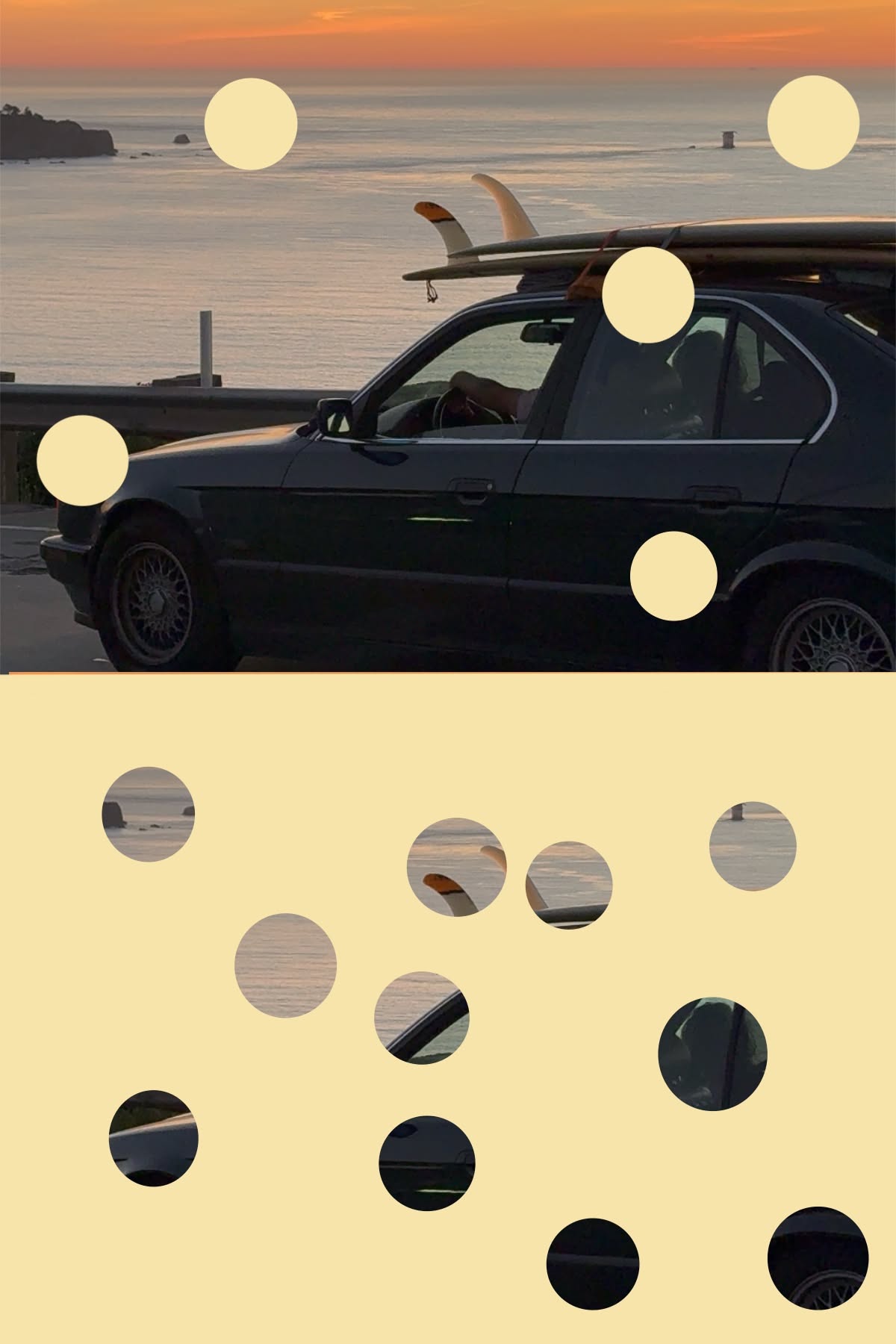
Sunset photograph of a car carrying surfboards, overlaid with cream circles, above a second panel where those circles become windows onto the same image
A pale pink cluster of overlapping rounded tiles forming a loose square on a bright orange ground
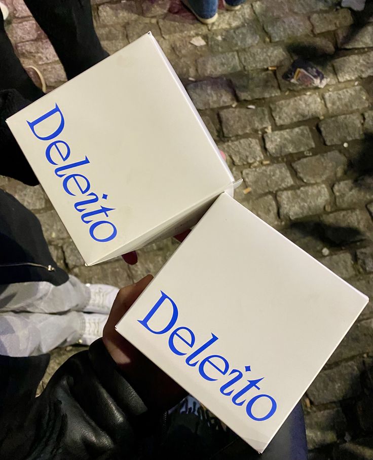
Two white boxes branded Deleito in blue serif type, held above wet cobblestones at night
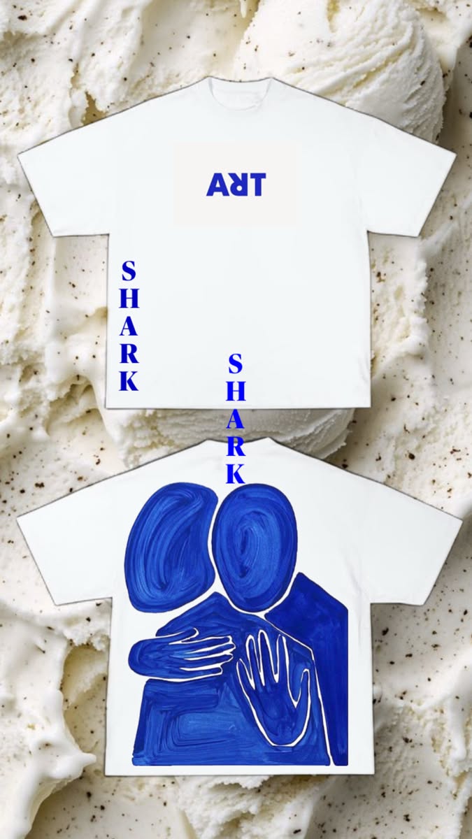
Two white T-shirts with cobalt blue lettering and a painted embracing figure, photographed on a bed of ice cream
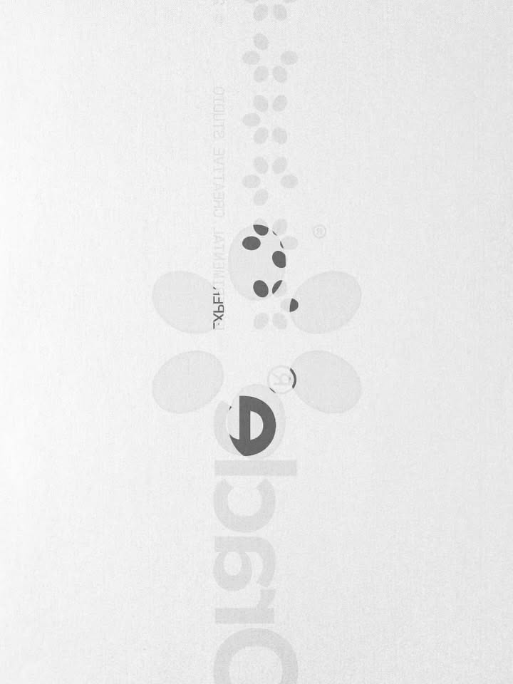
Visual identity Exploration for Oracle Project by @_louismoss — Submit your work — DM us your project #brandingdesign #visualidentity #brandidentity #swissdesign #typography
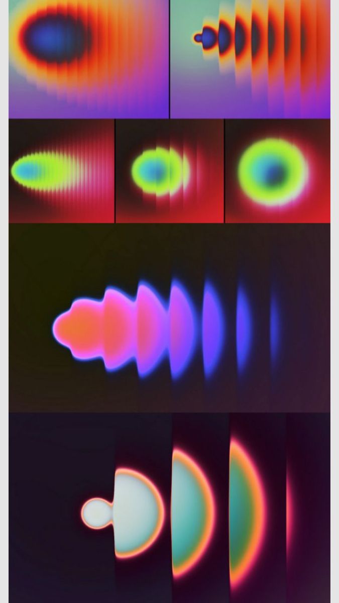
Grid of glowing gradient studies — concentric rainbow blurs and repeating arcs on red, purple and black grounds
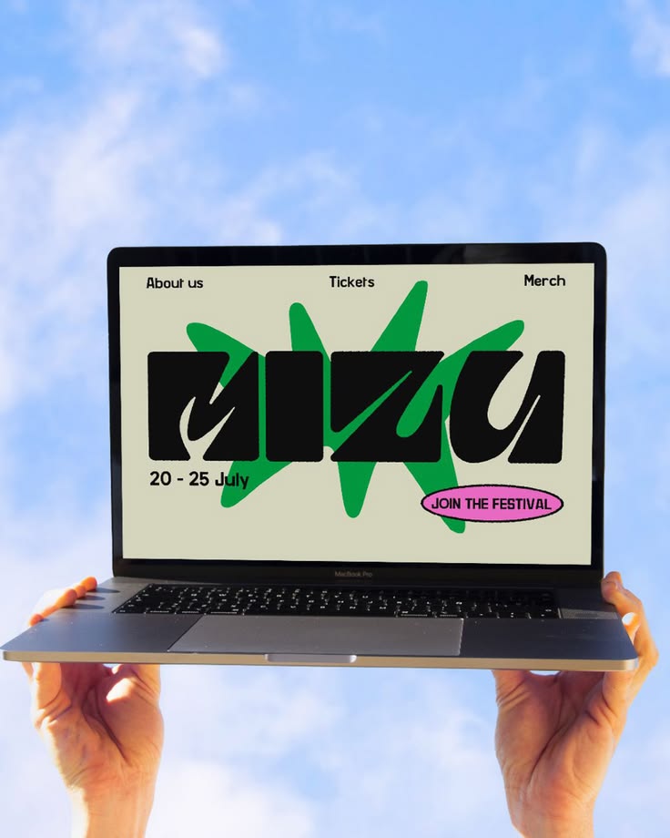
Check out this stunning motion graphics project by Asia Somma , a student of our Online Master in Art Direction. For her assignment, Asia brought the Mizu festival to life. It’s an immersive sensory journey where fluid, hand-drawn shapes and vibrant colours "unleash creativity beyond boundaries". Wa
Get started with a 7 day free trial. Pilates, strength, delicious recipes, breathwork, yoga and more. Workouts anytime, anywhere
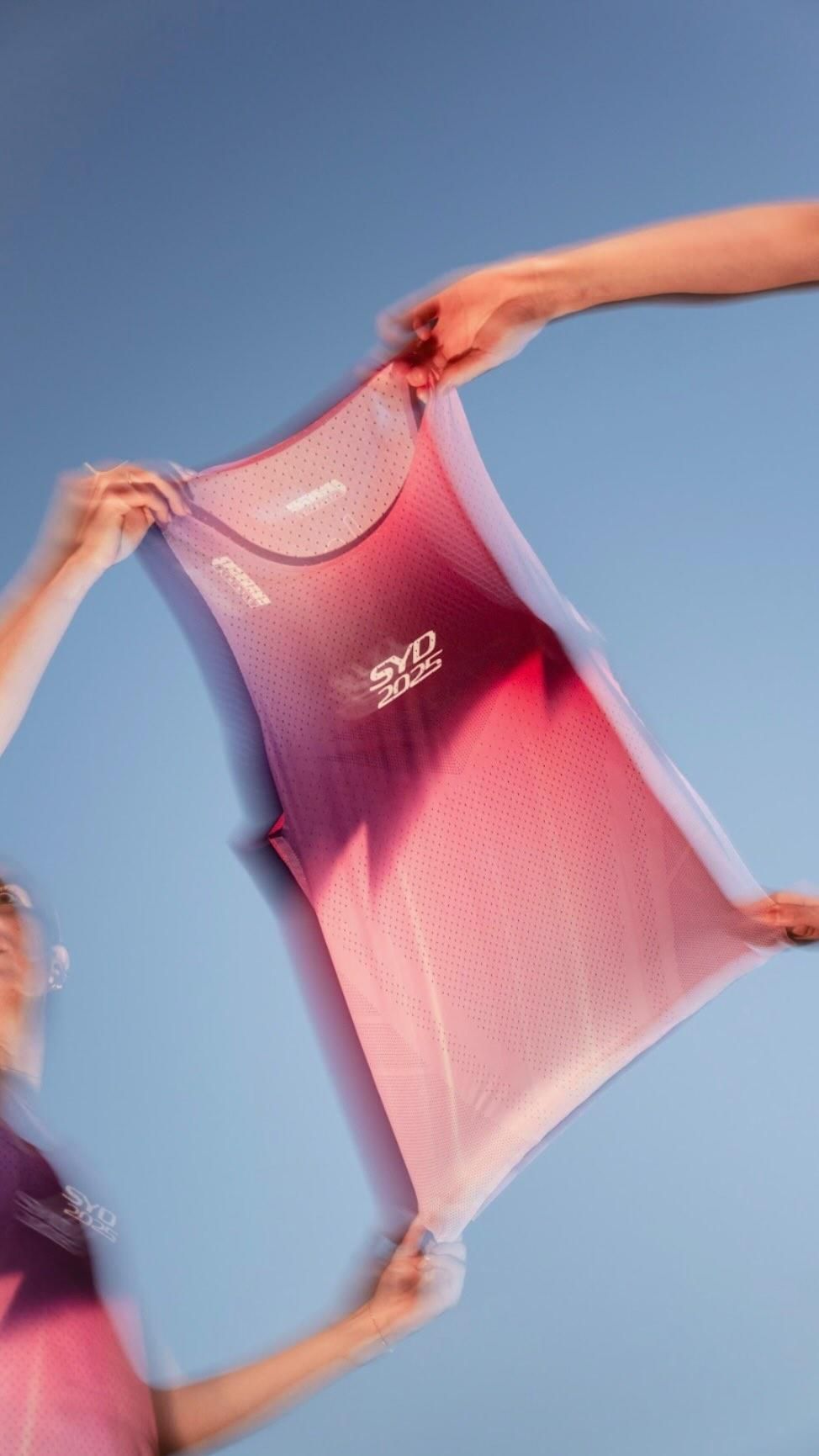
We Run This City. We’re excited to introduce our first exclusive Pace Athletic Sydney Collection. Born from the streets of Sydney, with its city lights, golden hour reflections, and unmistakable silhouettes of its landmarks, this limited edition collection is a tribute to the place and the community
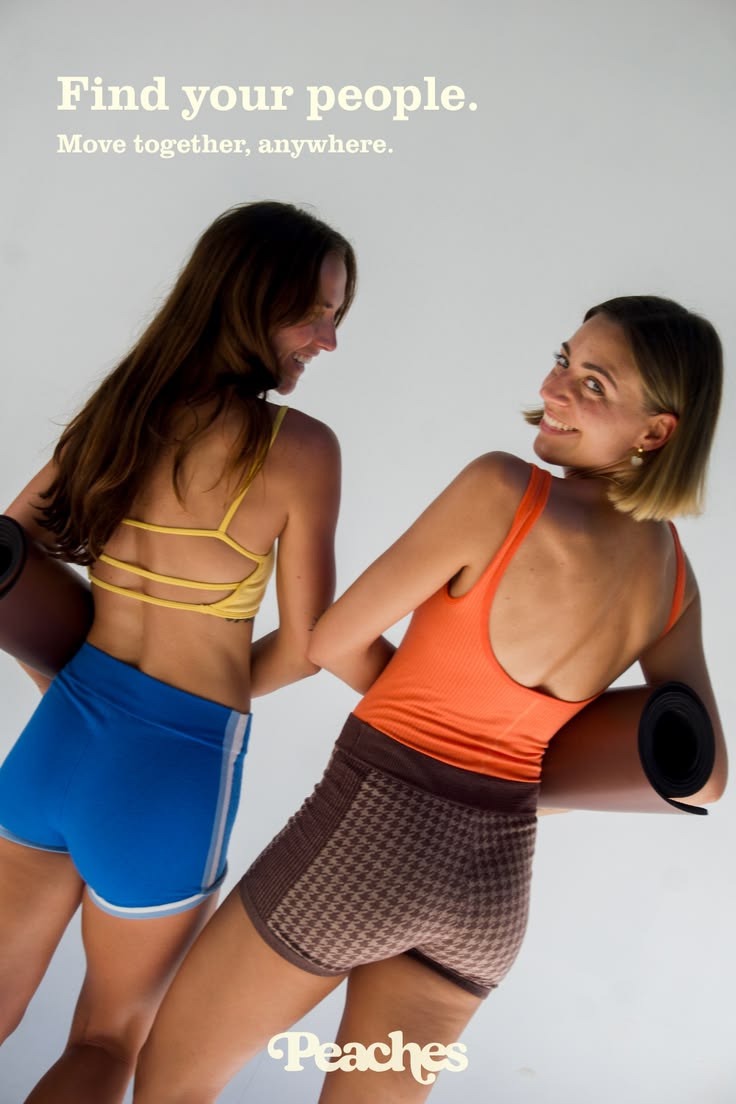
Join Peaches House Sessions now for the best online workouts. Pilates, strength, yoga, breathwork and delicious recipes. Workout anytime, anywhere with trainers from our actual studios
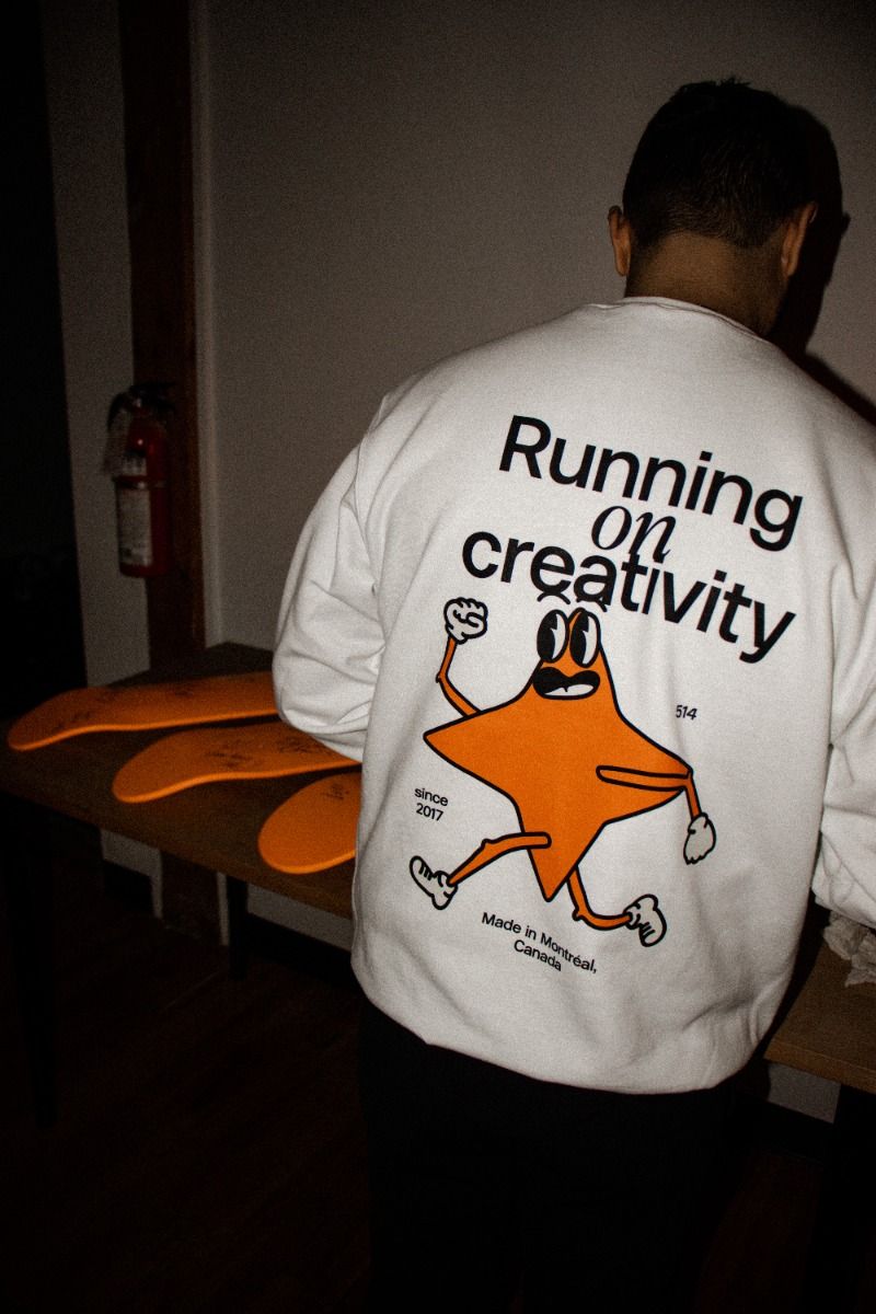
Back of a white sweatshirt reading Running on creativity, with an orange star mascot character below the type
Branding for Fisio & Movement — a runner mid-stride overlaid with green and cream sticker-style logo lozenges
31/03/25
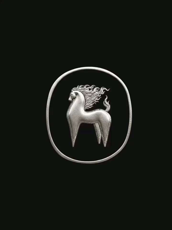
The Year of the Fire Horse by Gianella Oblitas.piot Font in use : PP Gatwick Pang Ram.pangram —— See your work featured? Engage and be observed. ———————————————————————————— Submit your work - link bio / Use Tag #unbserved _______________________ #graphicdesign #visualidentity #identitysystem #d
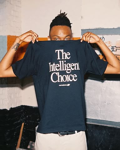
A person holding up a navy New Balance T-shirt printed with The Intelligent Choice in a serif face
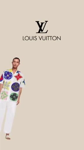
Louis Vuitton campaign layout — a model in a floral-printed short-sleeve shirt and white trousers against a beige ground
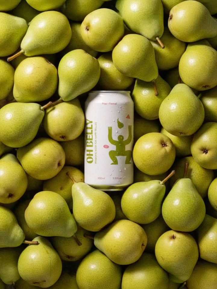
Oh Belly Sharing this brand identity project by Ashley.studio for Oh Belly. A sugar-free prebiotic soda created for gut comfort and everyday joy. The branding is bright and approachable, transforming functional health into something fun, accessible, and pleasurable making wellness feel like a natura
If you can adjust your phone’s brightness, you can use our stuff. First Slide coming soon, first slide images by Alicia Fazio
Motion explorations by cherry.visuals —— See your work featured? Engage and be observed. ———————————————————————————— Submit your work - link bio / Use Tag #unbserved ——————————————————————————— Our store @observedtemplates _______________________ #graphicdesign #branding #brandidentity #visualident
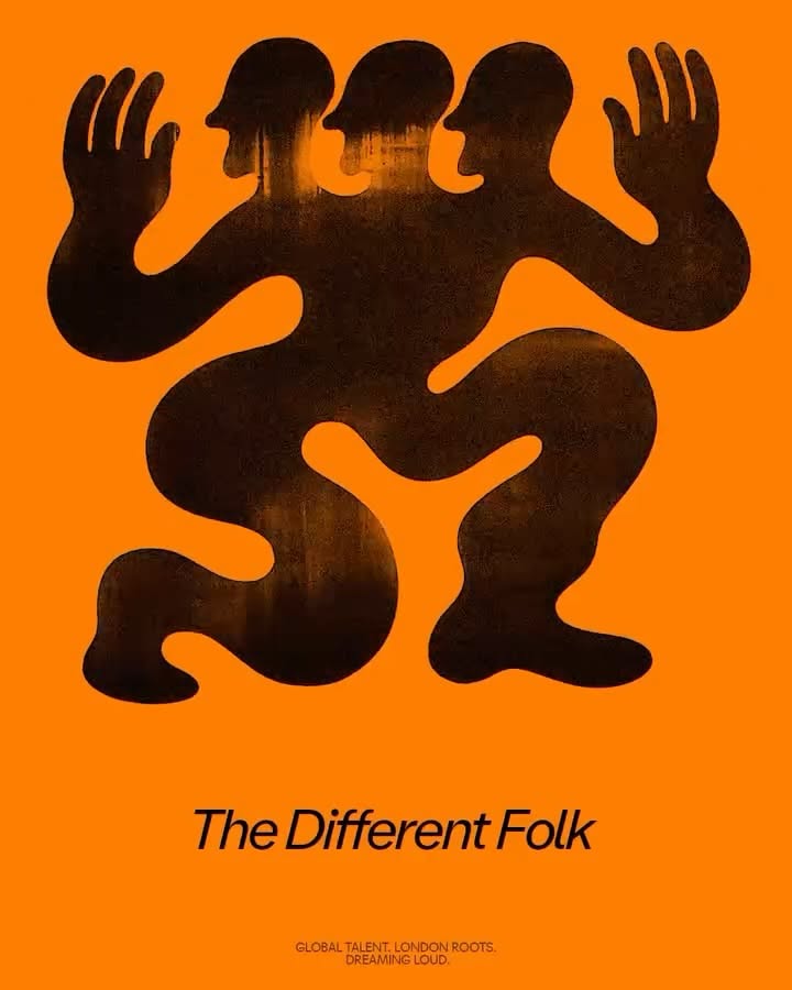
The Different Folk by @_los_caballos and The Different Folk - Credits TDF team: Subby Nibas @em.tardi Art direction, web design & code: @_los_caballos Logotype illustration: @elfluxor Logotype reinterpretations featured in this post: Juan Rodriguez Lage @jessbianxi @yay_abe @holamaybe User_rwdnhatce
Two large cartoon eyes sitting low on a hot pink field, both looking to the left
illotv partnered with Marex, a diversified global financial services platform, to create a motion language that mirrors the company’s balance between precision and fluidity. Operating across energy, commodities, and financial markets, Marex connects systems and people — and this sense of connection
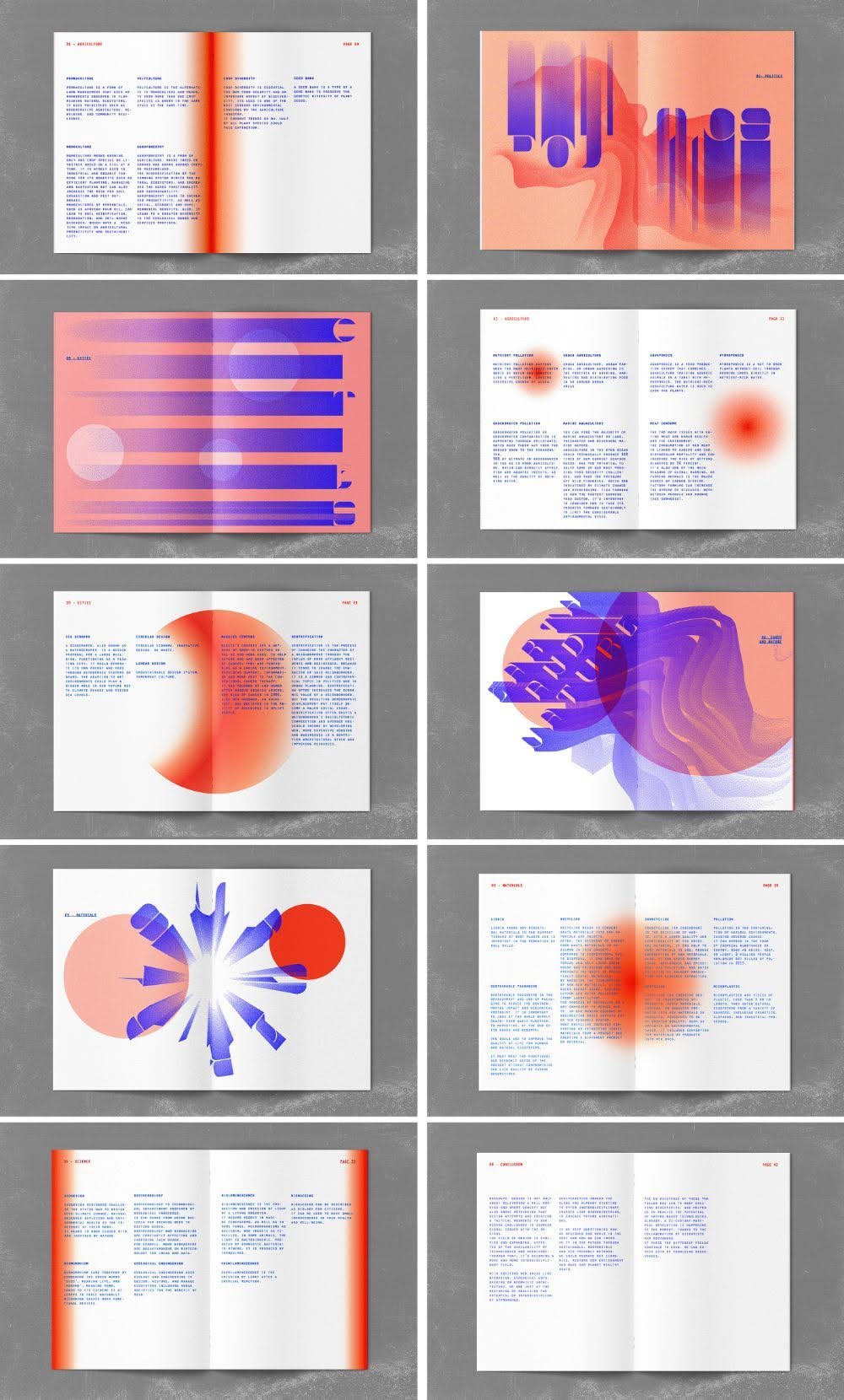
Grid of ten editorial spreads — orange and violet gradient graphics set against dense columns of text
layout Grid
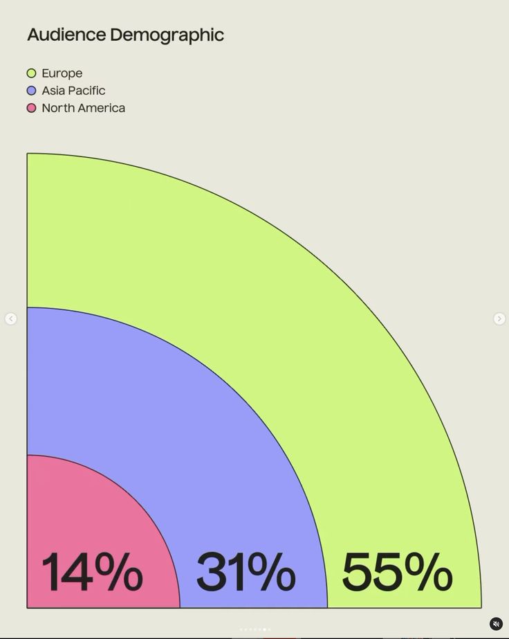
Nested quarter-circle chart titled Audience Demographic — 55% Europe in lime, 31% Asia Pacific in periwinkle and 14% North America in pink
alle aus pinterest. links nur nicht mehr gefunden
(2) Instagram
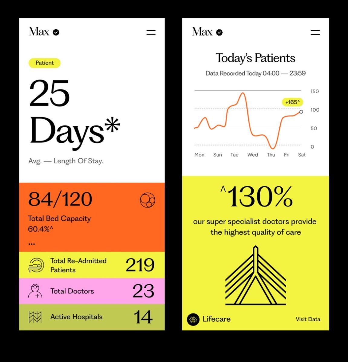
Two mobile screens for a hospital dashboard called Max — average length of stay, bed capacity and a patient line chart in orange, acid yellow and pink blocks
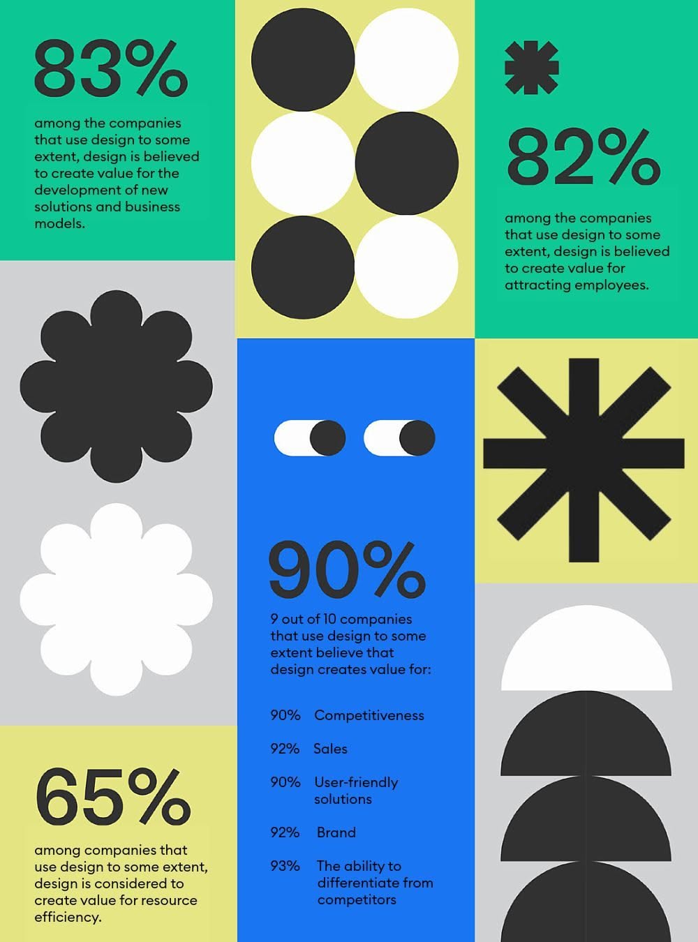
Statistics layout on the commercial value of design — 83%, 82%, 90% and 65% set in blocks of green, blue and grey with black geometric shapes
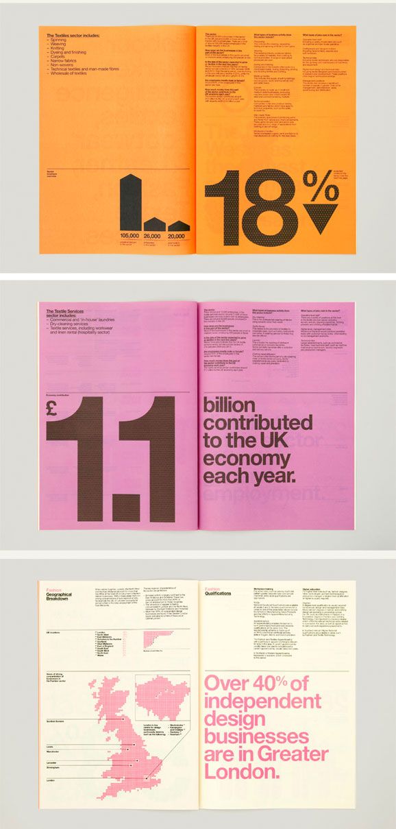
Three report spreads in orange, pink and white — oversized figures on the UK design economy set in grotesque type
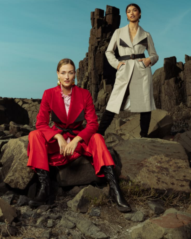
Fashion campaign still from the Tiger x Patou brand launch by Antimony Studio
Poster from the 5th Element holistic health and wellbeing brand identity system by Antimony Studio
Clay mask packaging mockup from the Sada Men product launch by Antimony Studio
Video designer Assembles, Cuts, Trims and Sequences raw footages into a well-knit video.
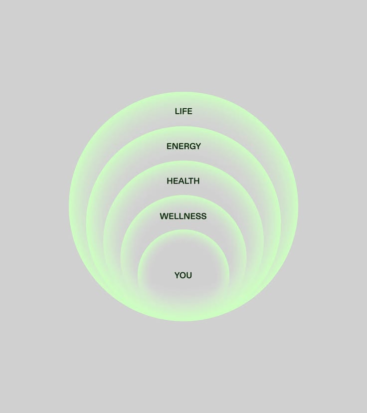
Concentric green glow rings labelled life, energy, health, wellness and you
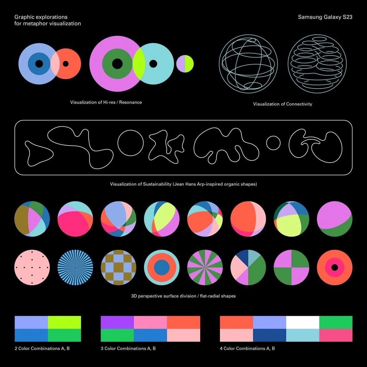
Dark visual system board of data-visualisation shapes, organic forms and colour combinations for a Samsung Galaxy release
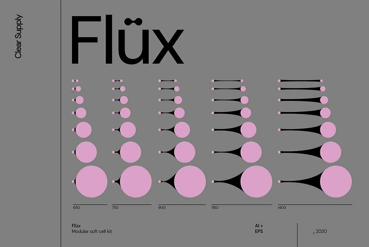
Flüx is a combination of a modular build kit for vector metaball structures and a ready-to-use library of soft cell compositions, for infographics, patterns and branding elements.
Personal brand and content system built for real-estate agent Lindsay Ryan by Antimony Studio — a single shoot engineered to manufacture familiarity at scale.
Property campaign by Antimony Studio for wine critic James Halliday AM's Yarra Valley estate, built around story rather than renders.
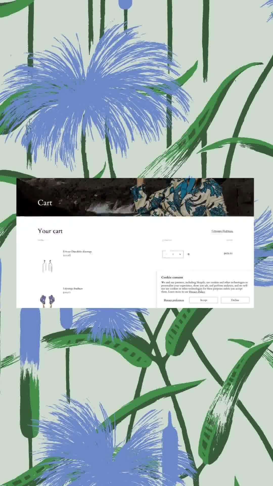
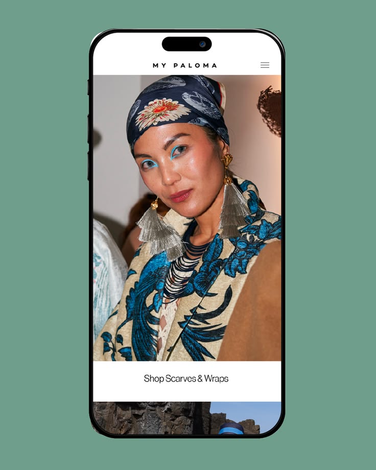
Art direction for My Paloma by Antimony Studio — South American heritage garments framed for a Sydney audience without trading on nostalgia.
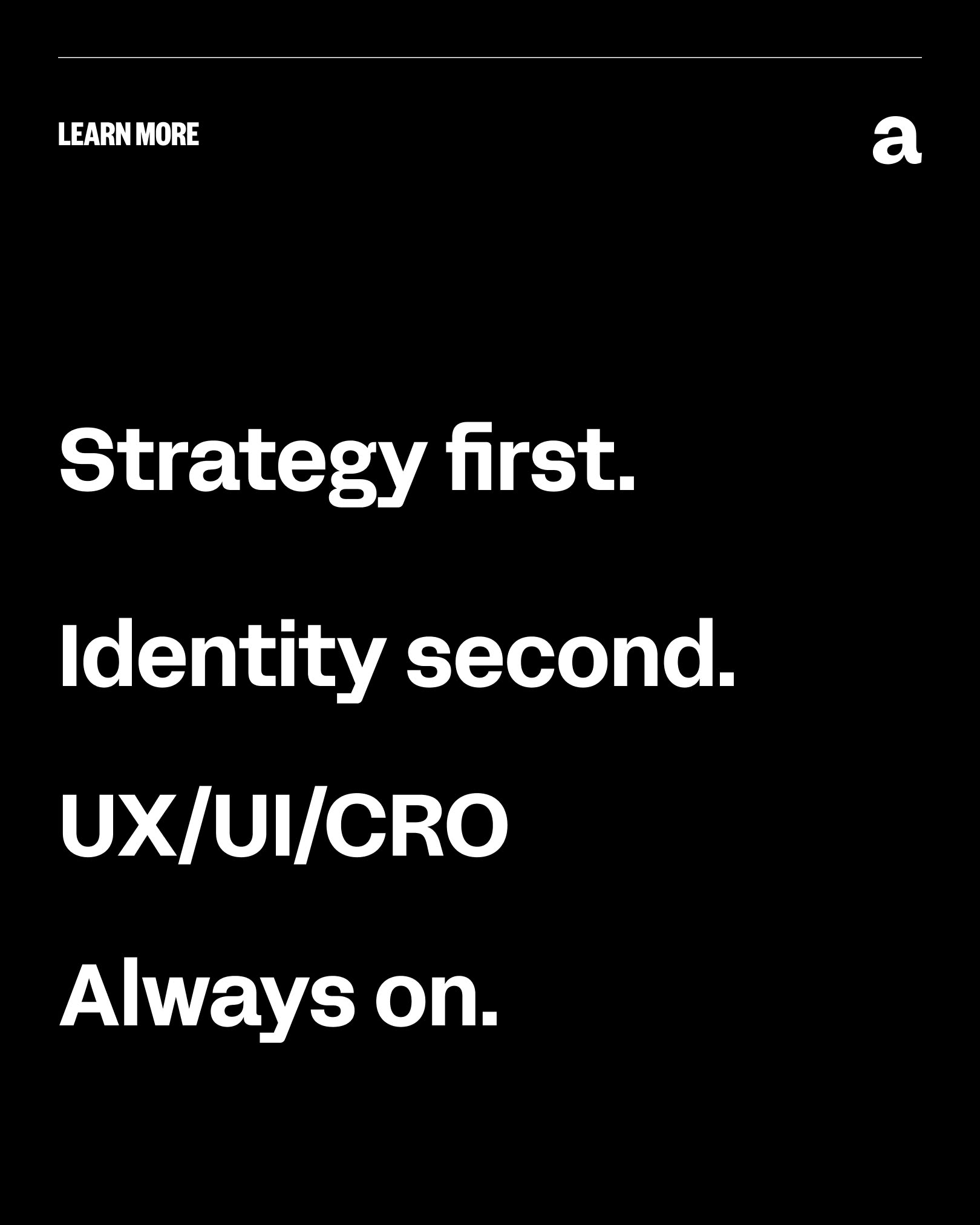
Antimony Studio methodology tile: strategy first, identity second — design that performs starts with positioning, not aesthetics.
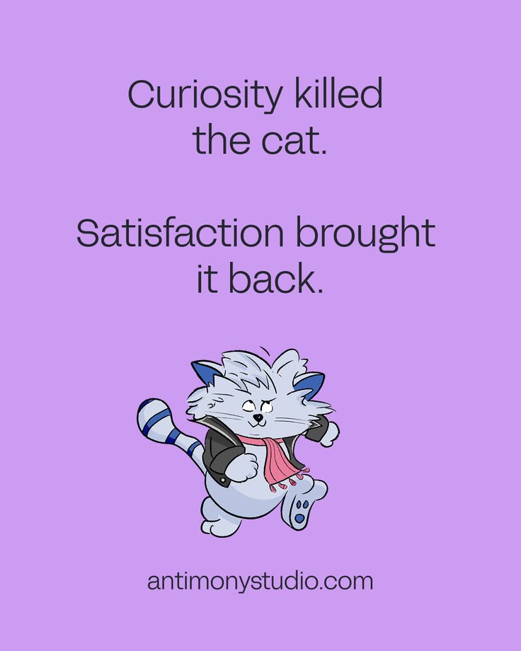
Antimony Studio culture tile: we are experts in understanding people — getting people talking and truly listening.
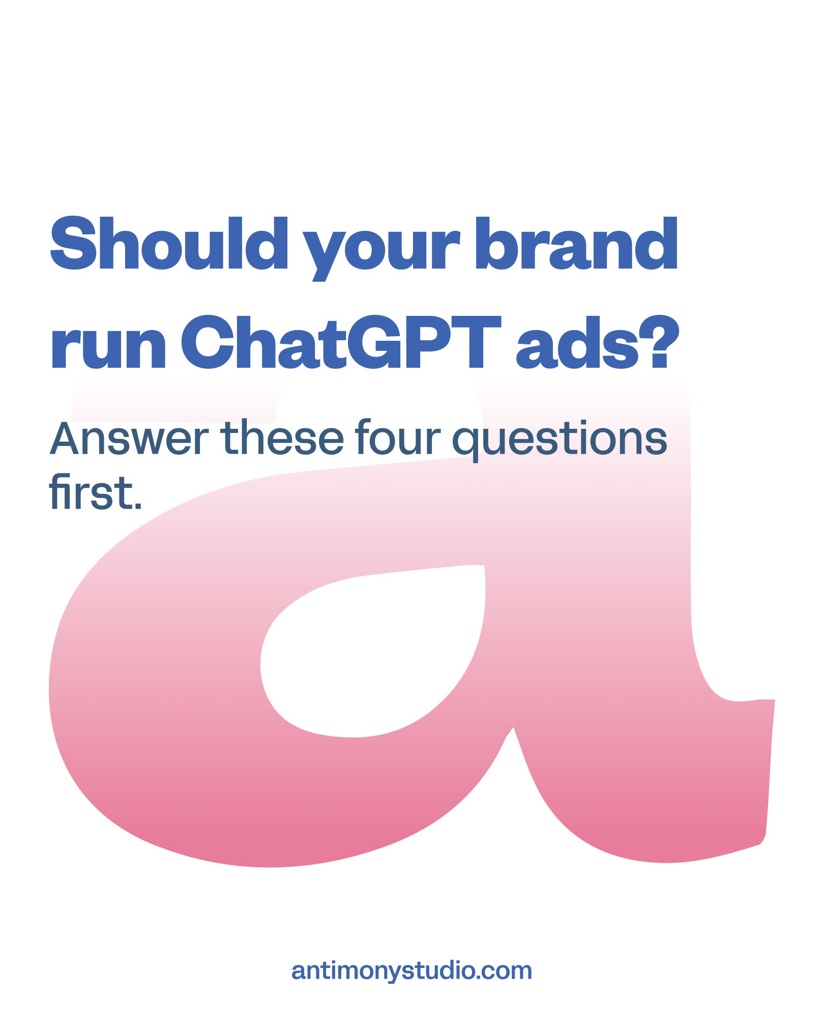
Antimony Studio decision-framework tile: four questions to answer before running ChatGPT ads — organic recommendation, publication citations, positioning clarity, unit economics.
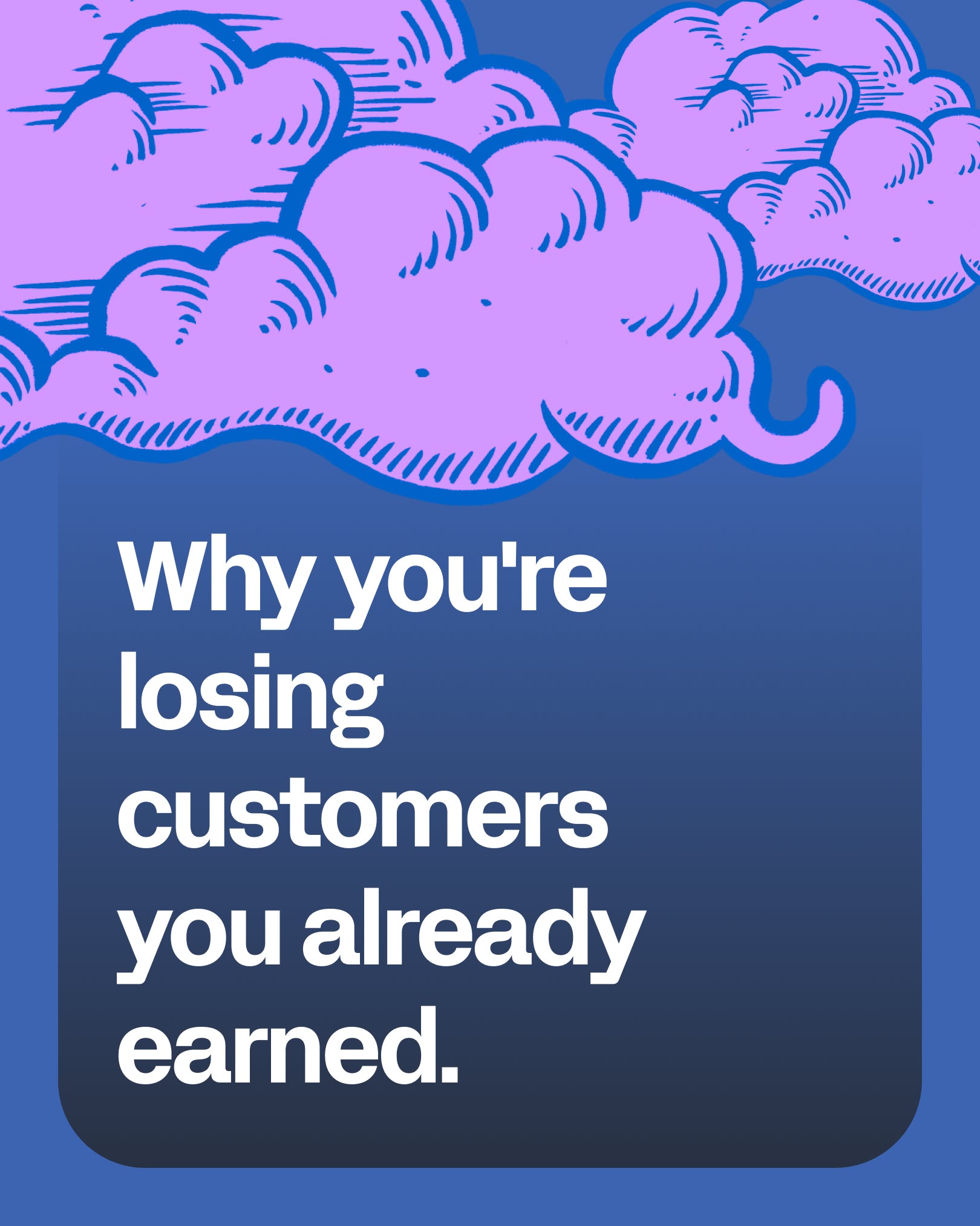
Antimony Studio social tile: acquiring a customer is the easy part — retention is the growth lever most businesses underinvest in.
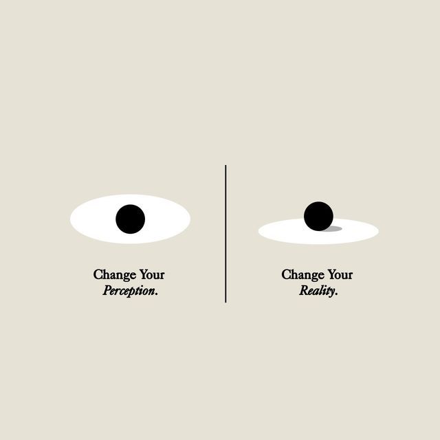
Cream diptych of two abstract eye forms captioned change your perception and change your reality
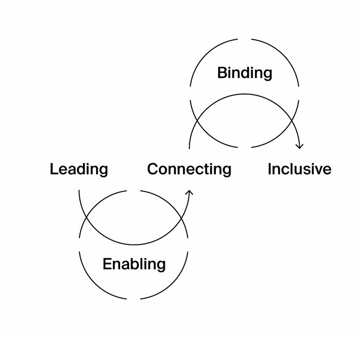
Minimal diagram linking the words leading, connecting, inclusive, binding and enabling with looping hand-drawn arrows
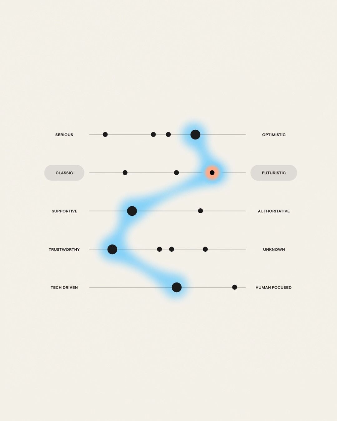
Cream brand-attribute chart with a luminous blue line tracing a brand's position across opposing trait scales
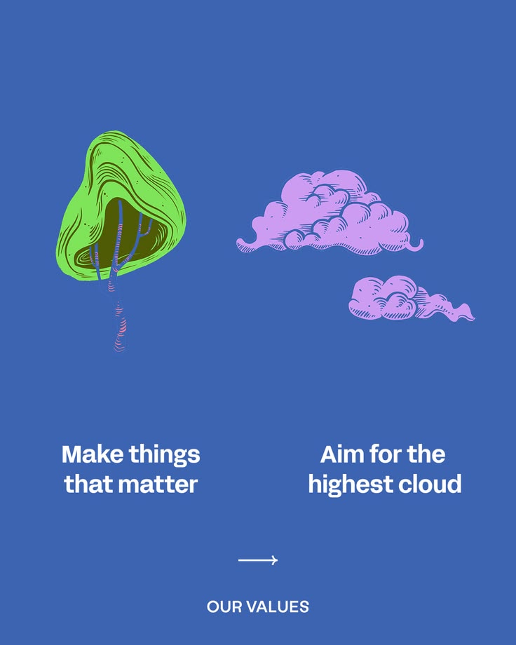
Antimony Studio values tile: make things that matter and aim for the highest cloud — looking beyond single touchpoints to the full system a brand lives in.
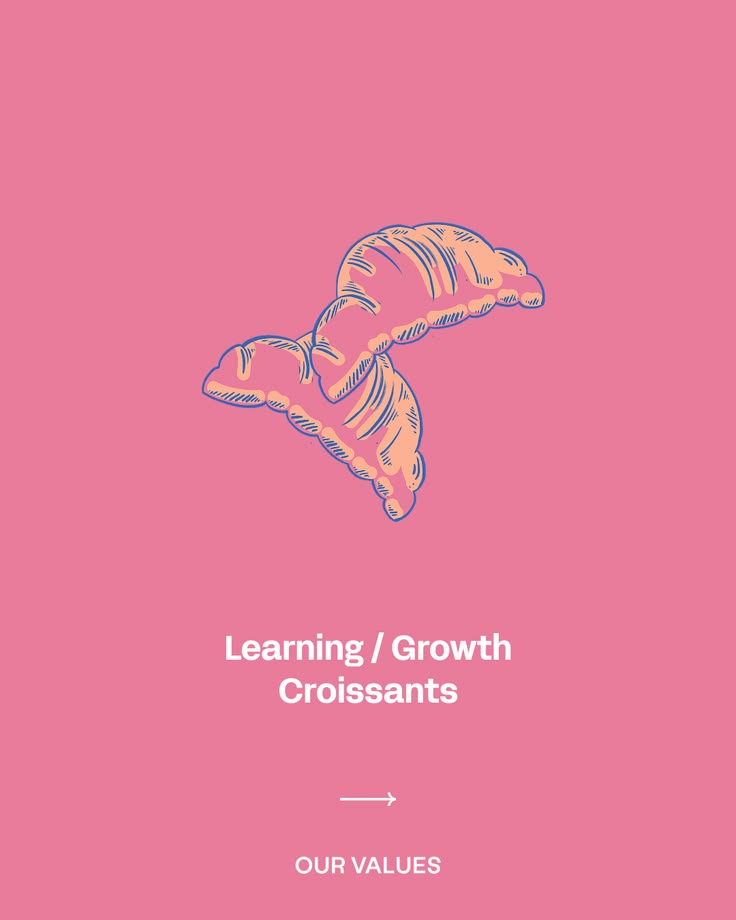
Antimony Studio values tile: learning and growth — acting as an extension of your team rather than an outside supplier.
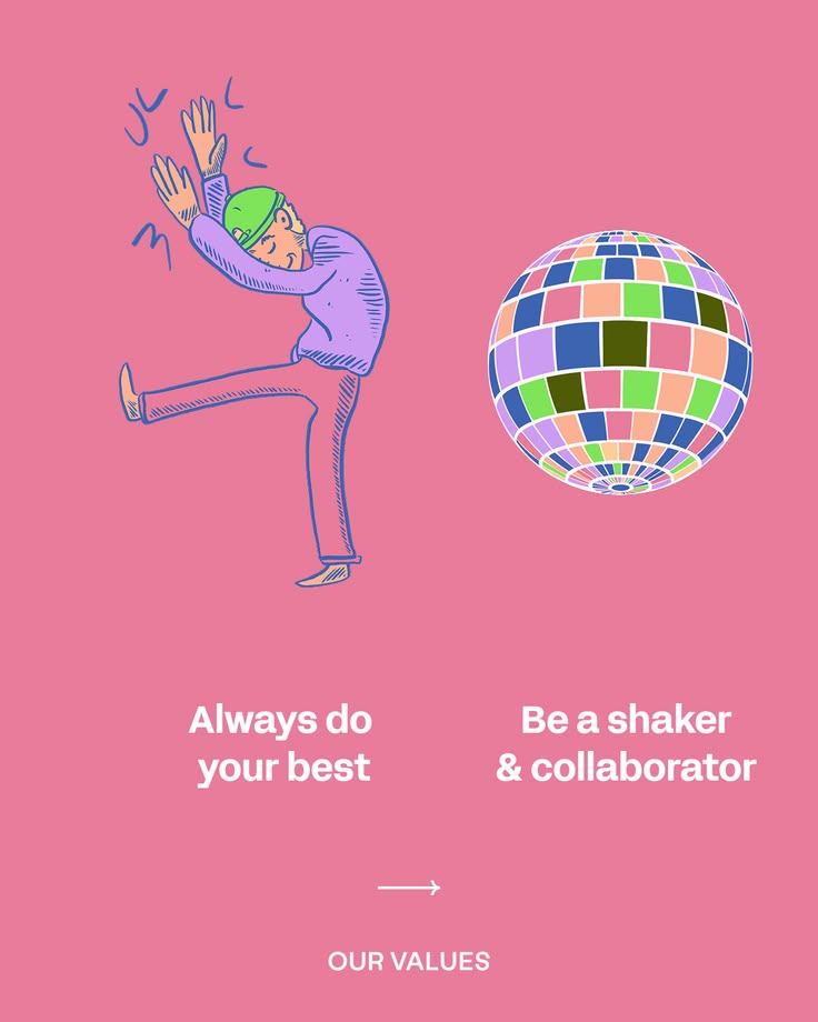
Antimony Studio values tile: always do your best, be a shaker and a collaborator — workflow tailored to context rather than a rigid process.
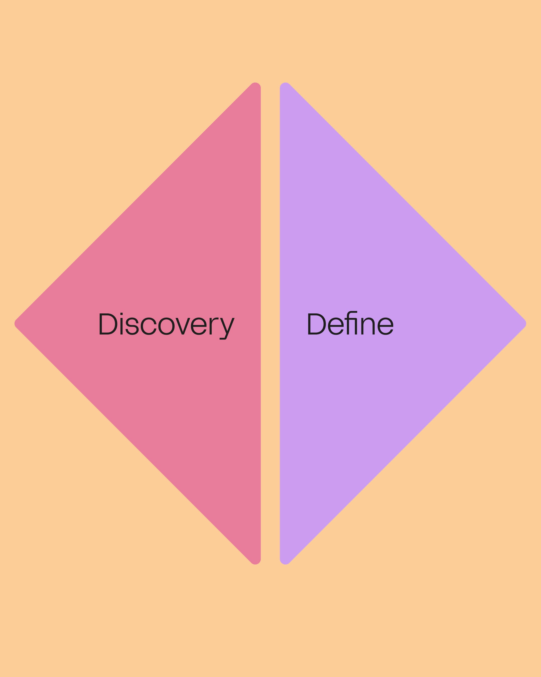
Antimony Studio methodology tile: Discovery and Define, the first stage of the branding process — designing something that matters takes systems, sweat and soul.
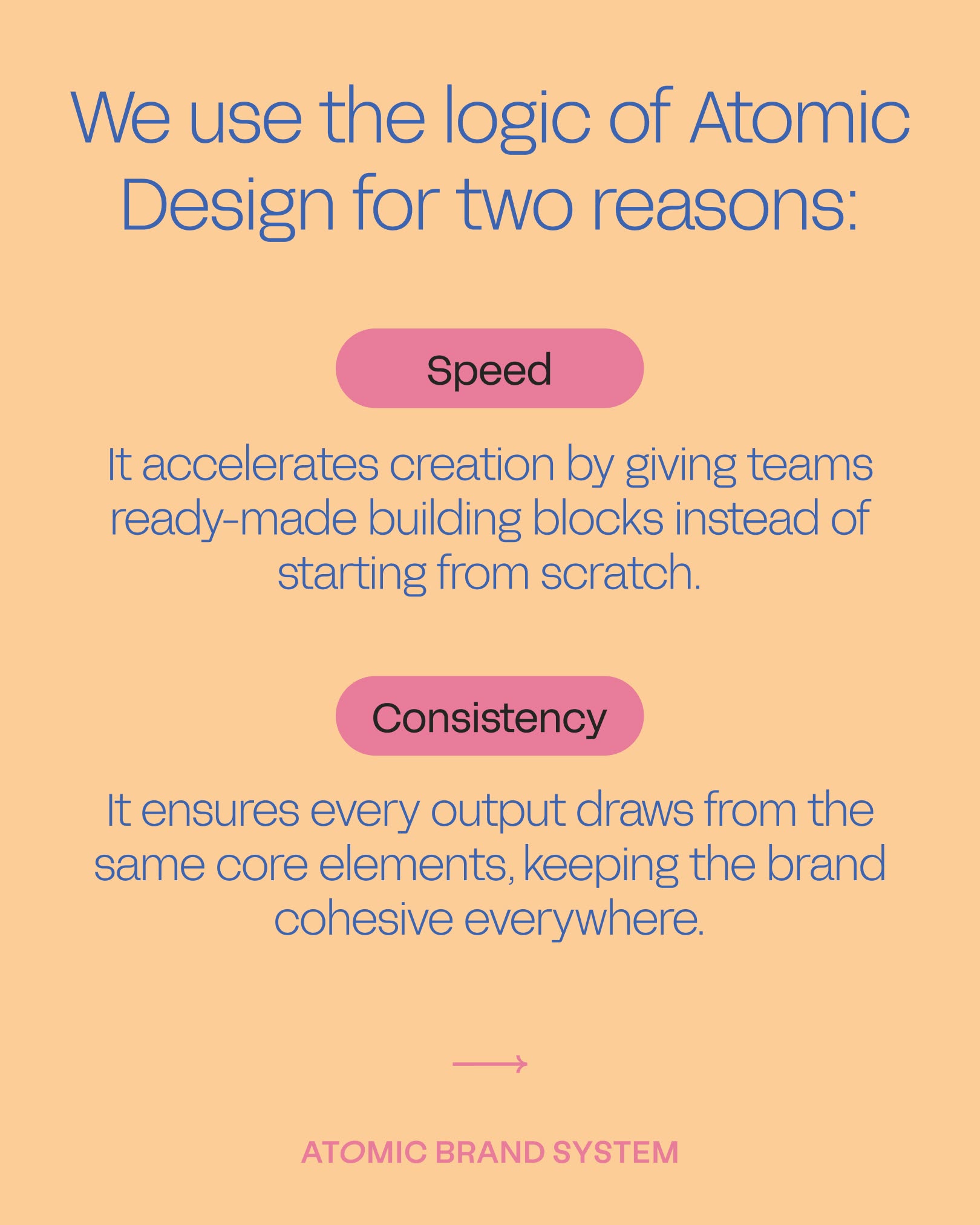
Antimony Studio systems tile: Atomic Design gives teams ready-made building blocks for speed and keeps every output drawing from the same core elements for consistency.
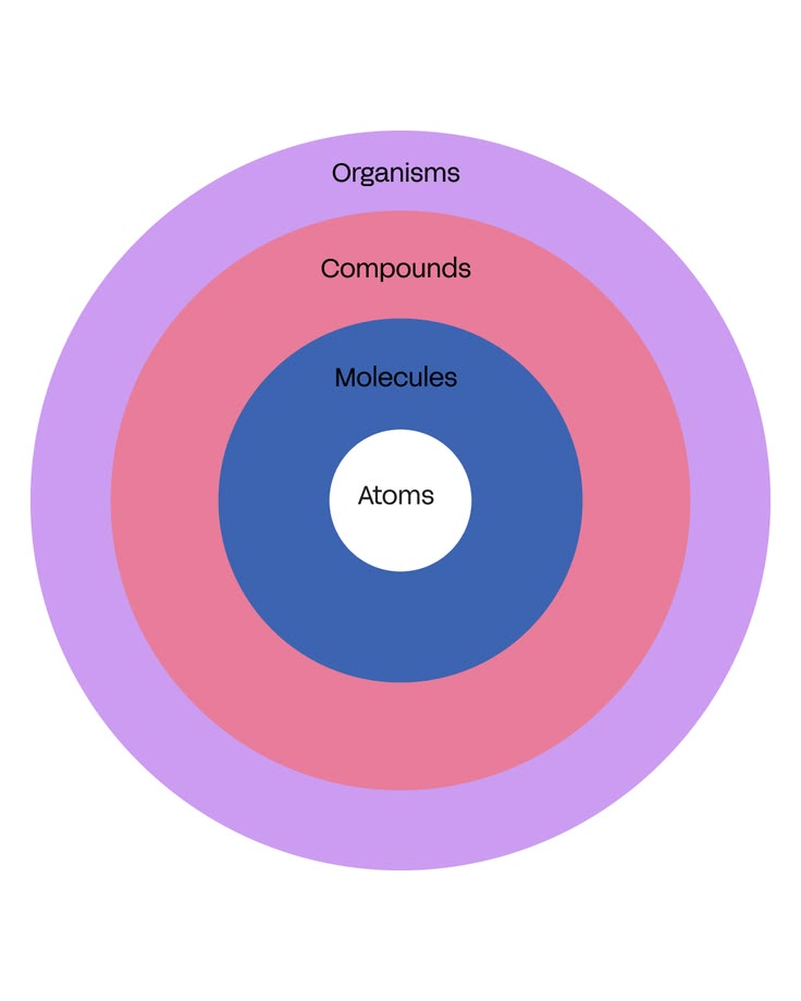
Antimony Studio diagram: brand frameworks built on Atomic Design — atoms as foundation, molecules combining them, compounds forming scalable brand architecture.
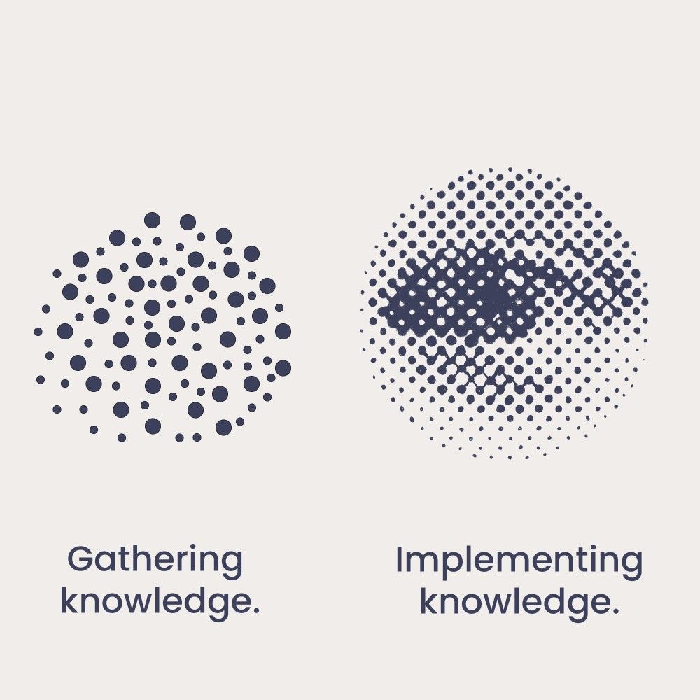
Two navy dot compositions, a scattered cluster beside a halftone eye, captioned gathering knowledge and implementing knowledge
Brand positioning diagram on cream — paired attribute scales with a glowing blue path plotting where a brand sits between simple and complex, supportive and authoritative
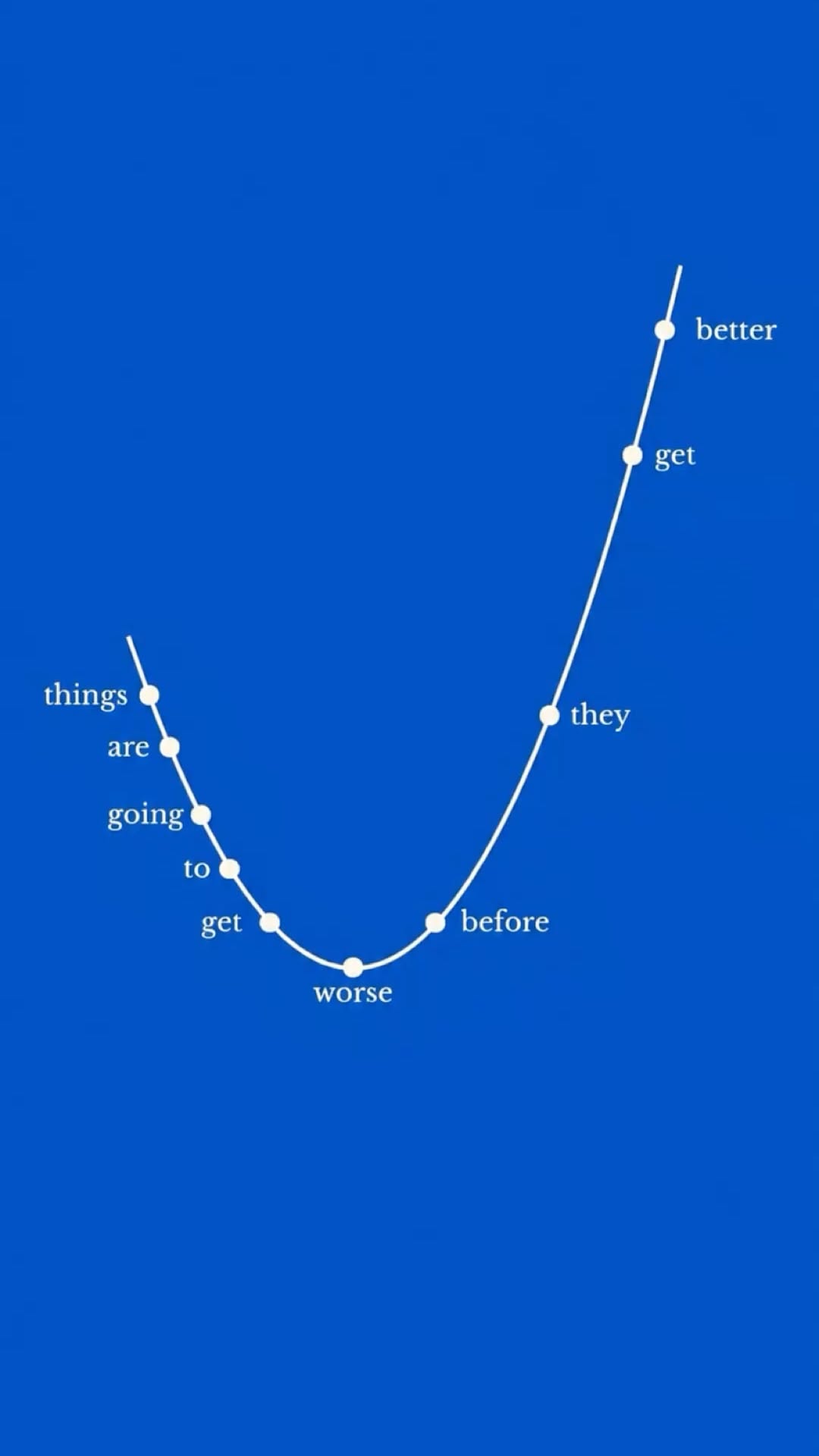
Editorial poster on cobalt blue with a hand-drawn line graph dipping then rising, lettered: things are going to get worse before they get better
Brand identity for My Paloma by Antimony Studio — South American soul made wearable in Sydney, with name, voice and visual world built from the ground up.
Antimony Studio case study slide on terracotta: identity for a Sydney wearable art couture designer with South American roots
Since founding The Woork in 2014, Debbie Martín and David Botella have carved out a distinctive position in the branding landscape by refusing to stop at brand creation. Having built their experience at multinational agencies before heading out on th
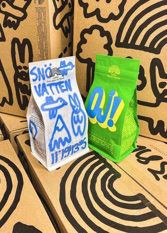
Swedish snack packaging on illustrated timber steps with Sno Vatten and OJ! wordmarks
40 Contemporary and Cool Coffee Packaging Designs - Design & Paper
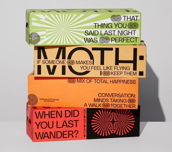
Stacked Moth conversation-game boxes in green, orange and red printed with question prompts
Independent craft soda brands often struggle with limited visibility and access to distribution networks. Couple that with an uncompromising commitment to premium, organic ingredients, which can result in higher per-unit costs, making competition tha
Stacked chilli con carne tins in pink, blue and sage with bull and chilli illustrations
Four syrup bottles with vivid illustrated labels including cranberry and macae verde
PERSPECTIVA ditches wellness minimalism for bold beverage branding — The Brand Identity – Graphic Design’s Greatest
25 Of The Biggest Graphic Design Trends For 2025
Wiseman beer six-pack in a red carrier with an eye motif, beside bottles with red figure labels
Overhead scatter of Dorado coffee cans in yellow, orange and cobalt blue
Scattered kraft paper envelopes sealed with orange sunburst and green branded stickers
Hands unrolling a sage green printed label sheet with engraved crests on a pink ground
Flamingo Estate, Los Angeles (@flamingo_estate) • Instagram photos and videos
Hand-drawn Lykke Coffee Club label artwork in black marker on grey card
Minimalism As A Design Trend Lets The Packaging Speak Volumes For A Brand - Design & Paper
Sage and beige skincare discovery set with a green glass serum bottle and printed cartons
Four-pack of green Sipps honeydew and mango cans with silver tops on a yellow ground
Flat carton dieline for a kale and green tea vitamin drink covered in colourful character illustration
Three stacked white Bigface coffee boxes with orange, yellow and purple accent panels
Graphic Design,Adobe Photoshop | package sticker design #packagestickerdesign 103.19.1.499
Warm, huggable and built to make you look good and feel good. For Sada Men we created a brand identity that feels as good as the product itself. A men's skincare brand made from all natural Australian ingredients, crafted specifically for men. The br

Archive