Let’s talk

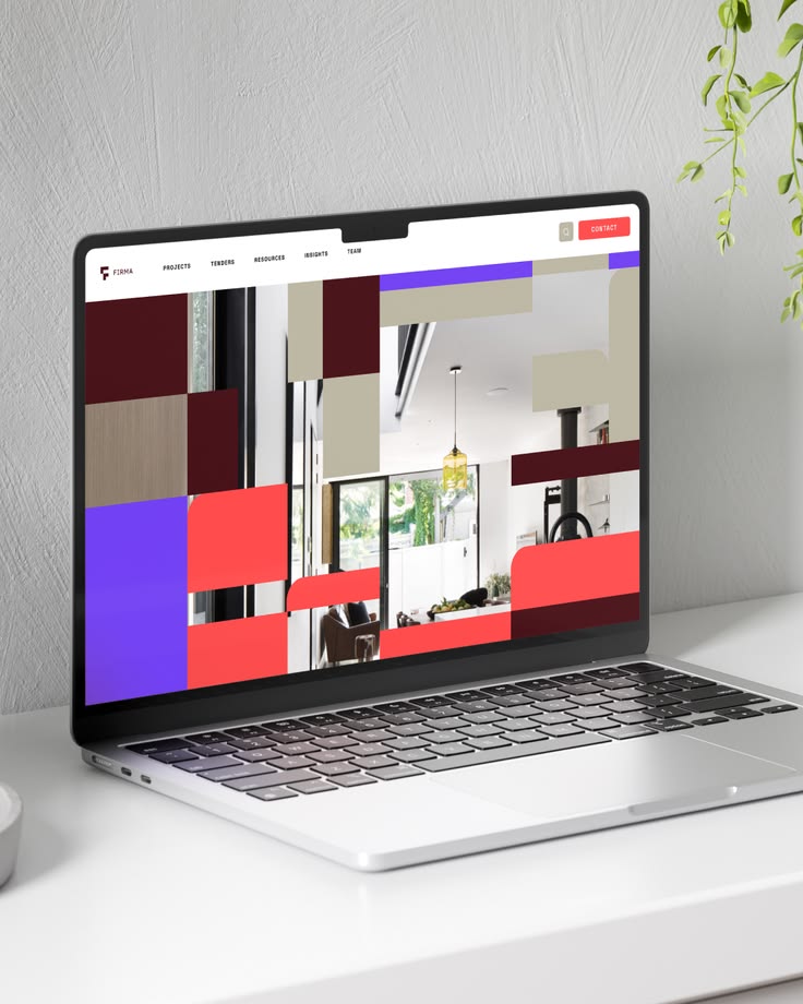
A key priority for Firma Construction Group was the development of structured corporate documentation to support commercial growth and tender submissions. We delivered separate Commercial and Residential Capability Statements, ensuring each division
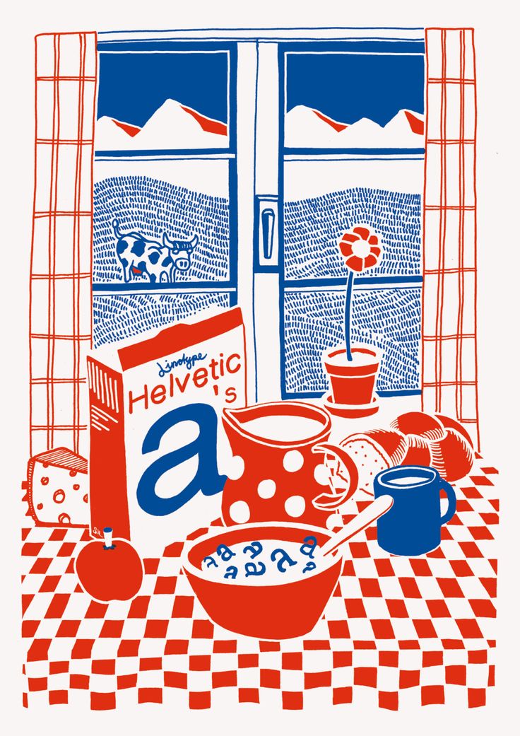
Red and blue illustration of a breakfast table with a Helvetica-branded cereal box beside a window
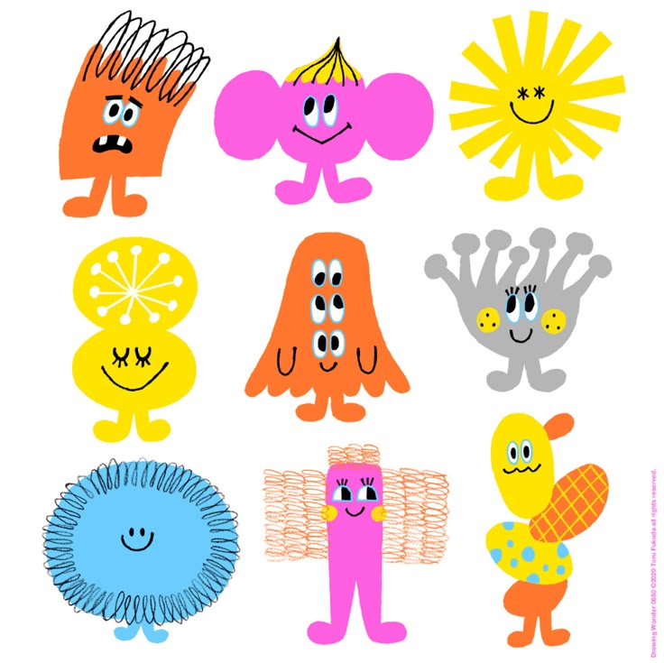
Grid of nine bright cartoon mascot characters with simple smiling faces
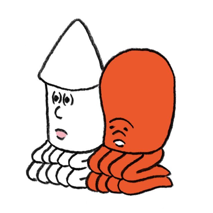
Loose line illustration of two hooded figures, one white and one orange, leaning together
Atom Animated Gif Images at Best Animations
40 Easy Things to Draw When You're Bored! | Displate Blog
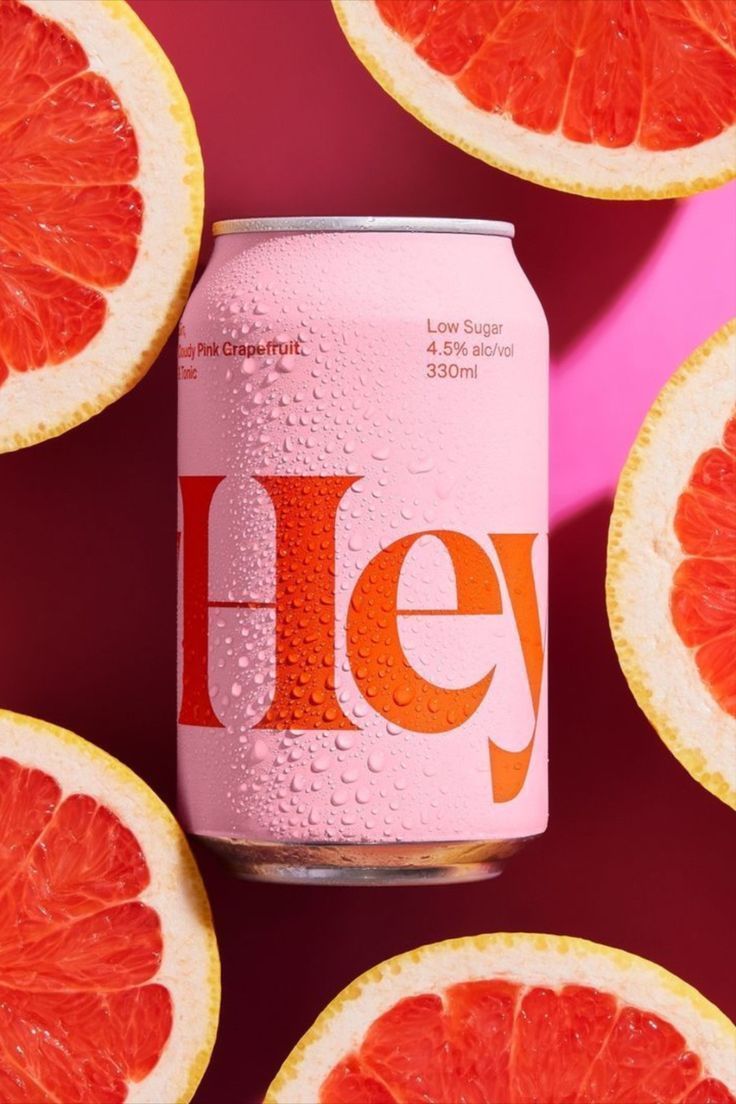
Take A Sip Of HeyHey! | Drinks packaging design, Packaging design inspiration, Branding design
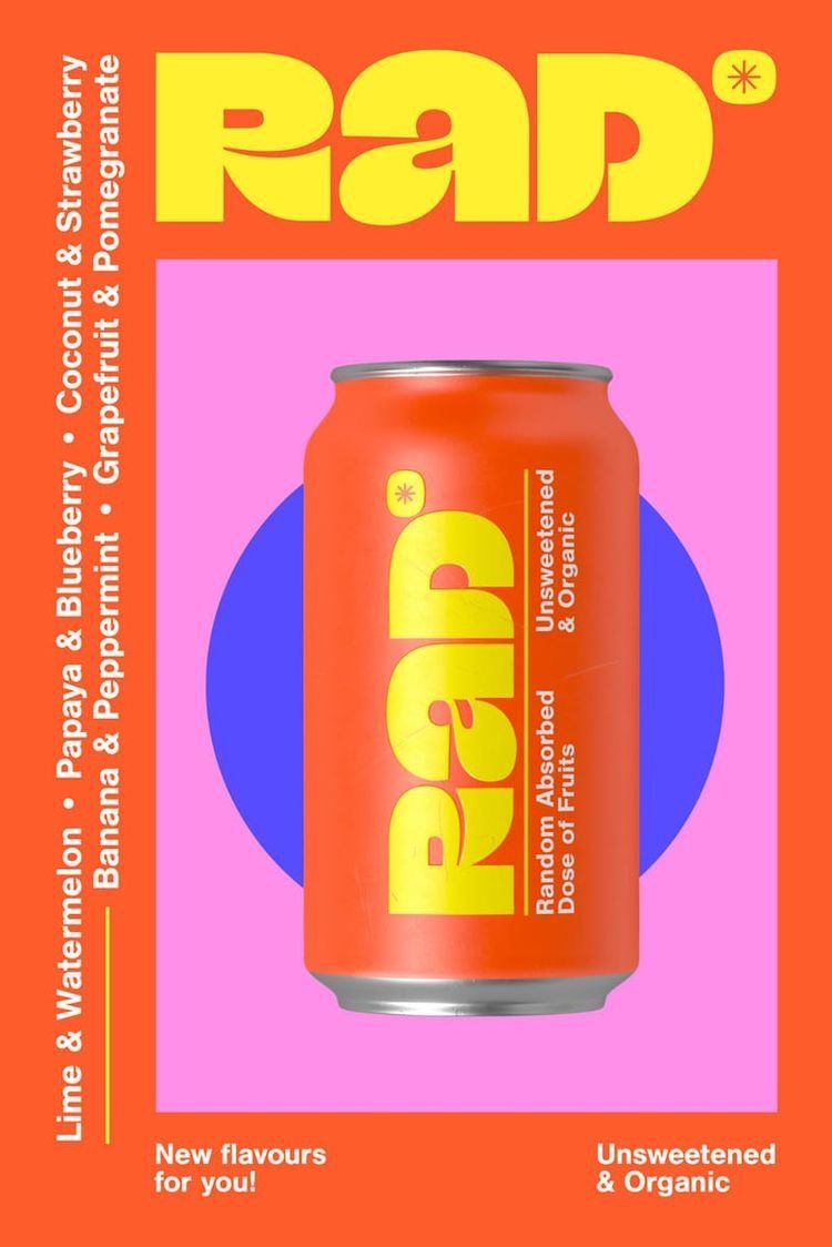
Poster for RAD sparkling water — an orange can on magenta with vertical fruit-flavour listings
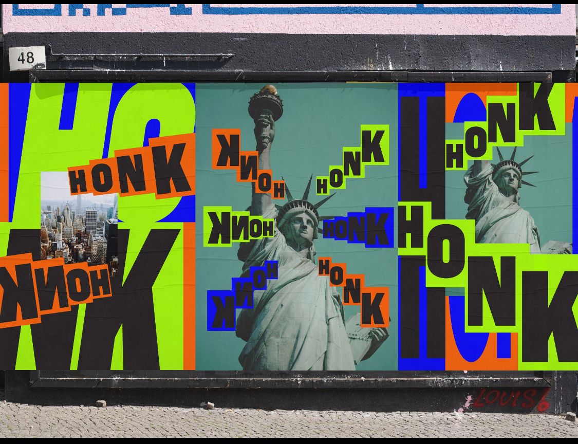
Street hoarding artwork repeating the word HONK in neon colours over Statue of Liberty imagery
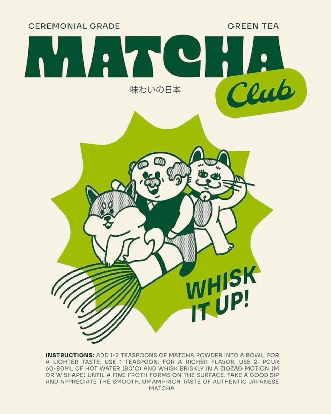
Matcha Club poster in cream and green with cartoon cats, a whisk and a whisk-it-up call to action
Bite into the history of the squishy sans serifs making scrolling sweeter.
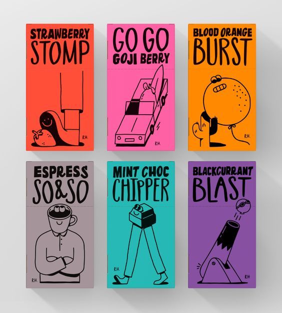
Six illustrated snack packs in candy colours with names including Strawberry Stomp and Go Go Goji Berry
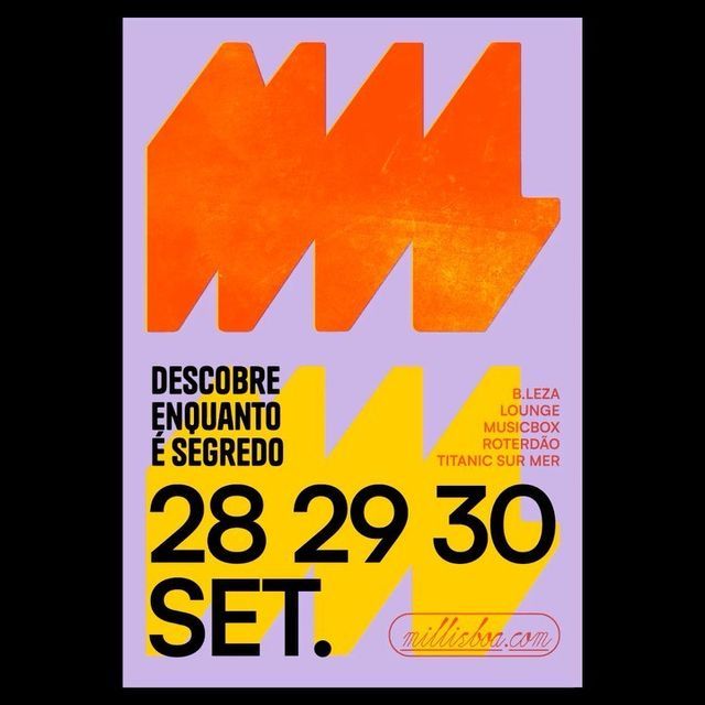
Bounty Hunters on Instagram: "Posters by José Costa Torres @josecostorres #bountyhuntersarchive #posters #graphicdesign #typography #visualdesign "
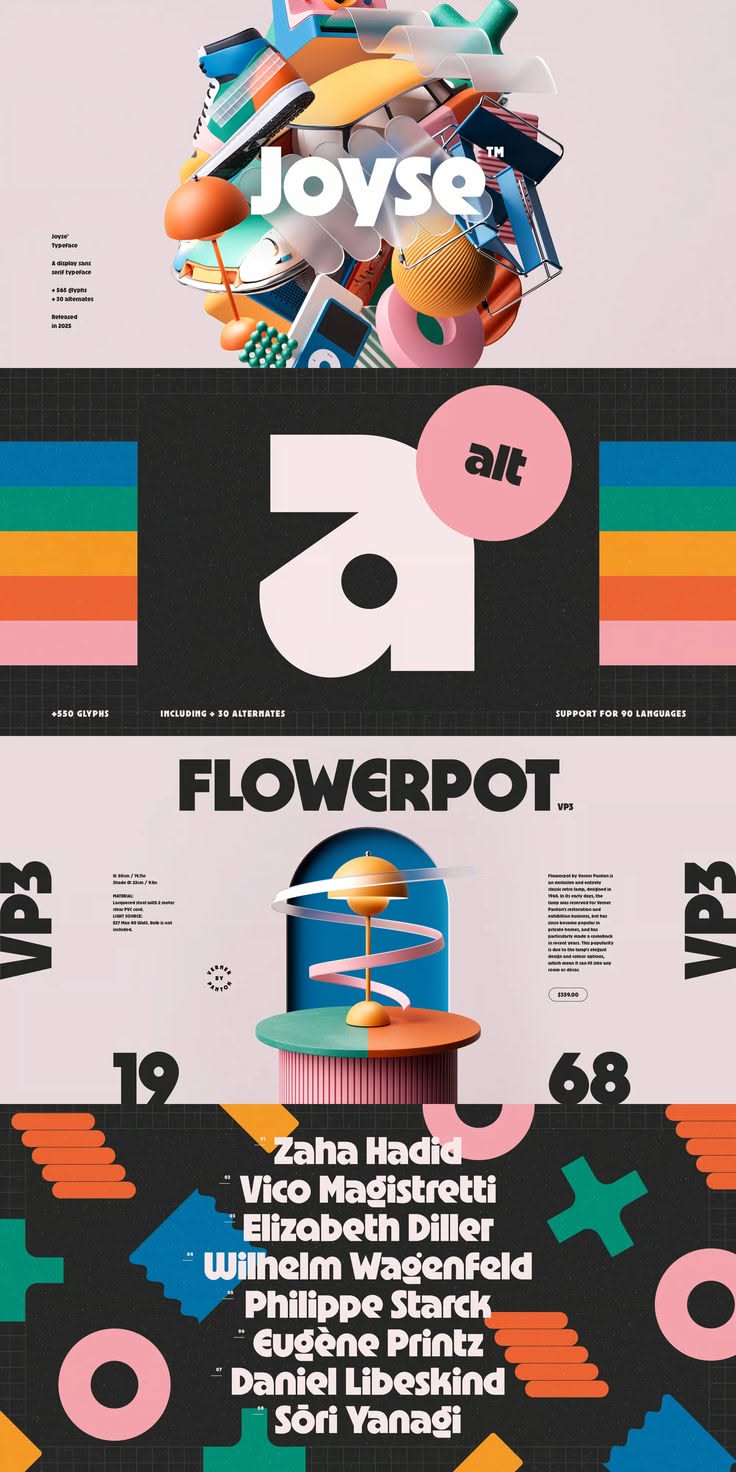
Vertical stack of colourful type specimen posters including Joyse, Flowerpot and VP3
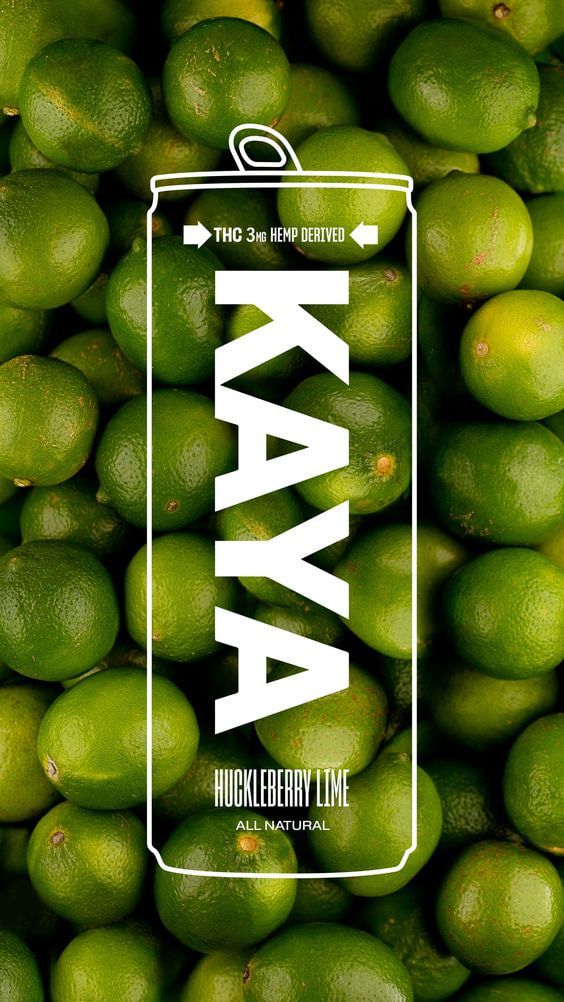
Kaya hard seltzer can standing on a bed of fresh limes with bold white type
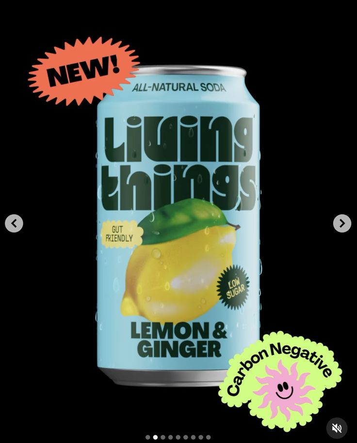
Living Things lemon and ginger soda can on black with new and carbon-negative starburst badges
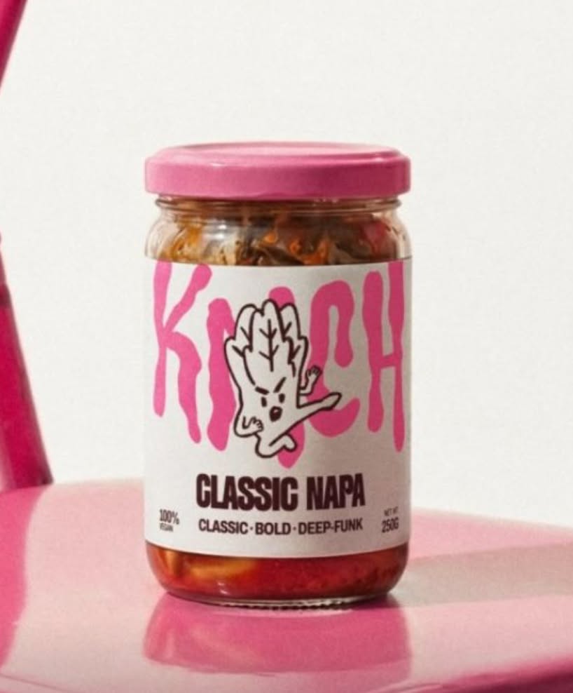
Kimchi jar with a pink lid and hand illustration, labelled Classic Napa
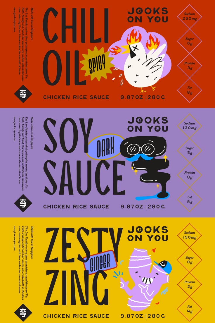
A playful and heartfelt brand identity for Jooks on You — a family-run food concept rooted in comfort, culture, and community. Inspired by nostalgic dishes like jook (rice porridge) and Hainanese chicken rice, this branding project features hand-draw
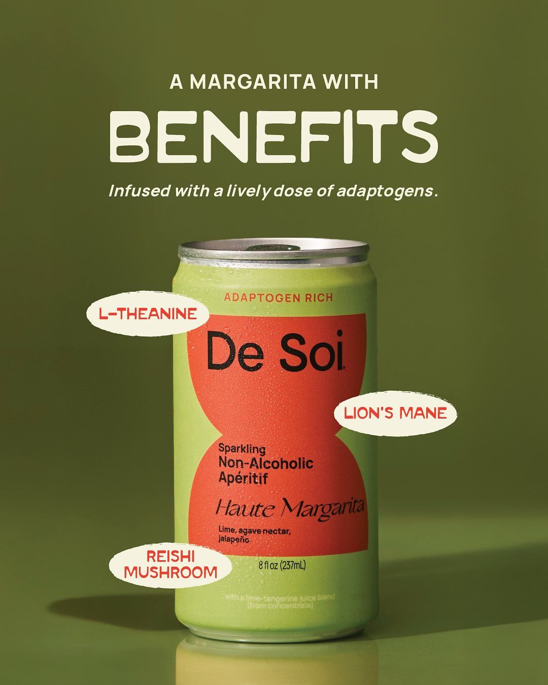
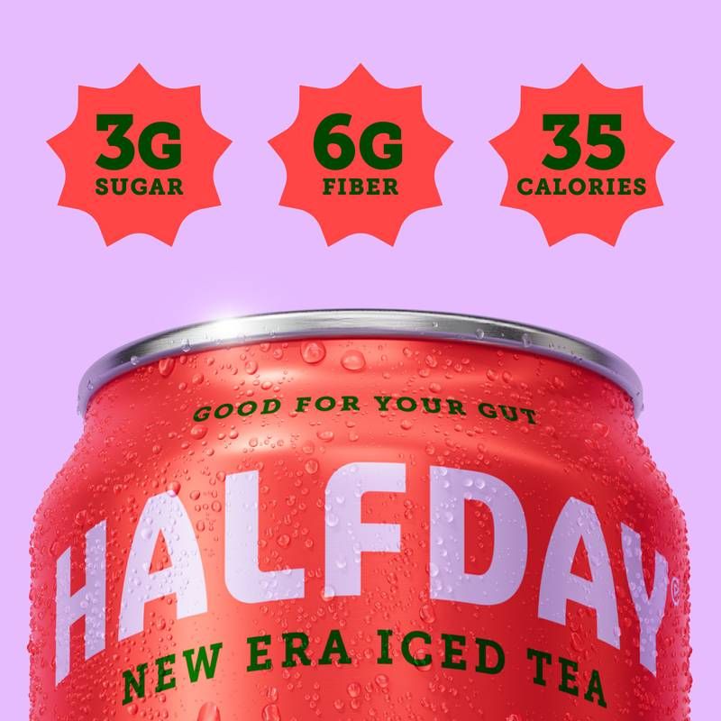
A bold, berry-packed escape with a refreshing smooth finish.
Introducing Haute Margarita: the evolution of a beloved classic—effervescent, elegant, and endlessly sippable. For lively dinner parties, long lunches, and that familiar, buzzy satisfaction of guac and drinks with friends. A little heat, a little hau
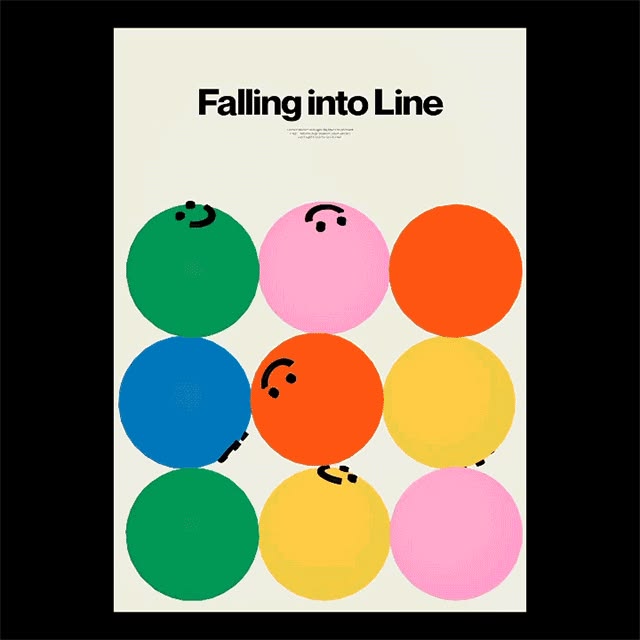
Falling into Line poster — a grid of coloured circles with simple drawn faces on black
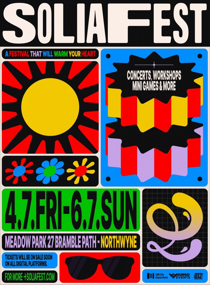
SOLIAFEST | Identity Design :: Behance
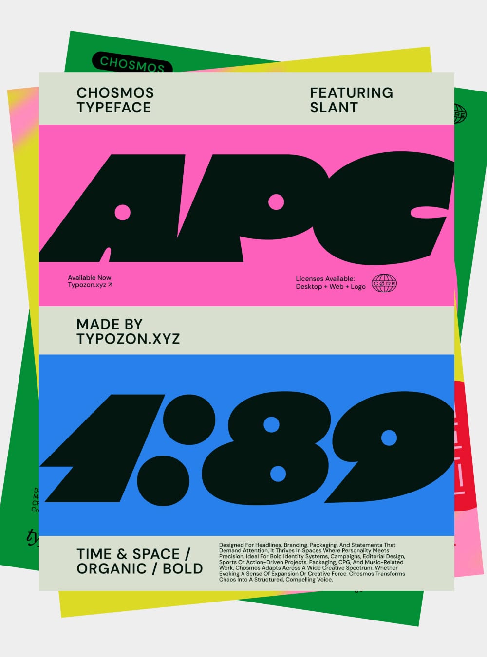
Stacked riso-bright type specimen sheets for the Chosmos typeface in pink, yellow and blue
CLIENT SPOTLIGHT - MORE MILES. Had to shine some more light on one of my fave projects of last year! I love that my client went from not wanting two bold colors to literally choosing two bold colors 😅 Paired a funky wordmark with editorial type for a
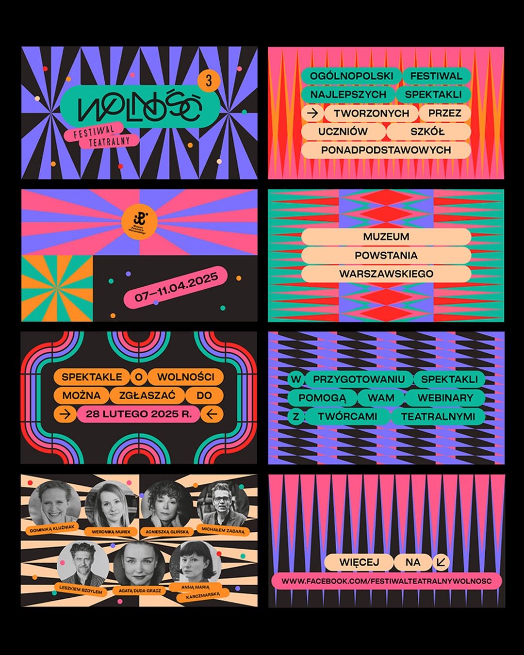
Neon poster grid on black for a Polish theatre festival, with warped moire patterns and photo strips
Most brands collect data after the work is done. That is reporting, not intelligence. The brands creating real momentum use data before the brief is written. They know where the journey breaks. They know what content compounds. They know where the ga
Great design work is never just design work. Behind every brand system and visual identity is a strategic layer most people never see. Research. Positioning. Audience architecture. Competitive mapping. That is where the real decisions get made. At An
To support Casper's evolution into a premium media platform, we developed a data-led acquisition strategy rooted in segmentation, personalisation and multi-channel funnel design. Audience profiling across progressive Gen Y professionals, conserva
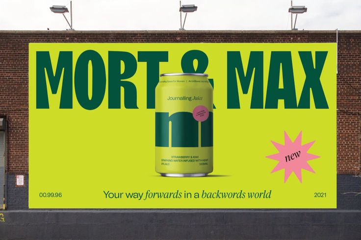
Carla Palette’s colourful identity for Mort & Max looks to set them apart in the busy CBD market — The Brand Identity
Bold und emotional: LIT rebranded Berliner Fintech › PAGE online
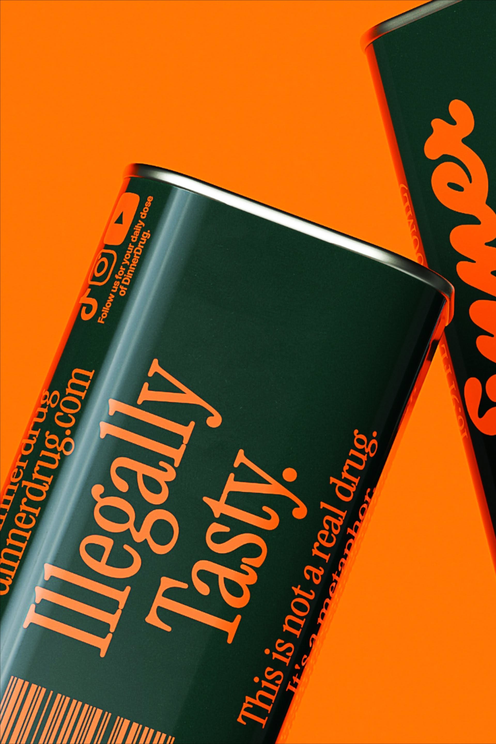
✅⬆️CLICK THE LINK!!⬆️Find the best olive oil for your next dinner. #oliveoil . #Logos #80s_Packaging_Design #Green_And_Orange_Branding #Orange_Green_Branding
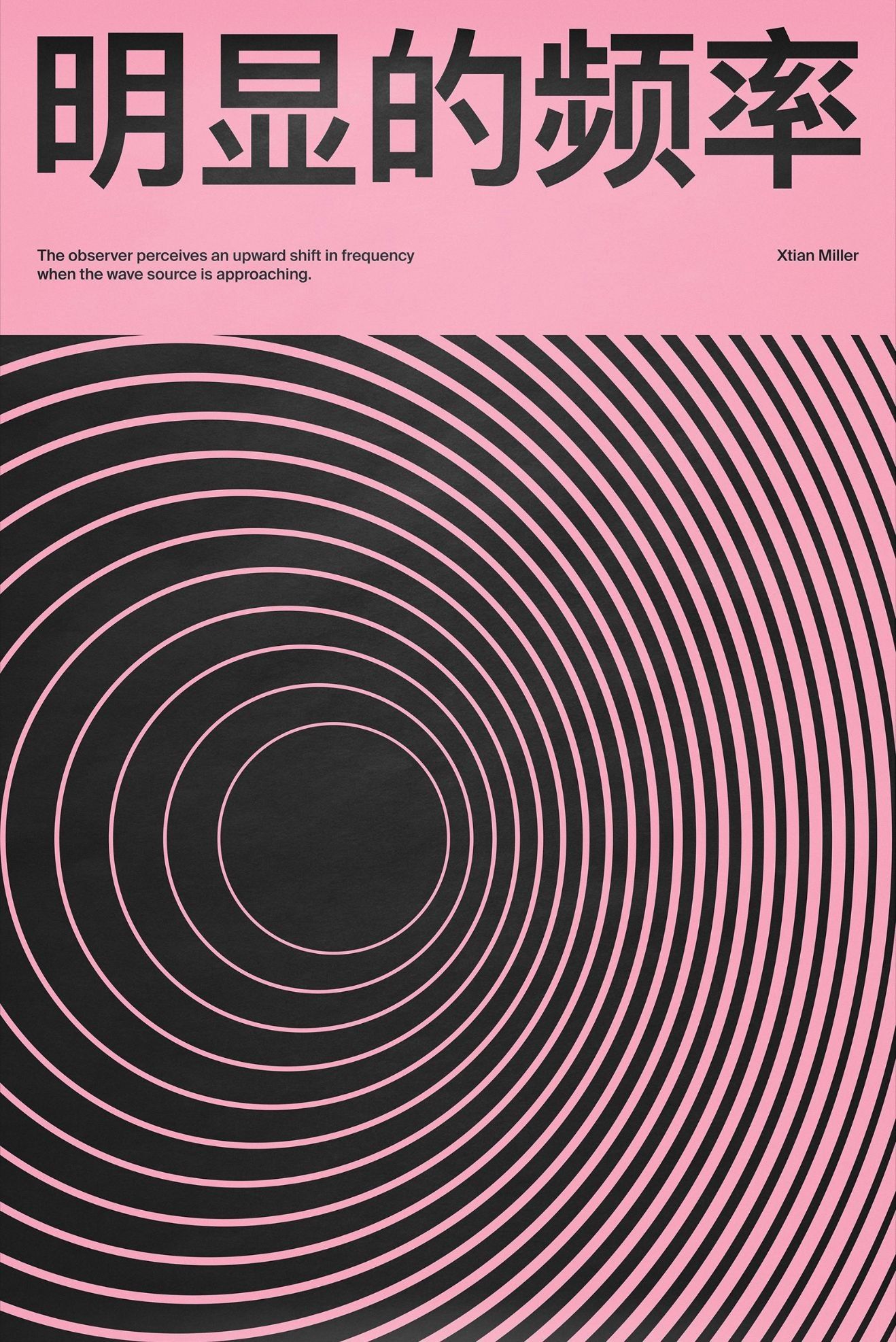
Poster pairing pink Chinese typography with a black concentric-circle moire pattern
Immerse yourself in Jessica Walsh's new type foundry showcasing playful typography, colourful packaging, and unique cover design ideas 🎨. This collection features box letters, type lockups, and hipster branding concepts perfect for inspiring stan
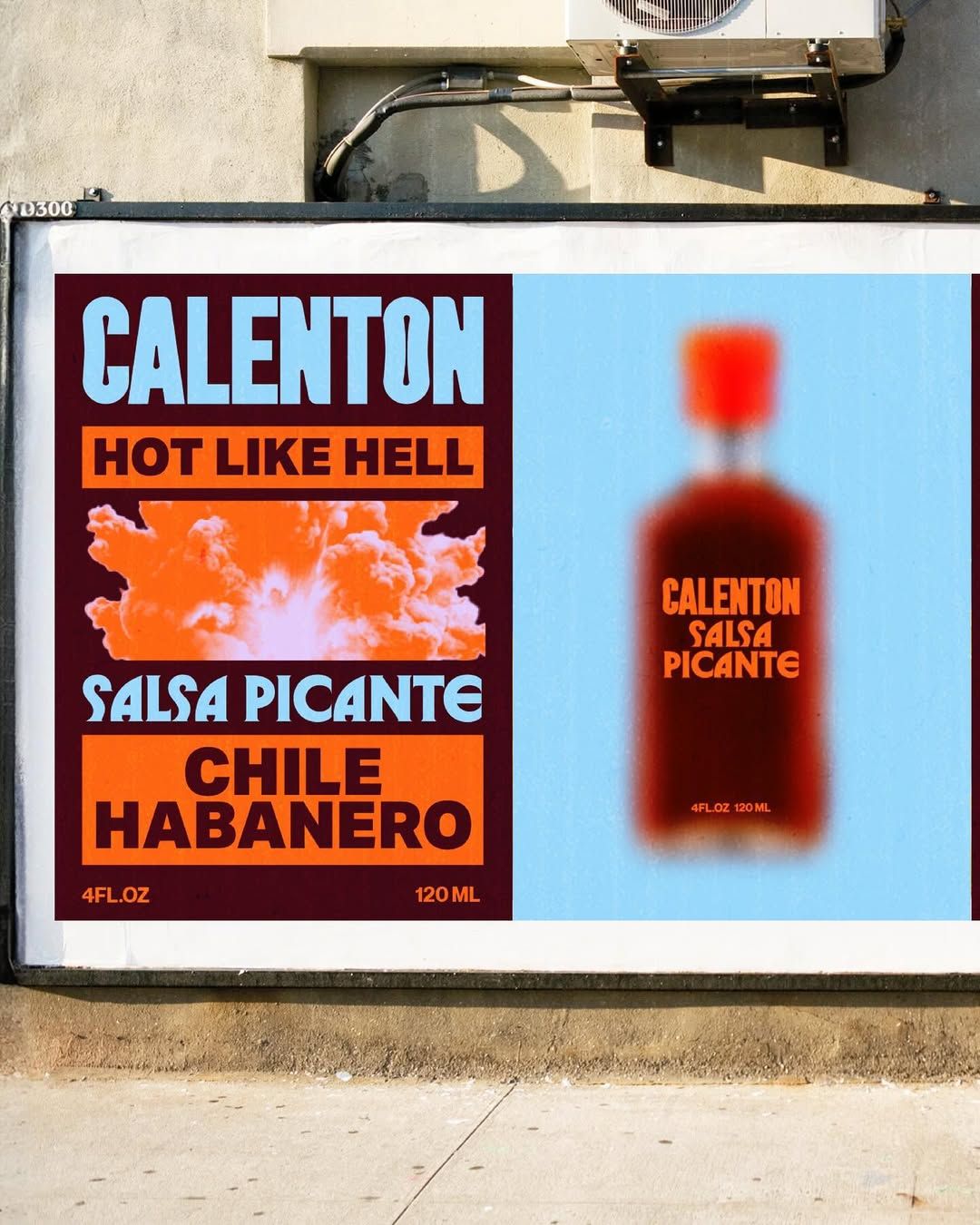
NO STUDIO | Spicy fictive brand concept for Calentón. Brief by designerbriefs #designerbriefs #dbcalenton #designchallenge #designeverywhere ... | Instagram
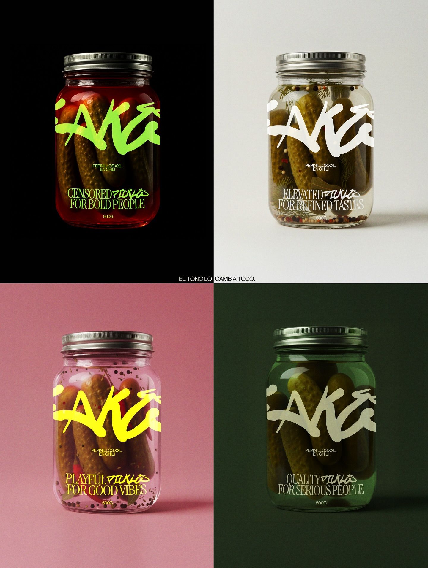
Me encanta cómo el tono puede cambiar por completo la percepción de una marca sin tocar la composición ni la tipografía. En este carrusel verás el mismo diseño, pero contado desde cuatro tonos distintos: 🧚🏻‍♀️ Divertido ✨ Elegante 👔 Serio 😈 Provocado
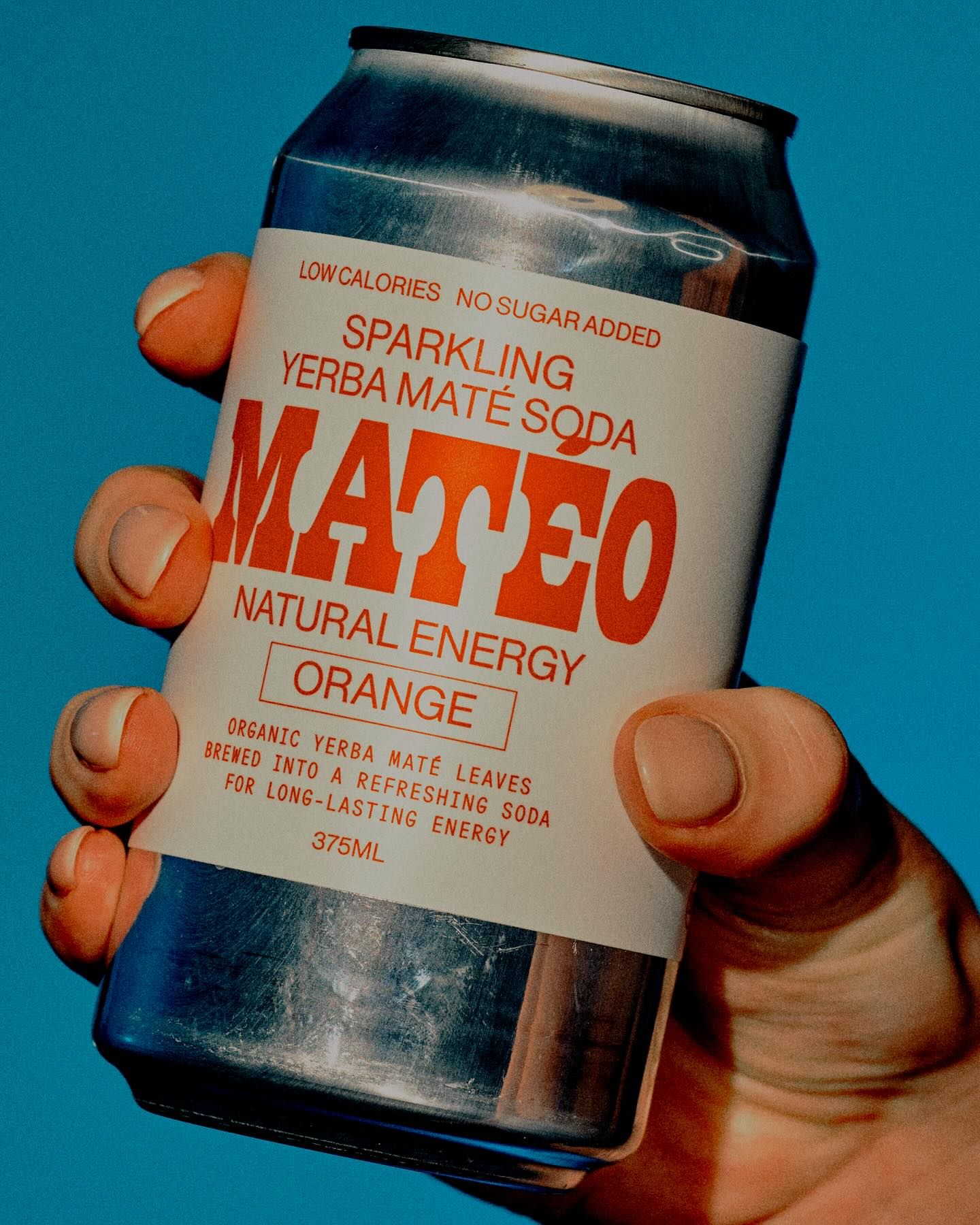
Matéo — Packaging, 2025 NEW: MATÉO VITAMIN C 🍊🍊🍊 Photography: @shelley_horan Campaign and Art Direction: Kimberly Fowler.intoit
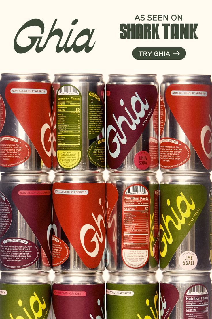
Rows of Ghia aperitif cans in deep red, olive and cream beneath an as-seen-on-Shark-Tank banner
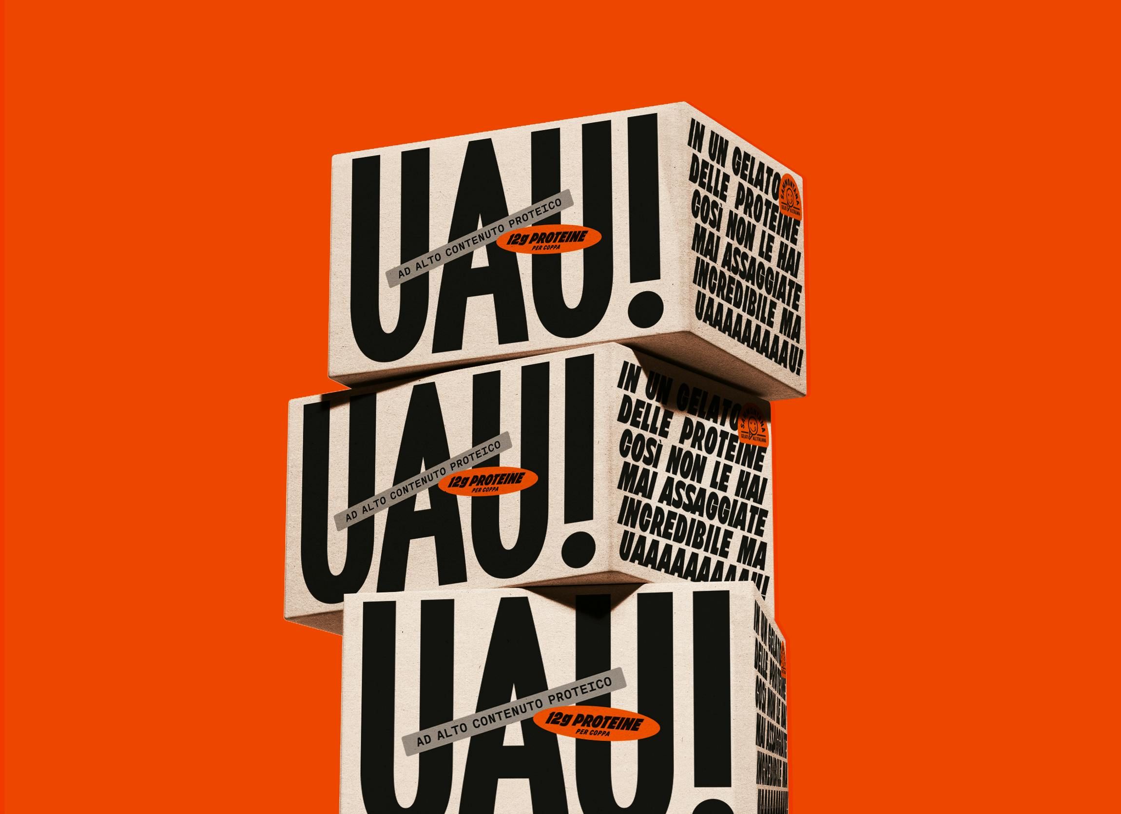
Stacked cartons on a vivid orange ground printed with an oversized UAU! wordmark and dense small type
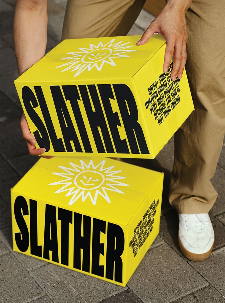
A person carrying two bright yellow Slather cartons printed with a sunburst motif and heavy black wordmark
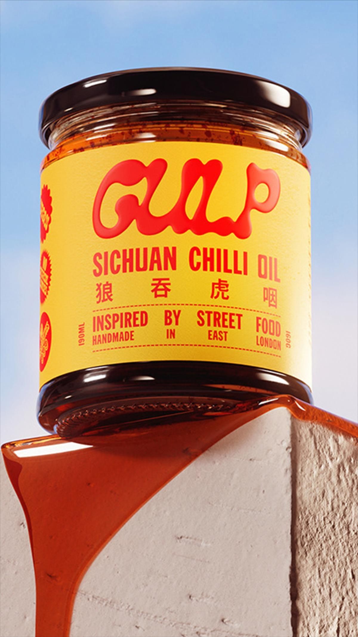
Gulp Sichuan chilli oil jar with a yellow label, oil spilling down a plaster plinth
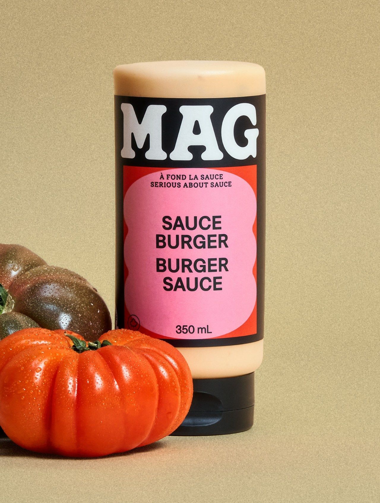
MAG burger sauce bottle with a pink label, styled on tan with heirloom tomatoes
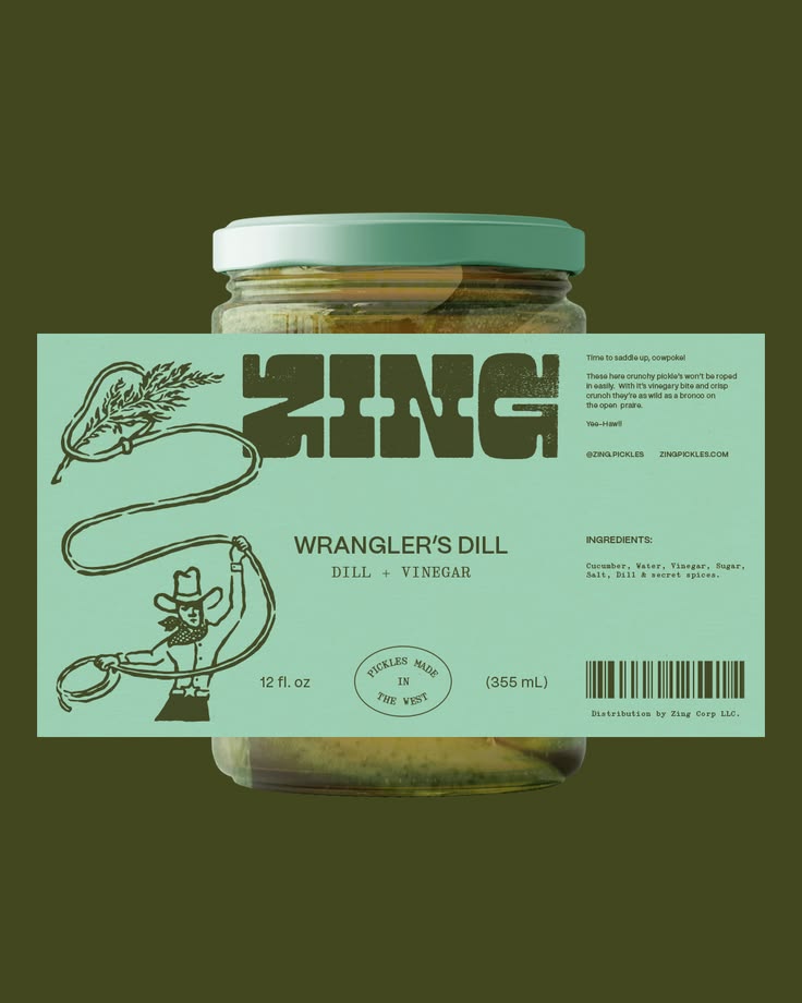
Zing Pickle Co. designed by Andreas Pedersen. Connect with them on Dribbble; the global community for designers and creative professionals.
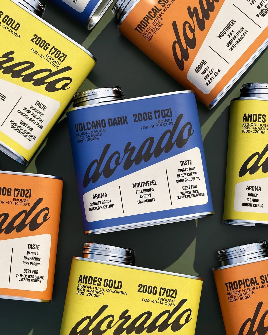
Scattered coffee cans in yellow, orange and cobalt with Dorado wordmarks and origin roast labels
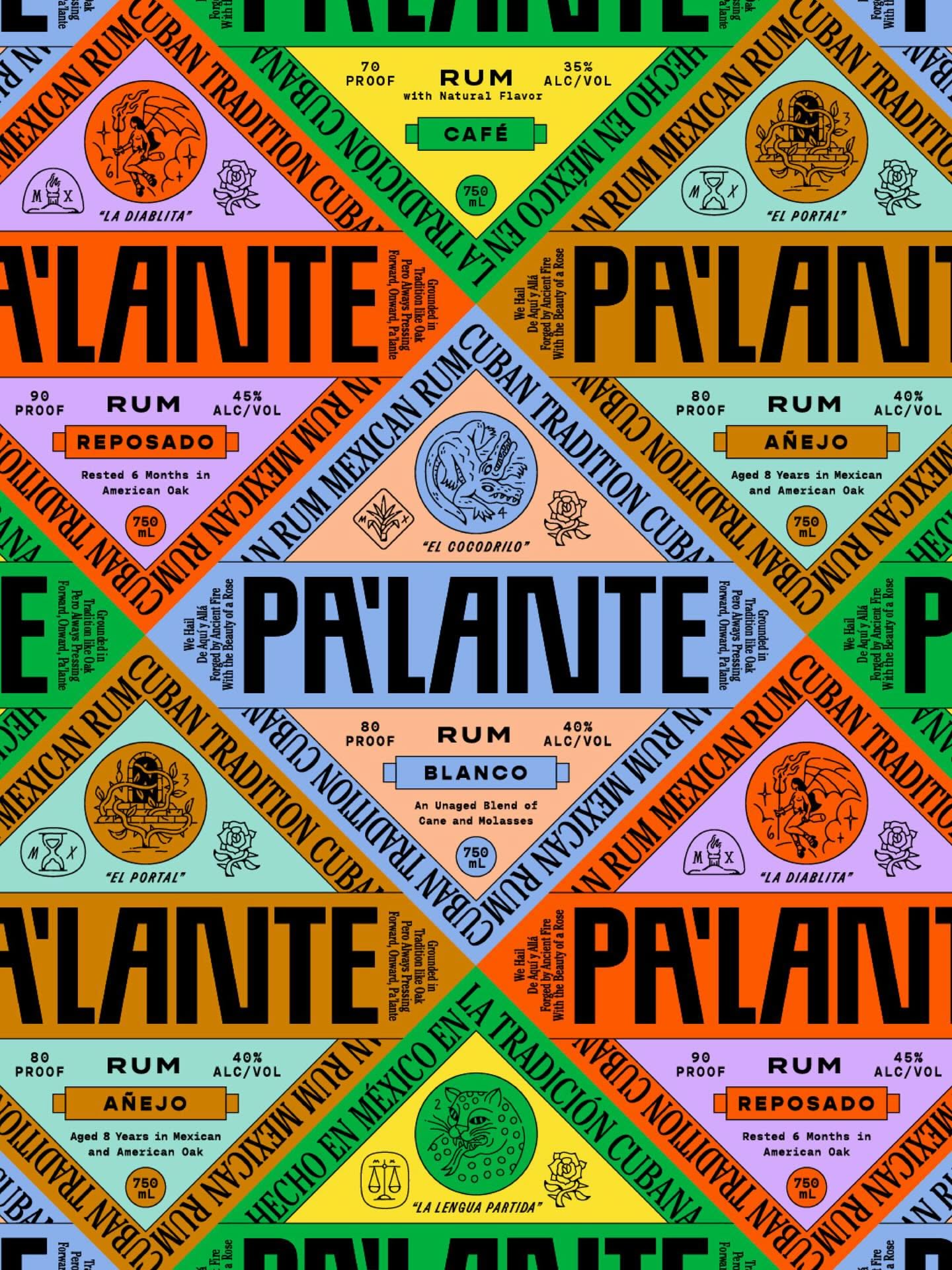
Tiled rum label artwork for Pr'lante in clashing brights with ornate badge illustrations
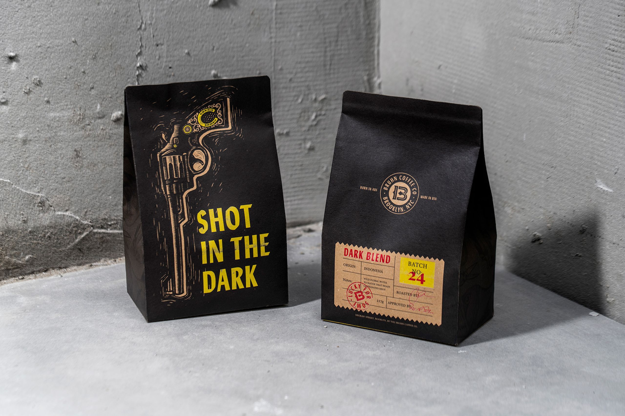
Two matte black coffee bags with yellow line illustration and a Shot in the Dark wordmark, photographed against a concrete wall
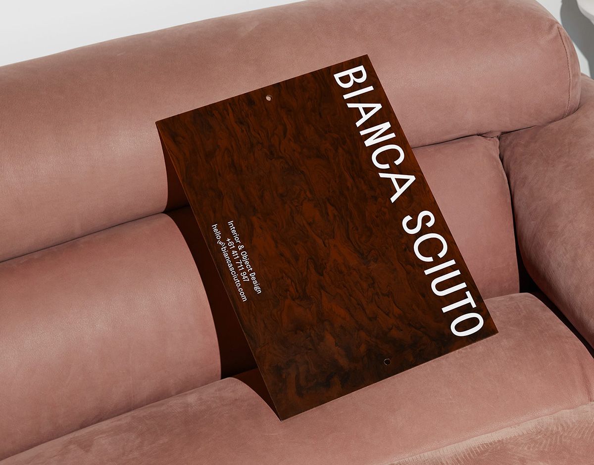
Dark woodgrain presentation folder with a vertical Bianca Sciuto wordmark, resting on a pink velvet sofa
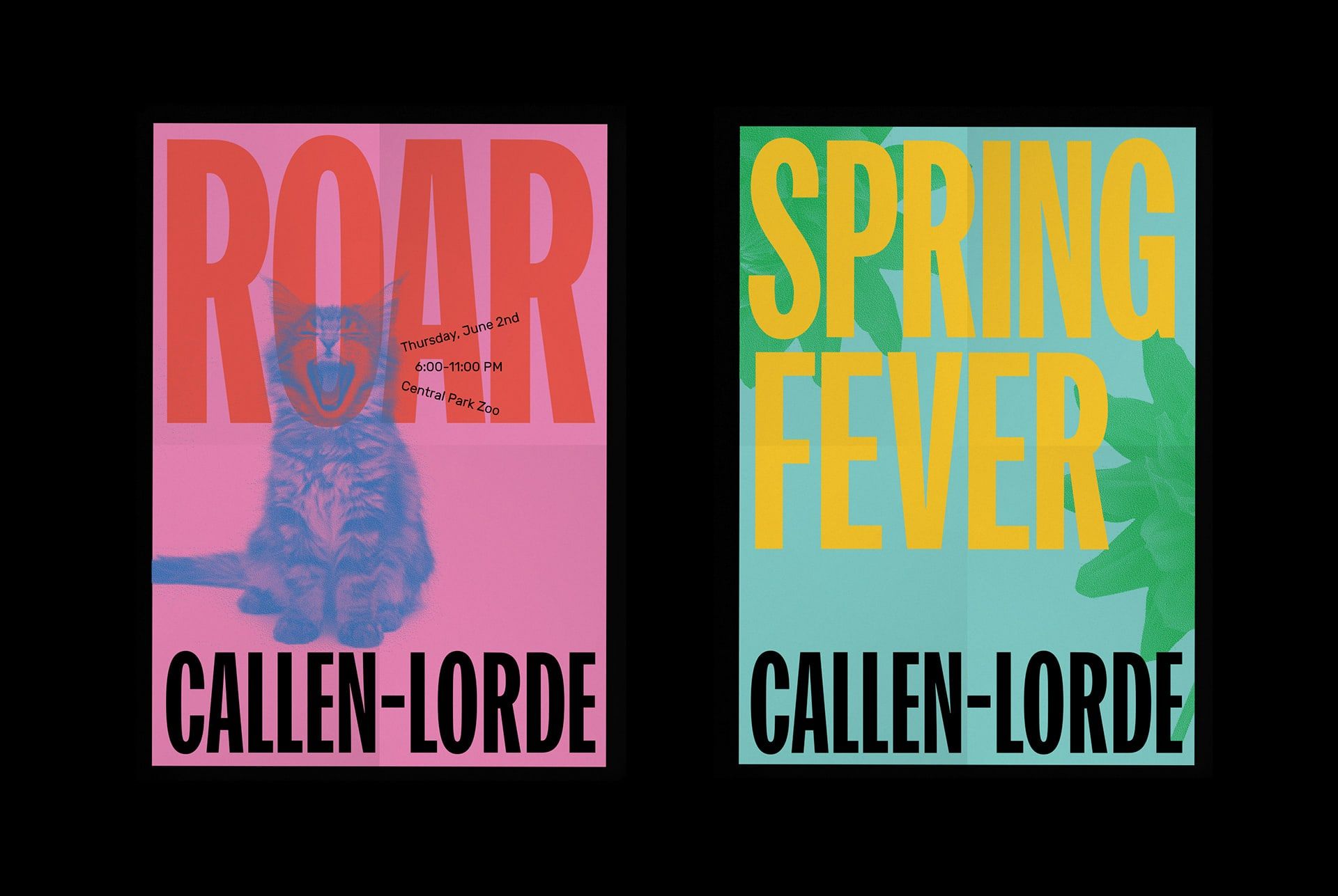
Callen-Lorde Identity - Mindsparkle Mag
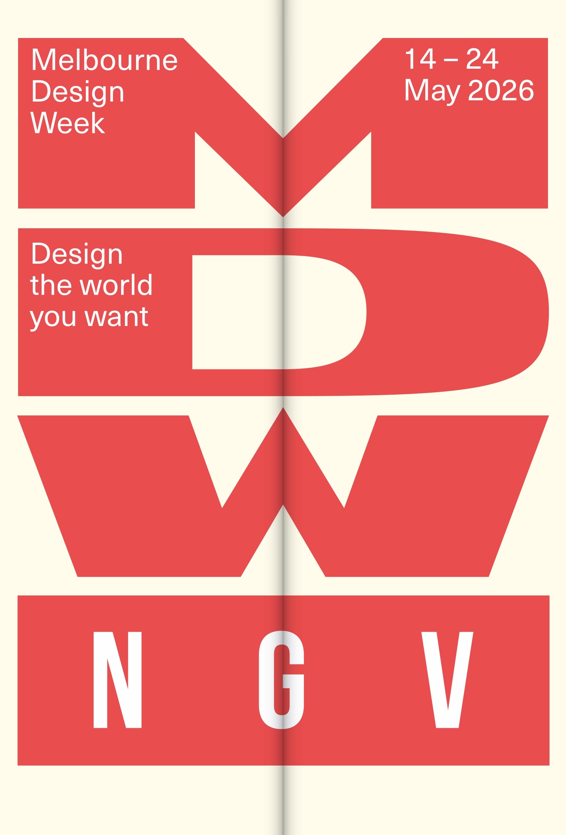
Melbourne Design Week
Good Good by Brittany Perkins.design is a housing organisation reimagining property development by putting well-being, people-centric design and sustainability at the forefront of everything they do. The new branding has been designed by Perks Design
Your brand is a commercial system. Most studios stop at how a brand looks. We build the engine underneath it. Strategy, identity, website, content, lifecycle, campaigns, commerce, experience. One system, pulling in one direction, built to move a busi
Most brands collect data after the work is done. That is reporting, not intelligence. The brands creating real momentum use data before the brief is written. They know where the journey breaks. They know what content compounds. They know where the ga
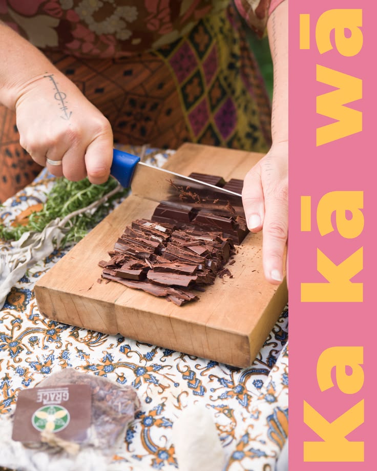
Most branding starts after the product exists. We built Ka Kā Wā the other way round. Brand and business designed together, from a blank page to a bar you can buy. Ka Kā Wā is sustainable cacao with something real underneath it. Ethically sourced bea
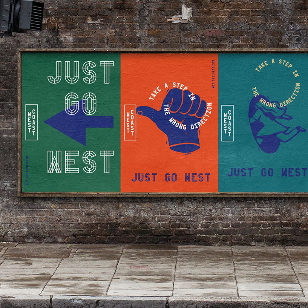
Great work from @forthepeopleau for West Coast Tassie #creativejobslist #creativejobs #jobsboard #CJL #creative #jobs #list #jobsearch
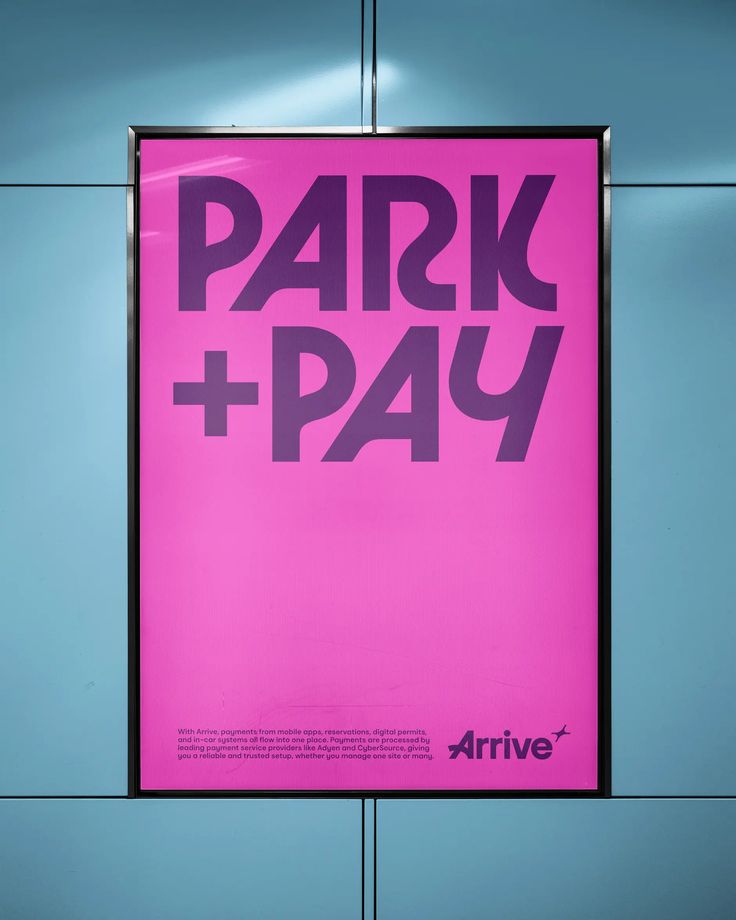
Magenta poster reading Park + Pay for Arrive, mounted in an illuminated transit lightbox
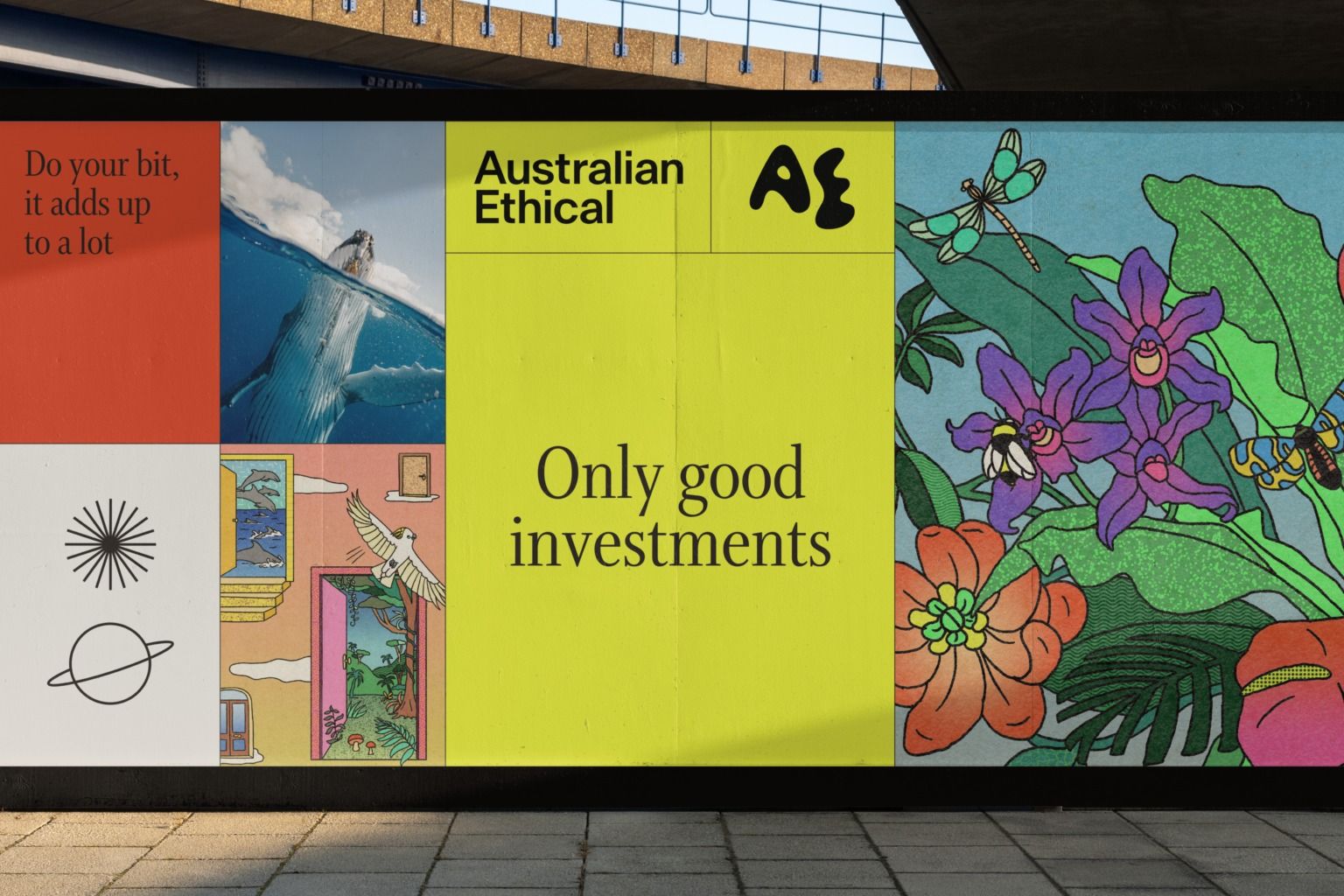
Accompany – Australian Ethical
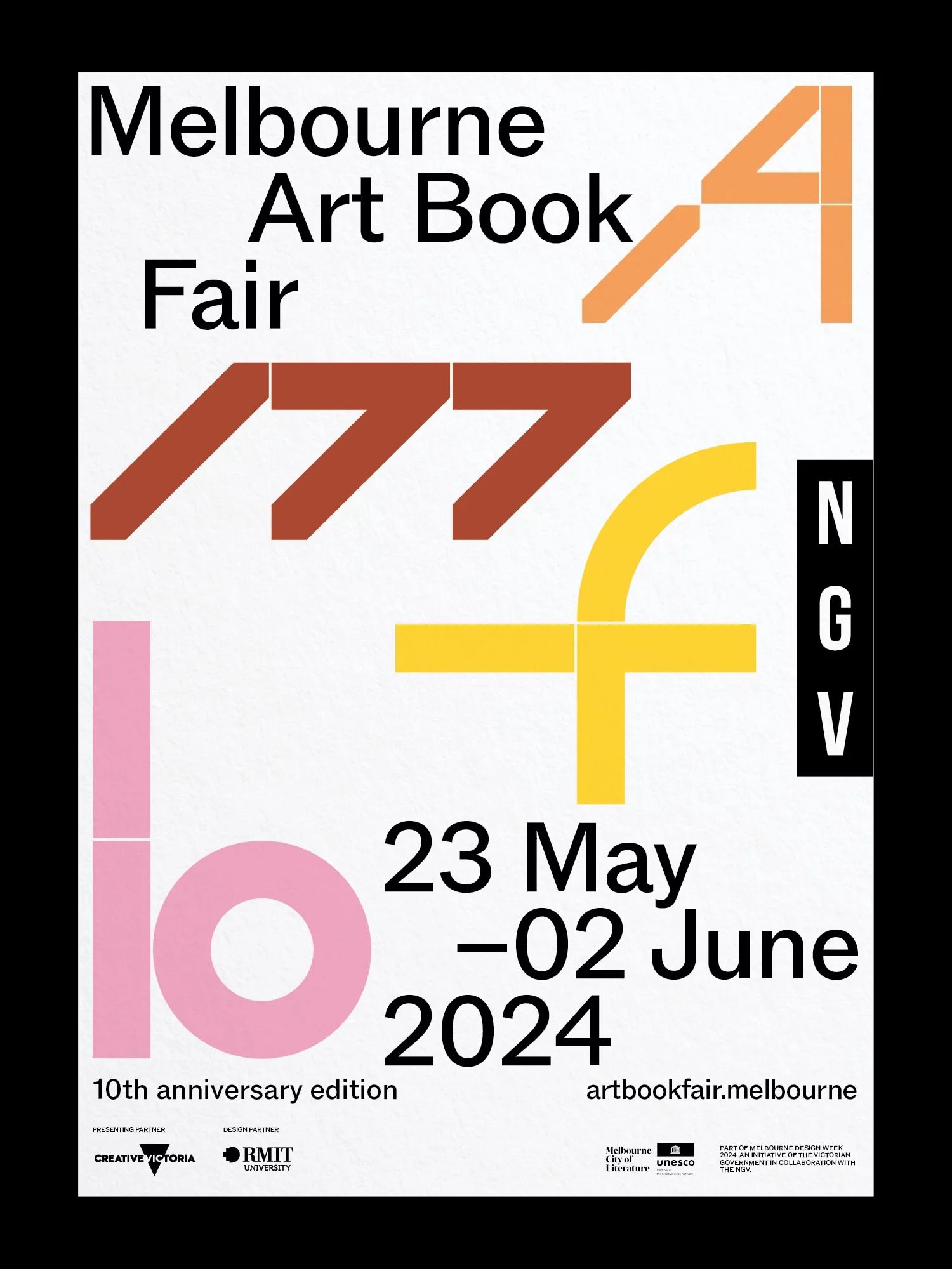
U-P — National Gallery of Victoria — Melbourne Art Book Fair
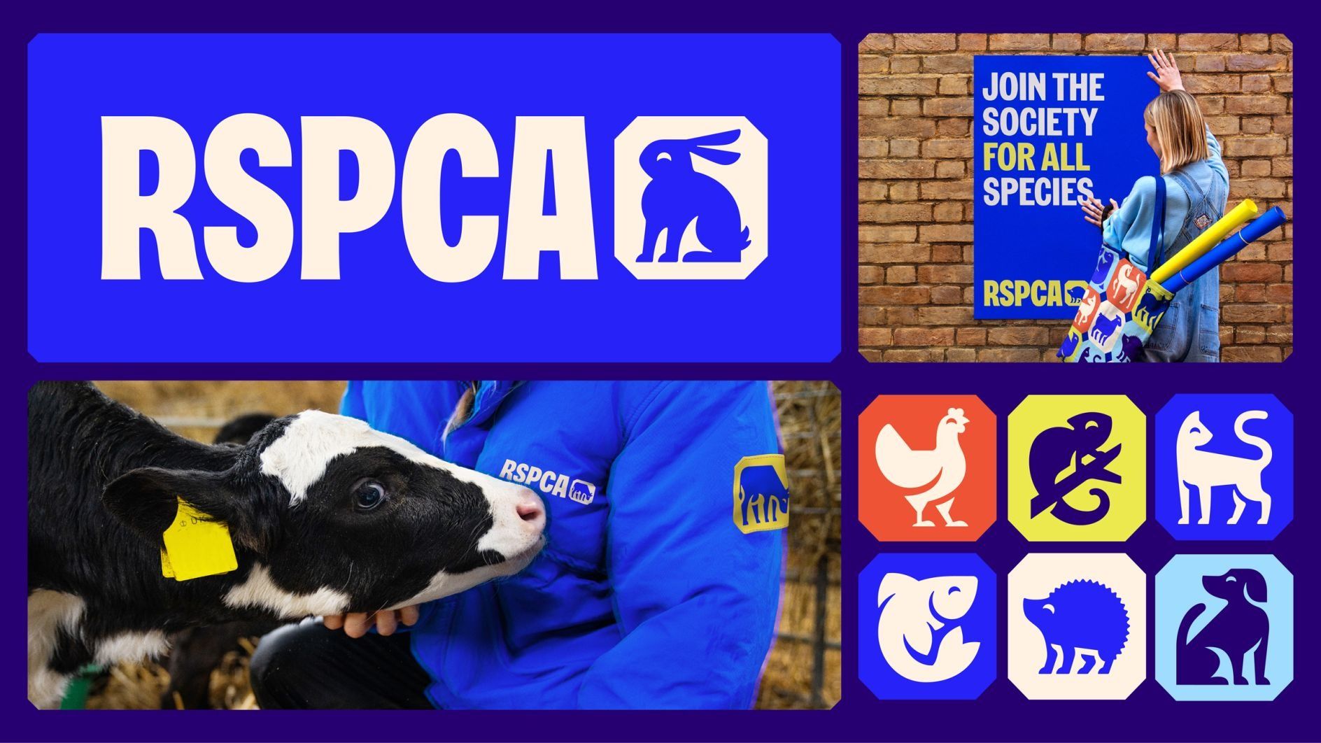
JKR overhauls RSPCA’s identity to align with its newly defined purpose | Creative Boom
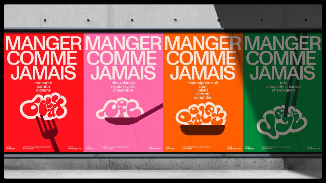
Four-colour packaging range for Manger Comme Jamais in red, pink, orange and green with line-drawn food illustrations

Archive