


.png)
Let’s talk

Thank you! Your submission has been received!
Oops! Something went wrong while submitting the form.
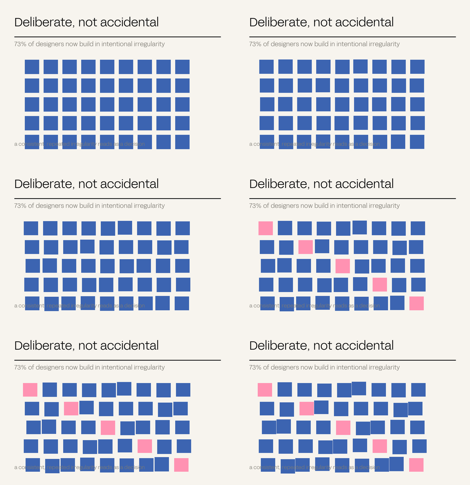
Roughly 73% of designers now incorporate intentionally imperfect elements – asymmetry, uneven type, visible texture – specifically to distinguish their work from AI-generated output. The polished, symmetrical, gradient-smooth aesthetic has become the marker of something nobody chose. Irregularity now reads as evidence of judgement.
Something strange has happened to visual polish. For decades it signalled investment: smooth, symmetrical and precise meant somebody had been paid to care. It now increasingly signals the opposite.
Generative tools produce competent, smooth, centred, gradient-rich work by default and at no cost. So the qualities that used to prove effort now prove only that a prompt was written.
73% of designers now deliberately introduce imperfection – asymmetric layouts, uneven typography, visible hand-drawn marks – specifically to look un-generated. The interesting work is sitting in the tension between machine-made and hand-made: AI for ideas and raw material, then broken on purpose with grain, collage, odd crops and real texture.
Polish used to prove somebody cared. Now it mostly proves nobody chose.
– The Antimony position
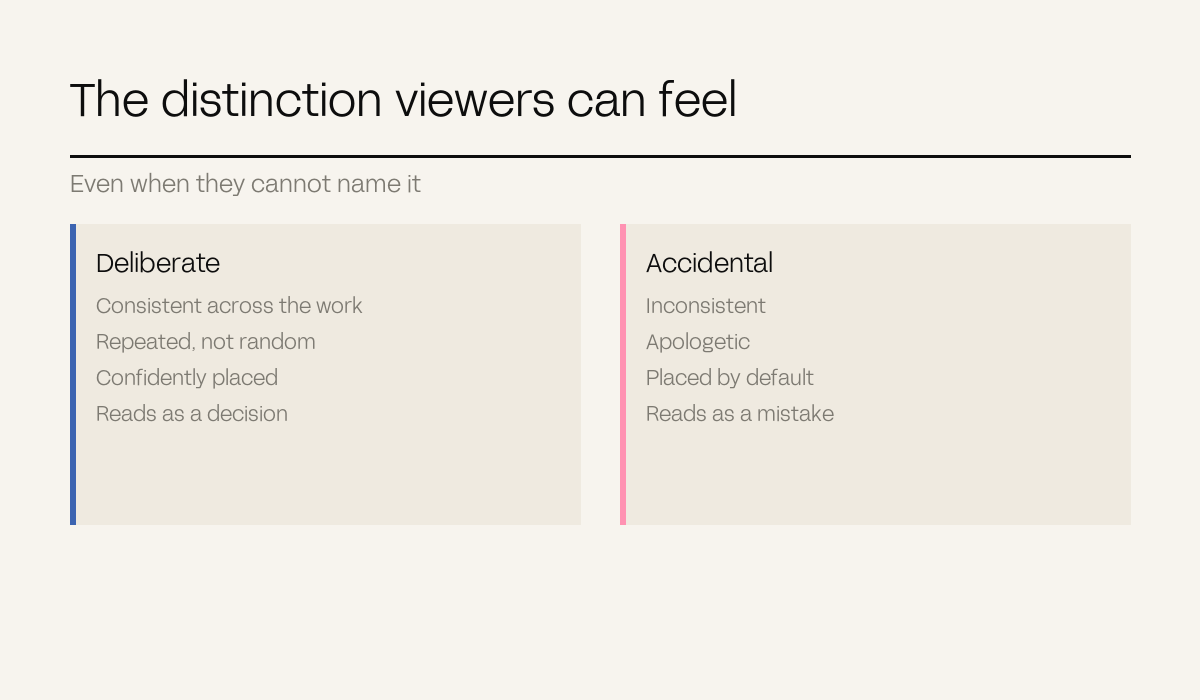
Controlled imperfection is not sloppiness, and the difference is legible to a viewer even when they cannot articulate it.
A deliberate irregularity is consistent, repeated, and confidently placed – it reads as a decision. An accidental one is inconsistent and apologetic, and reads as a mistake. Random noise added to a template does not become craft.
Letterpress bite, risograph misregistration, paper grain, the specific way a physical medium fails. These carry authenticity because they are traces of an actual process rather than a filter imitating one.
An off-centre composition that follows a grid nobody else uses reads as a system. One that is off-centre arbitrarily reads as a mistake.
The detail no generator would invent because it is too particular: a real place, a real constraint, a real quirk of the business. This is the cheapest and most reliable version, and it lives in content as much as in form.
Re<>Defined was built with the strategy, identity and spatial experience as one piece of work, so the brand had a sense of place – deliberately Papamoa rather than generically wellness. A generated wellness identity would have been smoother and interchangeable with fifty others.
SADA MEN is Australian-made with native ingredients, positioned as approachable, masculine and premium at once. That combination is specific enough to be difficult, which is precisely why it is defensible.
Welly Deli used in-store placemaking and photography direction – 200+ assets shot for a real deli rather than sourced – and revenue rose 28% with delivery ratings averaging 4.6 out of 5.
Every diagram in this series is drawn programmatically in our own typeface on our own palette, which is about as machine-made as production gets. The thing keeping it from looking generated is not texture – it is that each figure charts a specific real number from a specific named engagement.
The general rule: when the production method is unavoidably mechanical, specificity of content is what carries the human signal. A generic chart of invented data looks generated because it is generically true. A chart showing that one campaign produced leads at $16.20 could only have come from someone who ran it.

Definitions. Controlled imperfection: deliberate, systematic irregularity introduced as a design decision.