Let’s talk

Antimony Studio Showreel

Reel-illustration-Image
Close Icon
WELLY DELI
Full rebrand, identity, packaging, placemaking and channel design for a much-loved neighbourhood deli
EMAIL US
Antimony CS LioncRock Page Image
A SHORT INTRODUCTION
Wellington Street Delicatessen had a loyal following but a brand that wasn't doing the food justice, inconsistent across signage, packaging, social and delivery platforms. Antimony delivered a full rebrand: identity, design system, in-store placemaking, packaging, Uber Eats channel design and photography direction. Every touchpoint a customer meets, whether walking in, scrolling past or ordering from the couch, now tells the same story.
Barfoot & Thompson is New Zealand's largest privately owned agency, family-run for a hundred years. They brought us in to sell their most remote, premium coastal listings the way the best brands sell anything: online, at scale, to exactly the right people.The job was to turn high-end video and photography into a journey that found serious buyers and warmed them up long before they stood on the land. So we built the system to do it, and built it to repeat.
THE CHALLENGE

A loved deli the brand wasn't doing justice

THE CONTEXT

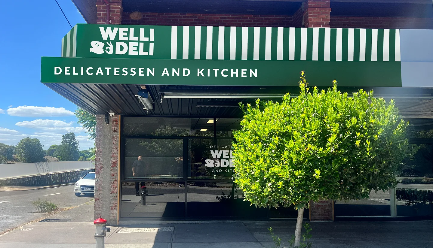
Wellington Street Delicatessen had the food and the regulars, but the brand was inconsistent across signage, packaging, social and delivery, so the experience on screen and on the shelf never matched the experience in the room.

THE MARKET

Neighbourhood hospitality now lives across walk-ins, social feeds and delivery apps at once. A deli that looks different in each place leaks trust and orders. Consistency across every touchpoint is the difference between a local favourite and a scalable brand.

OUR MOVE

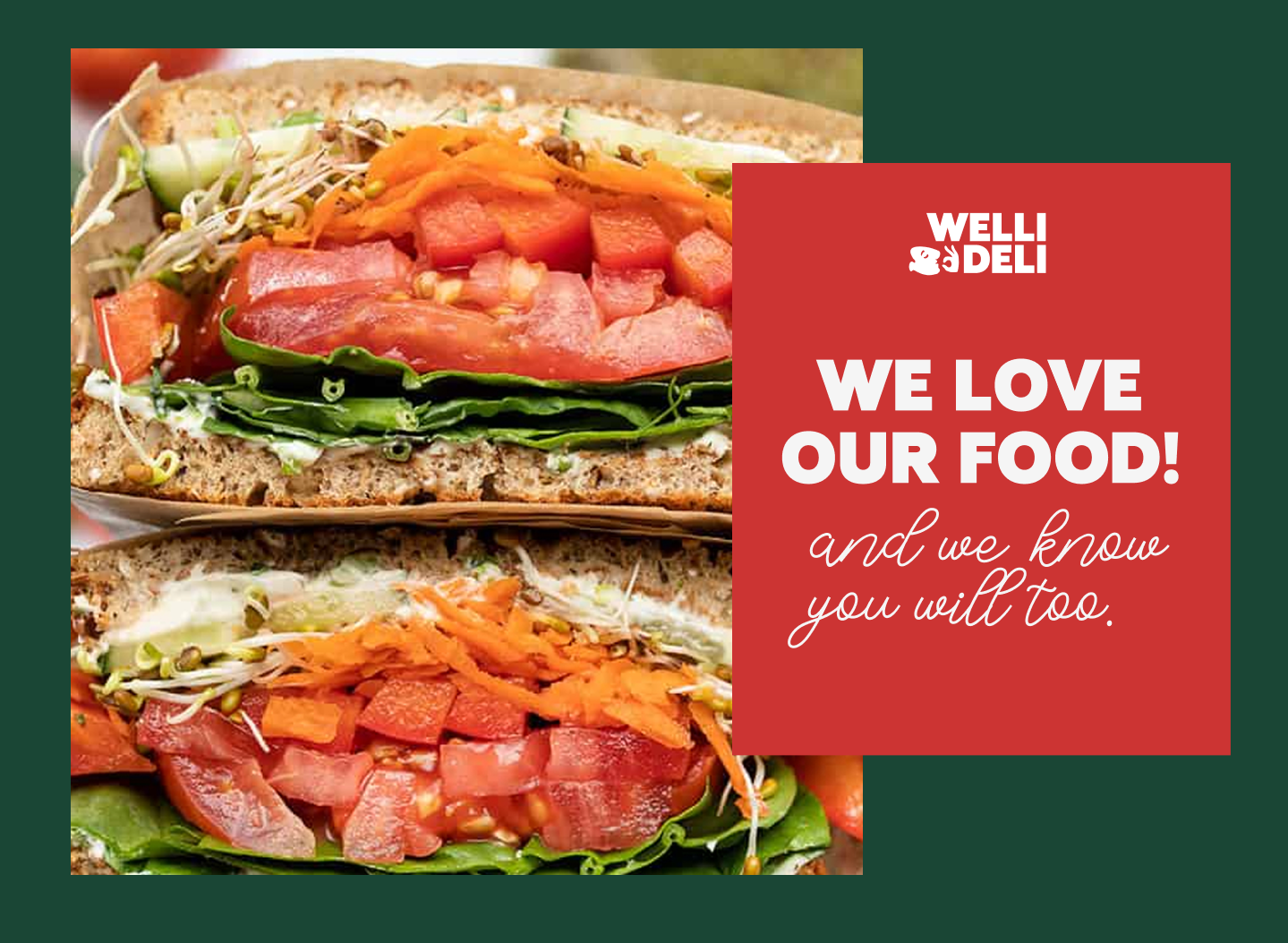
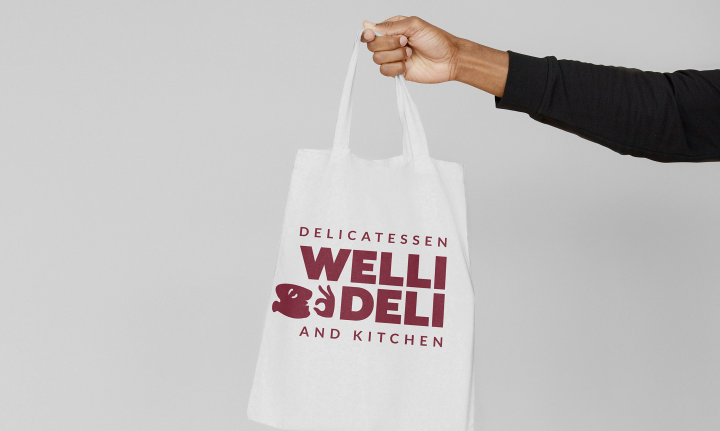
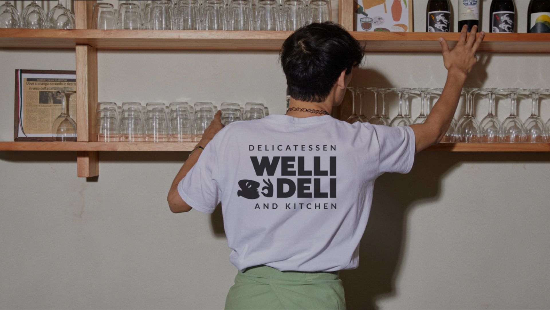
We delivered a full rebrand: a new identity and design system, in-store placemaking, packaging, Uber Eats channel design and photography direction, so every touchpoint tells one coherent story.

Wiroa Station

This private 88-hectare playground stretches over the tranquil Te Puna Inlet

SEE WIROA CASE STUDY

MATAKA LOT 14

This private 88-hectare playground stretches over the tranquil Te Puna Inlet

SEE MATAKA LOT 24  CASE STUDY

WORDS FROM ANTIMONY
A great deli lives or dies on consistency. The food was never the problem; the brand around it was telling three different stories. Our job was to make the signage, the packaging and the Uber Eats listing all feel like the same place you love walking into.
Sam Hill, Managing Director of Antimony

One story, from the front door to the delivery app.

WHAT WE DELIVERED

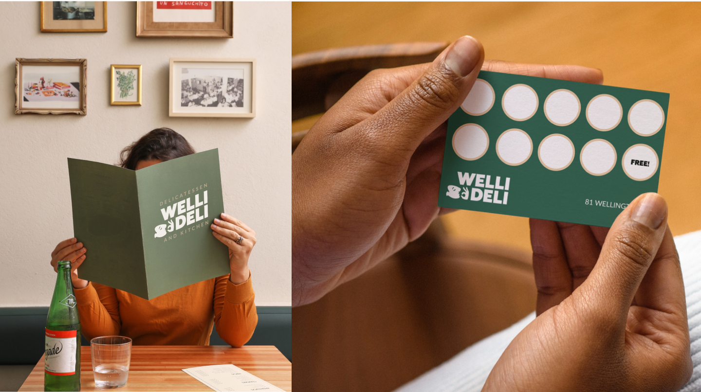
Antimony delivered naming, rebrand and a visual identity system, a design system and brand guidelines, placemaking and in-store branding, content strategy and social media channel design, packaging design and production, and photography and art direction.

EVERY TOUCHPOINT, ALIGNED

From the shopfront to the packaging to the Uber Eats listing, every customer touchpoint was rebuilt to tell the same story, so the brand finally matches the experience of being there.

MEASURABLE IMPACT

Revenue rose 28% since relaunch and Uber Eats order volume rose 48%, with delivery-platform ratings averaging 4.6 out of 5 post-redesign. Catering enquiries rose 40%, social following grew 2,800+ in the first six months, and 200+ photography assets were delivered across web, social and print.

WORDS FROM WELLY DELI
"We knew the food was good. Antimony made sure everything around it, the signage, the packaging, the way we look on Uber Eats, finally matched the experience of actually being here."
Khatan Shoab, Founder