Antimony have been working with Matt and the rest of the leadership team at 5th Element Wellness for since 2018. To date they are our oldest and dearest clients. Its difficult to distill & detail all of the intricate projects that we’ve done together for the past five years. 5th Element have always lead the way when it comes to health, wellbeing and innovation, even in the most difficult circumstances their adaptability, openness and resilience has earned them the award for most transformative business we’ve ever worked with.
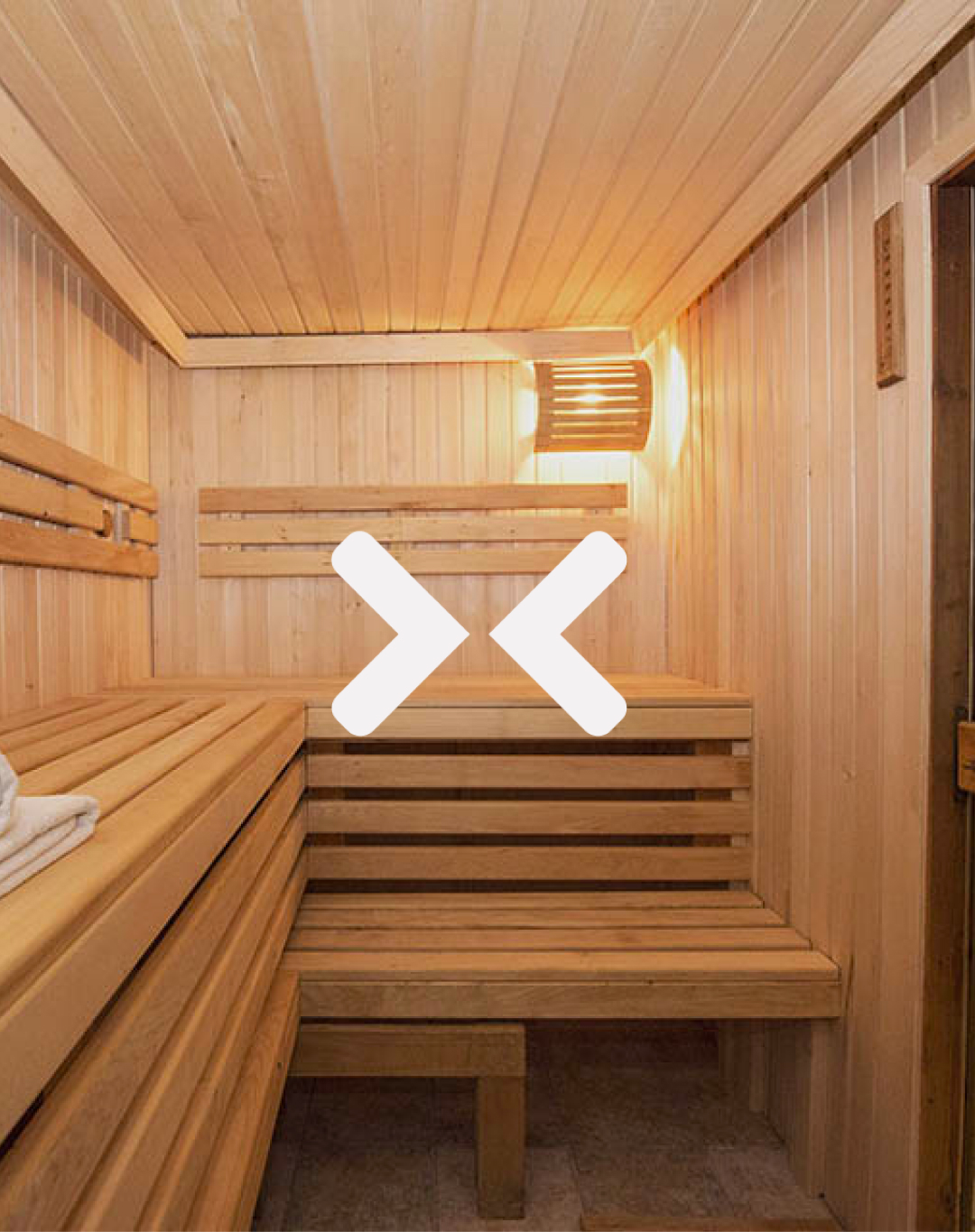
The multi-million dollar development launched in 2020 and has recently been nominated for several business awards both in Tauranga and in NZ. With 500+ Active members and a weekly local farmers market to further support the local community, Redefined have truly integrated within their chosen environment.
In 2018, New Zealand was the first western country to implement a $600 million ‘wellbeing budget’. This reflects why health and fitness is one of the most stable and fastest growing industries in New Zealand with 700,000+ current health club members nationally. Being a brand new concept in a $4.2 trillion global market, this project required deep analytical and critical thinking before formulating a long term go-to-market strategy for the business. For ReDefined, the Papamoa community is the second fastest growing suburb in New Zealand, with yearly growth of 7-10% predicted from 2019 - 2024. Our team created a predicted catchment pool of potential members, and implemented a plan to connect with them across a three phase program: Pre-Launch, Launch & Post Launch mimicking strategeies that aligned with Everett Rogers Innovation- Adoption curve
We are living in an era where digitalisation has changed our methods of communication. We are facing a digital society in which content and media evolve every day, creating new ways to consume information. There is an infinite number of ways in which to communicate a single message. Audiences and platforms have continued to multiply and each requires a specific approach.
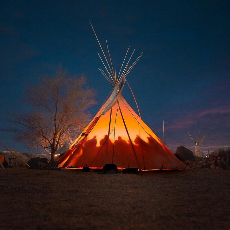
Antimony created an atomic graphic system that could be flexible and adaptable across the various touch points for the brand. First, a logo was developed based off of the visual research into mountains, the teepee and the Marae (Maori meeting place).
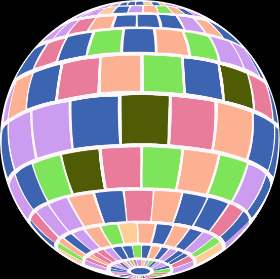
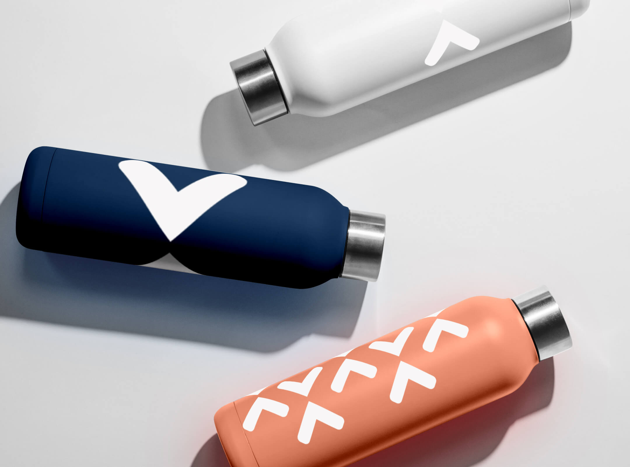
It was important that the symbol be a recognisable shape for ReDefined and their community to use while also conveying a sense of movement and transformation. Creating a family of supporting secondary shapes with the triangle representing sense of place, the diamond for wellbeing and the circle representing community.
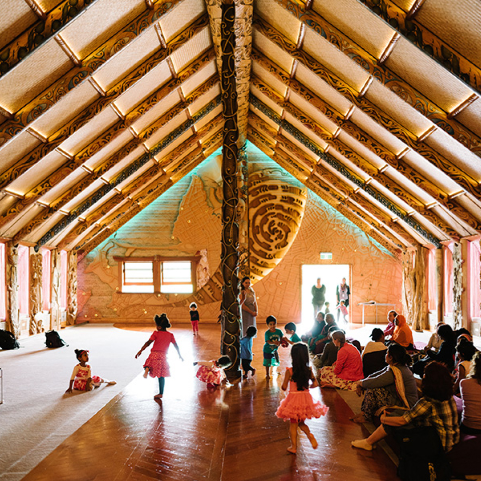
Our primary aim for the creative direction was to create a layered, yet accessible brand narrative across multiple client journey touch points. The narrative has the ability to expand and contract when required, connecting the dots and weaving aspects of the brand, the holistic services, and the space for members and the community to interact and commune with. We wanted to create a sense of sacredness for members when engaging with the space.
To translate the design into functional collateral and packaging, we returned to the essential elements of the symbolism and language that was created in the atomic design system. We focused on the raw elements of the brand and selected brand colours, matched with collateral that adds value to the business. Starting from the formal and organic shape of the brand symbol, we launched a process of transition from the literal to the abstract. Experiential value was the code at every level.
“I want to take this opportunity to share our sincere love and respect for the work Sam and Antimony did bringing our brand to life. Before Antimony we had nothing. Now we have a great brand, a unique story, a go-to-market strategy and a robust business plan that's helped us secure the investment we needed to launch and grow our dream"


Antimony have been working with Matt and the rest of the leadership team at 5th Element Wellness for since 2018. To date they are our oldest and dearest clients. Its difficult to distill & detail all of the intricate projects that we’ve done together for the past five years. 5th Element have always lead the way when it comes to health, wellbeing and innovation, even in the most difficult circumstances their adaptability, openness and resilience has earned them the award for most transformative business we’ve ever worked with.
The multi-million dollar development launched in 2020 and has recently been nominated for several business awards both in Tauranga and in NZ. With 500+ Active members and a weekly local farmers market to further support the local community, Redefined have truly integrated within their chosen environment.
In 2018, New Zealand was the first western country to implement a $600 million ‘wellbeing budget’. This reflects why health and fitness is one of the most stable and fastest growing industries in New Zealand with 700,000+ current health club members nationally. Being a brand new concept in a $4.2 trillion global market, this project required deep analytical and critical thinking before formulating a long term go-to-market strategy for the business. For ReDefined, the Papamoa community is the second fastest growing suburb in New Zealand, with yearly growth of 7-10% predicted from 2019 - 2024. Our team created a predicted catchment pool of potential members, and implemented a plan to connect with them across a three phase program: Pre-Launch, Launch & Post Launch mimicking strategeies that aligned with Everett Rogers Innovation- Adoption curve
We are living in an era where digitalisation has changed our methods of communication. We are facing a digital society in which content and media evolve every day, creating new ways to consume information. There is an infinite number of ways in which to communicate a single message. Audiences and platforms have continued to multiply and each requires a specific approach.
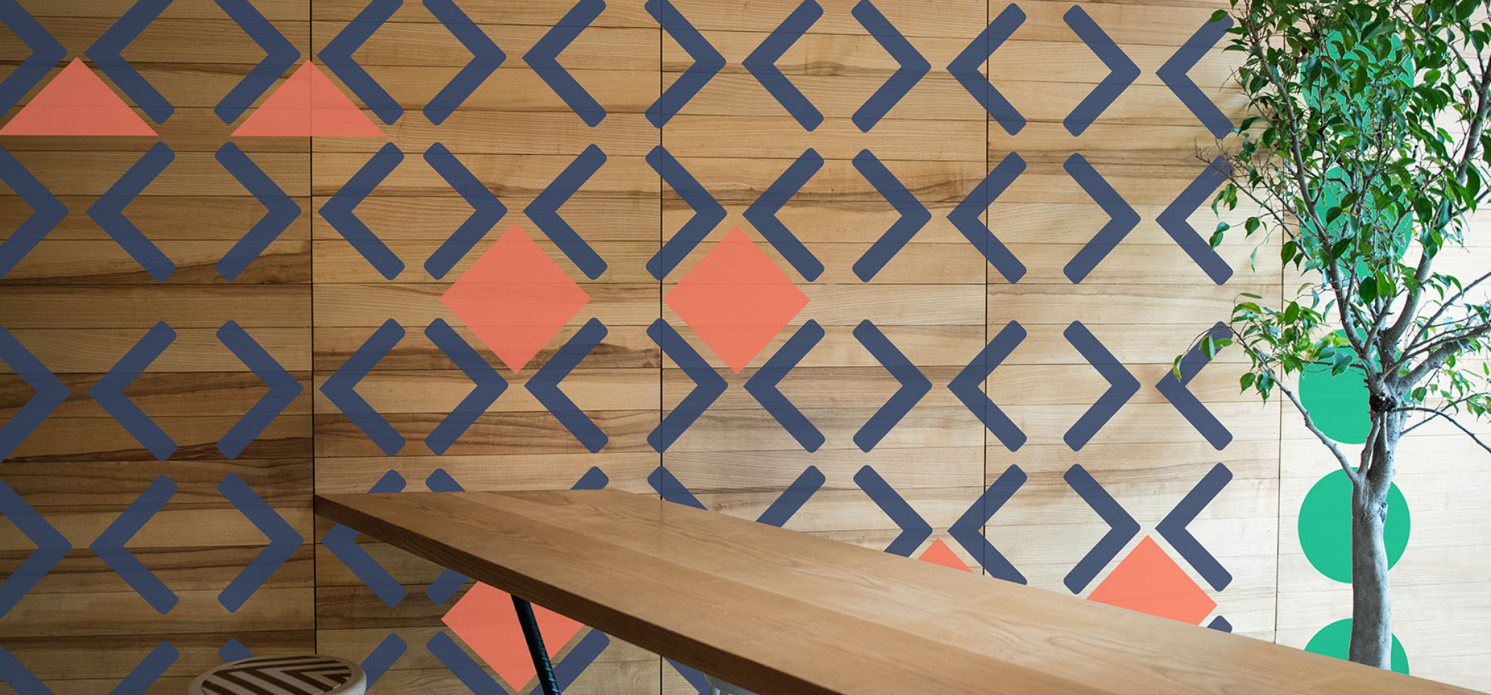
For many people, holistic health is still an abstract concept. The patterns were designed to illustrate a new design language reflective of the Redefined concept, aiming to make these ideas easily identifiable and relatable. This allowed us to bring together all the pieces of the puzzle through a contemporary, colourful and unique visual identity. This opened up new ways of telling stories for the brand, setting up a human centred way of communicating that could work across a variety of online and offline platforms. For the space itself, the system needed to be utilised in finding ways in which the team and members could identify different areas or modalities in the space.
Antimony created an atomic graphic system that could be flexible and adaptable across the various touch points for the brand. First, a logo was developed based off of the visual research into mountains, the teepee and the Marae (Maori meeting place).
It was important that the symbol be a recognisable shape for ReDefined and their community to use while also conveying a sense of movement and transformation. Creating a family of supporting secondary shapes with the triangle representing sense of place, the diamond for wellbeing and the circle representing community.
Our primary aim for the creative direction was to create a layered, yet accessible brand narrative across multiple client journey touch points. The narrative has the ability to expand and contract when required, connecting the dots and weaving aspects of the brand, the holistic services, and the space for members and the community to interact and commune with. We wanted to create a sense of sacredness for members when engaging with the space.
“I want to take this opportunity to share our sincere love and respect for the work Sam and Antimony did bringing our brand to life. Before Antimony we had nothing. Now we have a great brand, a unique story, a go-to-market strategy and a robust business plan that's helped us secure the investment we needed to launch and grow our dream"
Antimony have been working with Matt and the rest of the leadership team at 5th Element Wellness for since 2018. To date they are our oldest and dearest clients. Its difficult to distill & detail all of the intricate projects that we’ve done together for the past five years. 5th Element have always lead the way when it comes to health, wellbeing and innovation, even in the most difficult circumstances their adaptability, openness and resilience has earned them the award for most transformative business we’ve ever worked with.
The multi-million dollar development launched in 2020 and has recently been nominated for several business awards both in Tauranga and in NZ. With 500+ Active members and a weekly local farmers market to further support the local community, Redefined have truly integrated within their chosen environment.
In 2018, New Zealand was the first western country to implement a $600 million ‘wellbeing budget’. This reflects why health and fitness is one of the most stable and fastest growing industries in New Zealand with 700,000+ current health club members nationally. Being a brand new concept in a $4.2 trillion global market, this project required deep analytical and critical thinking before formulating a long term go-to-market strategy for the business. For ReDefined, the Papamoa community is the second fastest growing suburb in New Zealand, with yearly growth of 7-10% predicted from 2019 - 2024. Our team created a predicted catchment pool of potential members, and implemented a plan to connect with them across a three phase program: Pre-Launch, Launch & Post Launch mimicking strategeies that aligned with Everett Rogers Innovation- Adoption curve
We are living in an era where digitalisation has changed our methods of communication. We are facing a digital society in which content and media evolve every day, creating new ways to consume information. There is an infinite number of ways in which to communicate a single message. Audiences and platforms have continued to multiply and each requires a specific approach.
Antimony created an atomic graphic system that could be flexible and adaptable across the various touch points for the brand. First, a logo was developed based off of the visual research into mountains, the teepee and the Marae (Maori meeting place).
It was important that the symbol be a recognisable shape for ReDefined and their community to use while also conveying a sense of movement and transformation. Creating a family of supporting secondary shapes with the triangle representing sense of place, the diamond for wellbeing and the circle representing community.
Our primary aim for the creative direction was to create a layered, yet accessible brand narrative across multiple client journey touch points. The narrative has the ability to expand and contract when required, connecting the dots and weaving aspects of the brand, the holistic services, and the space for members and the community to interact and commune with. We wanted to create a sense of sacredness for members when engaging with the space.
To translate the design into functional collateral and packaging, we returned to the essential elements of the symbolism and language that was created in the atomic design system. We focused on the raw elements of the brand and selected brand colours, matched with collateral that adds value to the business. Starting from the formal and organic shape of the brand symbol, we launched a process of transition from the literal to the abstract. Experiential value was the code at every level.
“I want to take this opportunity to share our sincere love and respect for the work Sam and Antimony did bringing our brand to life. Before Antimony we had nothing. Now we have a great brand, a unique story, a go-to-market strategy and a robust business plan that's helped us secure the investment we needed to launch and grow our dream"
Antimony have been working with Matt and the rest of the leadership team at 5th Element Wellness for since 2018. To date they are our oldest and dearest clients. Its difficult to distill & detail all of the intricate projects that we’ve done together for the past five years. 5th Element have always lead the way when it comes to health, wellbeing and innovation, even in the most difficult circumstances their adaptability, openness and resilience has earned them the award for most transformative business we’ve ever worked with.
The multi-million dollar development launched in 2020 and has recently been nominated for several business awards both in Tauranga and in NZ. With 500+ Active members and a weekly local farmers market to further support the local community, Redefined have truly integrated within their chosen environment.
In 2018, New Zealand was the first western country to implement a $600 million ‘wellbeing budget’. This reflects why health and fitness is one of the most stable and fastest growing industries in New Zealand with 700,000+ current health club members nationally. Being a brand new concept in a $4.2 trillion global market, this project required deep analytical and critical thinking before formulating a long term go-to-market strategy for the business. For ReDefined, the Papamoa community is the second fastest growing suburb in New Zealand, with yearly growth of 7-10% predicted from 2019 - 2024. Our team created a predicted catchment pool of potential members, and implemented a plan to connect with them across a three phase program: Pre-Launch, Launch & Post Launch mimicking strategeies that aligned with Everett Rogers Innovation- Adoption curve
We are living in an era where digitalisation has changed our methods of communication. We are facing a digital society in which content and media evolve every day, creating new ways to consume information. There is an infinite number of ways in which to communicate a single message. Audiences and platforms have continued to multiply and each requires a specific approach.
Antimony's strategy was centered around building a mobile-first content platform, serving as the nucleus for education and engagement. The website was designed to be the 'central point of truth', disseminating diverse formats of content from infographics to podcasts, all crafted to foster meaningful discussion and offer a broad perspective on key cannabis issues in Australia.
The Honahlee platform was meticulously crafted with a user-centric approach, ensuring ease of navigation and engagement. The emphasis on mobile-first content, coupled with diverse media formats, ensured that Honahlee's message reached its audience effectively, making complex cannabis information accessible and engaging
The Honahlee platform was meticulously crafted with a user-centric approach, ensuring ease of navigation and engagement. The emphasis on mobile-first content, coupled with diverse media formats, ensured that Honahlee's message reached its audience effectively, making complex cannabis information accessible and engaging
“I want to take this opportunity to share our sincere love and respect for the work Sam and Antimony did bringing our brand to life. Before Antimony we had nothing. Now we have a great brand, a unique story, a go-to-market strategy and a robust business plan that's helped us secure the investment we needed to launch and grow our dream"
Antimony have been working with Matt and the rest of the leadership team at 5th Element Wellness for since 2018. To date they are our oldest and dearest clients. Its difficult to distill & detail all of the intricate projects that we’ve done together for the past five years. 5th Element have always lead the way when it comes to health, wellbeing and innovation, even in the most difficult circumstances their adaptability, openness and resilience has earned them the award for most transformative business we’ve ever worked with.
The multi-million dollar development launched in 2020 and has recently been nominated for several business awards both in Tauranga and in NZ. With 500+ Active members and a weekly local farmers market to further support the local community, Redefined have truly integrated within their chosen environment.
In 2018, New Zealand was the first western country to implement a $600 million ‘wellbeing budget’. This reflects why health and fitness is one of the most stable and fastest growing industries in New Zealand with 700,000+ current health club members nationally. Being a brand new concept in a $4.2 trillion global market, this project required deep analytical and critical thinking before formulating a long term go-to-market strategy for the business. For ReDefined, the Papamoa community is the second fastest growing suburb in New Zealand, with yearly growth of 7-10% predicted from 2019 - 2024. Our team created a predicted catchment pool of potential members, and implemented a plan to connect with them across a three phase program: Pre-Launch, Launch & Post Launch mimicking strategeies that aligned with Everett Rogers Innovation- Adoption curve
We are living in an era where digitalisation has changed our methods of communication. We are facing a digital society in which content and media evolve every day, creating new ways to consume information. There is an infinite number of ways in which to communicate a single message. Audiences and platforms have continued to multiply and each requires a specific approach.
Antimony created an atomic graphic system that could be flexible and adaptable across the various touch points for the brand. First, a logo was developed based off of the visual research into mountains, the teepee and the Marae (Maori meeting place).
It was important that the symbol be a recognisable shape for ReDefined and their community to use while also conveying a sense of movement and transformation. Creating a family of supporting secondary shapes with the triangle representing sense of place, the diamond for wellbeing and the circle representing community.
Our primary aim for the creative direction was to create a layered, yet accessible brand narrative across multiple client journey touch points. The narrative has the ability to expand and contract when required, connecting the dots and weaving aspects of the brand, the holistic services, and the space for members and the community to interact and commune with. We wanted to create a sense of sacredness for members when engaging with the space.
To translate the design into functional collateral and packaging, we returned to the essential elements of the symbolism and language that was created in the atomic design system. We focused on the raw elements of the brand and selected brand colours, matched with collateral that adds value to the business. Starting from the formal and organic shape of the brand symbol, we launched a process of transition from the literal to the abstract. Experiential value was the code at every level.
“I want to take this opportunity to share our sincere love and respect for the work Sam and Antimony did bringing our brand to life. Before Antimony we had nothing. Now we have a great brand, a unique story, a go-to-market strategy and a robust business plan that's helped us secure the investment we needed to launch and grow our dream"
Antimony have been working with Matt and the rest of the leadership team at 5th Element Wellness for since 2018. To date they are our oldest and dearest clients. Its difficult to distill & detail all of the intricate projects that we’ve done together for the past five years. 5th Element have always lead the way when it comes to health, wellbeing and innovation, even in the most difficult circumstances their adaptability, openness and resilience has earned them the award for most transformative business we’ve ever worked with.
Elly Sofocli is a leading Australian bridal designer celebrated for her architectural silhouettes, artisanal detail, and daring femininity. With increasing demand from international stockists and a growing global profile, Elly needed more than a website she needed a digital ecosystem that could support e-commerce, made-to-order management, and a seamless luxury experience. As Elly Sofocli’s recognition grew, her digital presence needed to reflect the brand’s evolution from boutique atelier to a globally recognised name in bridal couture. This meant more than a pretty website. We needed to deliver a high-end experience while keeping the craftsmanship and couture details front and centre.
The bridal industry is intensely competitive. Bridal and luxury fashion brands face a delicate challenge in going digital: maintaining exclusivity while expanding access. Elly’s legacy was built offline, but the next chapter needed scalable, story-rich infrastructure. Her clients aren’t casual browsers they’re women making life-defining decisions. The experience had to meet them with elegance, clarity and confidence at every click. For Elly, growth was coming from three fronts: a surge in made-to-order demand, international stockist interest, and direct customer enquiries. However, the website lacked the functionality and flexibility to meet this scale. Stockist journeys, international clientele, and internal management tools were underdeveloped.
We are living in an era where digitalisation has changed our methods of communication. We are facing a digital society in which content and media evolve every day, creating new ways to consume information. There is an infinite number of ways in which to communicate a single message. Audiences and platforms have continued to multiply and each requires a specific approach.

Elly was managing international interest, stockist growth, and made-to-order requests across disparate channels manual forms, email chains, and offline processes. Her site didn’t reflect the global brand she’d become. More than a refresh, she needed a total digital transformation to meet demand while preserving the couture feel.
We approached Elly Sofocli’s transformation with both strategy and sensitivity, ensuring that every layer of her digital ecosystem reflected the elegance of her craft while equipping her business for scale. The process began with audience and journey mapping, allowing us to fully understand the emotional, logistical and aspirational touch points of her clients.
We led a complete reimagining of the brand’s digital identity—designing a new visual system, refining her tone of voice, and crafting content to better reflect the couture experience she offers. We designed and built a custom Webflow site with a headless architecture, prioritising performance and editorial polish. We introduced e-commerce for the first time in the brand’s history, carefully balancing accessibility with exclusivity for our veil store front. This included dedicated pathways for made-to-order collections, veil purchases, and stockist engagement. On the backend, we streamlined her workflows with integrated CRM systems, custom booking forms, and scalable infrastructure, ensuring the site not only looked premium but functioned powerfully.
Every decision was made to uphold Elly’s reputation while setting the foundation for international growth, and the result is a digital presence that feels deeply personal, intelligently built, and unmistakably hers.
Elly Sofocli’s digital presence is now truly global, supporting online orders from the US, and Asia while nurturing exclusive partnerships across Australia. She now engages customers directly through a polished marketing platform, with bookings and orders streamlined through a fully integrated Webflow experience. The result? A brand that feels more herself than ever both online and offline.
We are living in an era where digitalisation has changed our methods of communication. We are facing a digital society in which content and media evolve every day, creating new ways to consume information. There is an infinite number of ways in which to communicate a single message. Audiences and platforms have continued to multiply and each requires a specific approach.
Antimony have been working with Matt and the rest of the leadership team at 5th Element Wellness for since 2018. To date they are our oldest and dearest clients. Its difficult to distill & detail all of the intricate projects that we’ve done together for the past five years. 5th Element have always lead the way when it comes to health, wellbeing and innovation, even in the most difficult circumstances their adaptability, openness and resilience has earned them the award for most transformative business we’ve ever worked with.
The multi-million dollar development launched in 2020 and has recently been nominated for several business awards both in Tauranga and in NZ. With 500+ Active members and a weekly local farmers market to further support the local community, Redefined have truly integrated within their chosen environment.
In 2018, New Zealand was the first western country to implement a $600 million ‘wellbeing budget’. This reflects why health and fitness is one of the most stable and fastest growing industries in New Zealand with 700,000+ current health club members nationally. Being a brand new concept in a $4.2 trillion global market, this project required deep analytical and critical thinking before formulating a long term go-to-market strategy for the business. For ReDefined, the Papamoa community is the second fastest growing suburb in New Zealand, with yearly growth of 7-10% predicted from 2019 - 2024. Our team created a predicted catchment pool of potential members, and implemented a plan to connect with them across a three phase program: Pre-Launch, Launch & Post Launch mimicking strategeies that aligned with Everett Rogers Innovation- Adoption curve
We are living in an era where digitalisation has changed our methods of communication. We are facing a digital society in which content and media evolve every day, creating new ways to consume information. There is an infinite number of ways in which to communicate a single message. Audiences and platforms have continued to multiply and each requires a specific approach.
For many people, holistic health is still an abstract concept. The patterns were designed to illustrate a new design language reflective of the Redefined concept, aiming to make these ideas easily identifiable and relatable. This allowed us to bring together all the pieces of the puzzle through a contemporary, colourful and unique visual identity. This opened up new ways of telling stories for the brand, setting up a human centred way of communicating that could work across a variety of online and offline platforms. For the space itself, the system needed to be utilised in finding ways in which the team and members could identify different areas or modalities in the space.
Antimony created an atomic graphic system that could be flexible and adaptable across the various touch points for the brand. First, a logo was developed based off of the visual research into mountains, the teepee and the Marae (Maori meeting place).
It was important that the symbol be a recognisable shape for ReDefined and their community to use while also conveying a sense of movement and transformation. Creating a family of supporting secondary shapes with the triangle representing sense of place, the diamond for wellbeing and the circle representing community.
Our primary aim for the creative direction was to create a layered, yet accessible brand narrative across multiple client journey touch points. The narrative has the ability to expand and contract when required, connecting the dots and weaving aspects of the brand, the holistic services, and the space for members and the community to interact and commune with. We wanted to create a sense of sacredness for members when engaging with the space.
“I want to take this opportunity to share our sincere love and respect for the work Sam and Antimony did bringing our brand to life. Before Antimony we had nothing. Now we have a great brand, a unique story, a go-to-market strategy and a robust business plan that's helped us secure the investment we needed to launch and grow our dream"
Antimony have been working with Matt and the rest of the leadership team at 5th Element Wellness for since 2018. To date they are our oldest and dearest clients. Its difficult to distill & detail all of the intricate projects that we’ve done together for the past five years. 5th Element have always lead the way when it comes to health, wellbeing and innovation, even in the most difficult circumstances their adaptability, openness and resilience has earned them the award for most transformative business we’ve ever worked with.
The multi-million dollar development launched in 2020 and has recently been nominated for several business awards both in Tauranga and in NZ. With 500+ Active members and a weekly local farmers market to further support the local community, Redefined have truly integrated within their chosen environment.
In 2018, New Zealand was the first western country to implement a $600 million ‘wellbeing budget’. This reflects why health and fitness is one of the most stable and fastest growing industries in New Zealand with 700,000+ current health club members nationally. Being a brand new concept in a $4.2 trillion global market, this project required deep analytical and critical thinking before formulating a long term go-to-market strategy for the business. For ReDefined, the Papamoa community is the second fastest growing suburb in New Zealand, with yearly growth of 7-10% predicted from 2019 - 2024. Our team created a predicted catchment pool of potential members, and implemented a plan to connect with them across a three phase program: Pre-Launch, Launch & Post Launch mimicking strategeies that aligned with Everett Rogers Innovation- Adoption curve
For many people, holistic health is still an abstract concept. The patterns were designed to illustrate a new design language reflective of the Redefined concept, aiming to make these ideas easily identifiable and relatable. This allowed us to bring together all the pieces of the puzzle through a contemporary, colourful and unique visual identity. This opened up new ways of telling stories for the brand, setting up a human centred way of communicating that could work across a variety of online and offline platforms. For the space itself, the system needed to be utilised in finding ways in which the team and members could identify different areas or modalities in the space.
We are living in an era where digitalisation has changed our methods of communication. We are facing a digital society in which content and media evolve every day, creating new ways to consume information. There is an infinite number of ways in which to communicate a single message. Audiences and platforms have continued to multiply and each requires a specific approach.
Antimony created an atomic graphic system that could be flexible and adaptable across the various touch points for the brand. First, a logo was developed based off of the visual research into mountains, the teepee and the Marae (Maori meeting place).
It was important that the symbol be a recognisable shape for ReDefined and their community to use while also conveying a sense of movement and transformation. Creating a family of supporting secondary shapes with the triangle representing sense of place, the diamond for wellbeing and the circle representing community.
Our primary aim for the creative direction was to create a layered, yet accessible brand narrative across multiple client journey touch points. The narrative has the ability to expand and contract when required, connecting the dots and weaving aspects of the brand, the holistic services, and the space for members and the community to interact and commune with. We wanted to create a sense of sacredness for members when engaging with the space.
To translate the design into functional collateral and packaging, we returned to the essential elements of the symbolism and language that was created in the atomic design system. We focused on the raw elements of the brand and selected brand colours, matched with collateral that adds value to the business. Starting from the formal and organic shape of the brand symbol, we launched a process of transition from the literal to the abstract. Experiential value was the code at every level.
“I want to take this opportunity to share our sincere love and respect for the work Sam and Antimony did bringing our brand to life. Before Antimony we had nothing. Now we have a great brand, a unique story, a go-to-market strategy and a robust business plan that's helped us secure the investment we needed to launch and grow our dream"
