Empowering global brands with digital transformation, strategy & design
Empowering global brands with digital transformation, strategy & design
Empowering global brands with digital transformation, strategy & design
The multi-million dollar development launched in 2020 and has recently been nominated for several business awards both in Tauranga and in NZ. With 500+ Active members and a weekly local farmers market to further support the local community, Redefined have truly integrated within their chosen environment.
In 2018, New Zealand was the first western country to implement a $600 million ‘wellbeing budget’. This reflects why health and fitness is one of the most stable and fastest growing industries in New Zealand with 700,000+ current health club members nationally. Being a brand new concept in a $4.2 trillion global market, this project required deep analytical and critical thinking before formulating a long term go-to-market strategy for the business. For ReDefined, the Papamoa community is the second fastest growing suburb in New Zealand, with yearly growth of 7-10% predicted from 2019 - 2024. Our team created a predicted catchment pool of potential members, and implemented a plan to connect with them across a three phase program: Pre-Launch, Launch & Post Launch mimicking strategeies that aligned with Everett Rogers Innovation- Adoption curve
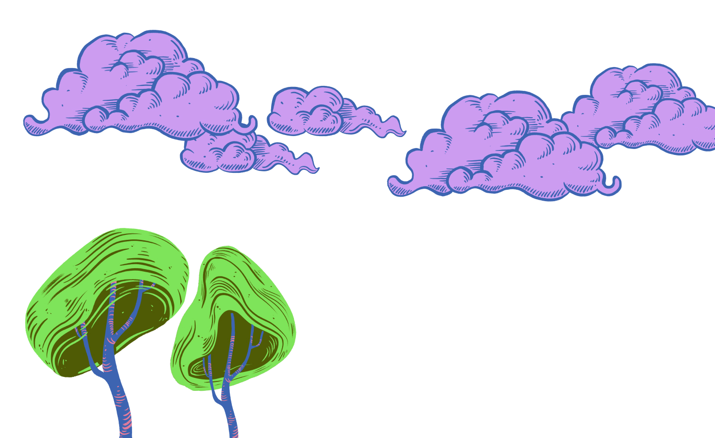
For many people, holistic health is still an abstract concept. The patterns were designed to illustrate a new design language reflective of the Redefined concept, aiming to make these ideas easily identifiable and relatable. This allowed us to bring together all the pieces of the puzzle through a contemporary, colourful and unique visual identity. This opened up new ways of telling stories for the brand, setting up a human centred way of communicating that could work across a variety of online and offline platforms. For the space itself, the system needed to be utilised in finding ways in which the team and members could identify different areas or modalities in the space.
The multi-million dollar development launched in 2020 and has recently been nominated for several business awards both in Tauranga and in NZ. With 500+ Active members and a weekly local farmers market to further support the local community, Redefined have truly integrated within their chosen environment.
In 2018, New Zealand was the first western country to implement a $600 million ‘wellbeing budget’. This reflects why health and fitness is one of the most stable and fastest growing industries in New Zealand with 700,000+ current health club members nationally. Being a brand new concept in a $4.2 trillion global market, this project required deep analytical and critical thinking before formulating a long term go-to-market strategy for the business. For ReDefined, the Papamoa community is the second fastest growing suburb in New Zealand, with yearly growth of 7-10% predicted from 2019 - 2024. Our team created a predicted catchment pool of potential members, and implemented a plan to connect with them across a three phase program: Pre-Launch, Launch & Post Launch mimicking strategeies that aligned with Everett Rogers Innovation- Adoption curve
For many people, holistic health is still an abstract concept. The patterns were designed to illustrate a new design language reflective of the Redefined concept, aiming to make these ideas easily identifiable and relatable. This allowed us to bring together all the pieces of the puzzle through a contemporary, colourful and unique visual identity. This opened up new ways of telling stories for the brand, setting up a human centred way of communicating that could work across a variety of online and offline platforms. For the space itself, the system needed to be utilised in finding ways in which the team and members could identify different areas or modalities in the space.
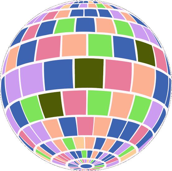
Antimony created an atomic graphic system that could be flexible and adaptable across the various touch points for the brand. First, a logo was developed based off of the visual research into mountains, the teepee and the Marae (Maori meeting place).
It was important that the symbol be a recognisable shape for ReDefined and their community to use while also conveying a sense of movement and transformation. Creating a family of supporting secondary shapes with the triangle representing sense of place, the diamond for wellbeing and the circle representing community.
Our primary aim for the creative direction was to create a layered, yet accessible brand narrative across multiple client journey touch points. The narrative has the ability to expand and contract when required, connecting the dots and weaving aspects of the brand, the holistic services, and the space for members and the community to interact and commune with. We wanted to create a sense of sacredness for members when engaging with the space.
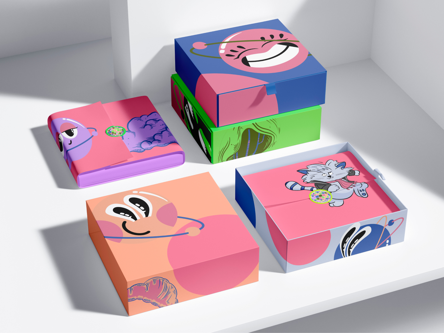
To translate the design into functional collateral and packaging, we returned to the essential elements of the symbolism and language that was created in the atomic design system. We focused on the raw elements of the brand and selected brand colours, matched with collateral that adds value to the business. Starting from the formal and organic shape of the brand symbol, we launched a process of transition from the literal to the abstract. Experiential value was the code at every level.
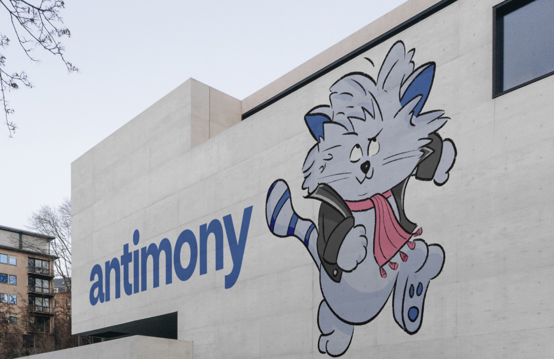
“I want to take this opportunity to share our sincere love and respect for the work Sam and Antimony did bringing our brand to life. Before Antimony we had nothing. Now we have a great brand, a unique story, a go-to-market strategy and a robust business plan that's helped us secure the investment we needed to launch and grow our dream"
.jpg)


We are living in an era where digitalisation has changed our methods of communication. We are facing a digital society in which content and media evolve every day, creating new ways to consume information. There is an infinite number of ways in which to communicate a single message. Audiences and platforms have continued to multiply and each requires a specific approach.
Antimony created an atomic graphic system that could be flexible and adaptable across the various touch points for the brand. First, a logo was developed based off of the visual research into mountains, the teepee and the Marae (Maori meeting place).
It was important that the symbol be a recognisable shape for ReDefined and their community to use while also conveying a sense of movement and transformation. Creating a family of supporting secondary shapes with the triangle representing sense of place, the diamond for wellbeing and the circle representing community.
Our primary aim for the creative direction was to create a layered, yet accessible brand narrative across multiple client journey touch points. The narrative has the ability to expand and contract when required, connecting the dots and weaving aspects of the brand, the holistic services, and the space for members and the community to interact and commune with. We wanted to create a sense of sacredness for members when engaging with the space.
To translate the design into functional collateral and packaging, we returned to the essential elements of the symbolism and language that was created in the atomic design system. We focused on the raw elements of the brand and selected brand colours, matched with collateral that adds value to the business. Starting from the formal and organic shape of the brand symbol, we launched a process of transition from the literal to the abstract. Experiential value was the code at every level.
“I want to take this opportunity to share our sincere love and respect for the work Sam and Antimony did bringing our brand to life. Before Antimony we had nothing. Now we have a great brand, a unique story, a go-to-market strategy and a robust business plan that's helped us secure the investment we needed to launch and grow our dream"
We are living in an era where digitalisation has changed our methods of communication. We are facing a digital society in which content and media evolve every day, creating new ways to consume information. There is an infinite number of ways in which to communicate a single message. Audiences and platforms have continued to multiply and each requires a specific approach.